Form 2 SelectMD 2.0 Clinician Choice Experiment Overview & Samp
SelectMD 2.0 Clinician Choice Experiment
Attachment C_SelectMD 2.0 Clinician Choice Experiment Overview and Sample Wireframes
Attachment C – SelectMD 2.0 Clinician Choice Experiment Overview & Sample Wireframes
OMB: 0935-0219
Attachment C
SelectMD 2.0 Clinician Choice Experiment Overview & Sample Wireframes
Table of Contents
Description of the Experimental Arms 3
Consistent Content and Functionality 3
What Participants Will See in Each Experimental Arm 7
Where Would You Like to Begin? 9
Pages Displaying Standardized Quality Metrics 11
Use of Effective Treatments 14
Methods to Reduce Medical Errors 15
Exhibits and Figures
Exhibit 1. Stages in the SelectMD 2.0 Experiment 2
Exhibit 2. The Eight Arms of the SelectMD 2.0 Experiment 5
Exhibit 3. The Six Versions Available to Respondents in Arm 5 6
Figure 1. Structure of the SelectMD Site 7
Figure 3. Where Would You Like to Begin? 9
Figure 4. Five Steps in the Tutorial 10
Figure 5a. Performance Overview 13
Figure 5b. Performance Overview for Arm 3 Only 13
Figure 5c. Performance Overview for Arm 6 Only 14
Figure 6. Use of Effective Treatments 14
Figure 7. Methods to Reduce Medical Errors 15
Figure 8. Patient Survey Results 16
Figure 9a. What Patients Say 17
Figure 9b. What Patients Say in Arm 6 17
Figure 9c. What Patients Say in Arm 7 18
Introduction
The purpose of this document is to:
Provide an overview of the eight arms of the SelectMD 2.0 experiment.
Show the wireframes for the SelectMD website that respondents in each experimental arm will use to choose a physician.
The wireframes convey the comparative performance information, descriptive text and visual formatting that will be displayed on the SelectMD website once it is operational. Over the past 6 months, the research team has worked with professional web designers to develop and refine these wireframes, which embody all the key content and design elements central to the experiment. However, the final operational version of the website will reflect findings from extensive user testing to ensure that all text and core functions are readily understood by a representative sample of Americans. This refinement of the SelectMD website will proceed during the OMB review process.
The SelectMD 2.0 experiment involves multiple steps. All respondents begin at the GfK website, where they will be able to read an introduction to the study and complete a brief survey (referred to as the "pre-choice" questionnaire) prior to engaging in one of the experimental arms. Respondents then visit the SelectMD website to review information on physician performance and make a choice among the doctors available to them. What the respondents will see on the SelectMD site depends on the arm to which they are randomly assigned. Once they have selected a doctor, they are returned to the GfK website to complete a "post-choice" questionnaire. Exhibit 1 summarizes the stages of the experiment.
In order for the research team to assess the impact of exposure to the website on changes in respondents’ attitudes, understandings, and perceptions, several questions on the initial pre-choice survey are replicated on the post-choice questionnaire. To reduce the likelihood that respondents will simply repeat their answers when asked these questions a second time (to appear consistent), it is essential to allow some time to elapse between the two surveys. Consequently, participants will not have access to the SelectMD website until one week after completing the pre-choice survey.
Exhibit 1. Stages in the SelectMD 2.0 Experiment
Stage 1 |
Respondent views the introduction to the experiment on the GfK site. |
Stage 2 |
Respondent completes the pre-choice questionnaire on the GfK site. |
Stage 3 |
Respondent waits one week after completing initial survey. |
Stage 4 |
Respondent returns to the study and is randomly assigned to one of eight arms of the experiment. (See description of arms in Exhibit 2.) |
Stage 5 |
Based on this assignment, respondent is transferred to the appropriate version of the SelectMD site, which the respondent will use to select a physician. |
Stage 6 |
Respondent is transferred back to the GfK site. |
Stage 7 |
Respondent completes the post-choice questionnaire on the GfK site. |
Stage 8 |
Respondent views conclusion and thank you on the GfK site. |
Description of the Experimental Arms
The SelectMD 2.0 experiment involves 8 arms, where one is a control arm and the other seven are experimental arms (See Exhibit 2.) Much of the website content and functionality is consistent across all arms. However, the arms differ in several important ways that are discussed below.
Consistent Content and Functionality
All of the arms display comparative scores for the following types of standardized quality information:
Use of Effective Treatments: How closely this doctor’s treatment matches the care provided by the best doctors. (This category presents fabricated scores for HEDIS-like measures.)
Methods to Reduce Medical Errors: The doctor's office has methods in place to prevent medical errors and keep patients safe. (This category presents fabricated scores for measures of the use of specific patient safety systems and procedures.)
Patient Survey Results: How patients answer survey questions about their doctor and office staff. (This category presents fabricated scores for CAHPS Clinician & Group Survey measures.)
The control arm of the experiment presents only these quantifiable dimensions of physician performance, where physicians are ranked on relative performance on a scale from one to five stars. Each of the experimental arms supplements these quantifiable aspects of quality with narrative accounts from patients, described to respondents in the following manner:
What Patients Say: Written comments from surveyed patients about their doctors. (This category presents fictional patient reviews of doctors.)
All arms also offer respondents the following functionality:
The ability to choose to search for either an internist or a family doctor.
The ability to specify a zip code and a distance the respondent is willing to travel.
The ability to limit the list of doctors to a specific gender and/or a specific level of experience (more or less than 10 years).
The ability to sort the list of doctors by their performance in a given measure or category of measures.
How the Arms Differ
The experiment is designed to rigorously test innovative ways of incorporating patient comments into web-based physician quality reports in order to:
expand on the findings from our previous doctor-choice experiment regarding how including narrative patient comments influences the ways in which consumers learn about and select among doctors, and
assess whether and how patient comments can be presented in a way that promotes learning about physician quality and complements rather than detracts from standardized measures of quality.
We will derive this new knowledge through a set of comparisons among the experimental arms. The baseline comparison contrasts the choices made by participants in the control group (Arm 1) with the first experimental group (Arm 2), which incorporates patient comments by simply listing comments offered by the patients of each doctor in the choice set. We anticipate that this initial comparison will replicate the key findings of the experiments we conducted under the auspices of CAHPS III several years ago: that including comments increases consumers’ engagement with the website but distracts their attention from quantifiable, standardized performance metrics, causing them to make worse choices (i.e., they chose doctors whose performance on the standardized measures was surpassed by one or more of the other available options). The baseline comparison extends the findings from our previous experiments by expanding the standardized metrics to include ratings related to patient safety; the addition of this information reflects emerging practices in contemporary websites that report physician performance.
The baseline comparison serves as a touchstone and common comparator for the other experimental arms, each of which is designed to create the same level of enhanced consumer engagement that we expect to find in Arm 2, while limiting the extent to which the standardized measures are neglected. The remaining experimental arms are designed to make it easier for participants to integrate the narrative comments with the standardized performance metrics. They do so in two ways:
By reducing the cognitive burdens associated with making sense of the complex information embedded in comments.
By making it easier to integrate the information that can be extracted from the comments with the dimensions of quality conveyed through the standardized metrics.
Each of the experimental arms applies these strategies by altering one or more of four aspects of the website:
Whether standardized performance metrics are presented individually (“drill down” scores), “rolled-up” into broader categories of measures, or both,
How patients’ comments are grouped and labeled,
Whether respondents can choose what (and how much) information they are shown, and
Whether respondents have access to live telephone assistance when making choices.
Exhibit 2 summarizes the differences across the arms.
Exhibit 2. The Eight Arms of the SelectMD 2.0 Experiment
Arm |
Rolled-up Scores |
Scores for Individual Measures |
Patient Comments |
Special Features |
1: Standardized measures only (control group) |
|
|
|
N/A |
2: Standardized measures with comments (experimental baseline group)_ |
|
|
|
N/A |
3: Roll-up scores only, plus comments |
|
|
|
N/A |
4: Drill-down scores only, plus comments |
|
|
|
N/A |
5: User’s choice |
(optional) |
(optional) |
(optional) |
Respondent chooses which information is displayed and how. |
6: Amazon model |
|
|
|
Respondent can see how the commenter rated the positive or negative nature of her or his own comment and the distribution of positive-to-negative comments. |
7: Tagged comments |
|
|
|
Respondent can use a list of keywords to view only comments that address specific topics. |
8: Navigator |
|
|
|
Content and display are the same as Arm 7 but respondent can talk to a navigator by phone while viewing the SelectMD site and deciding which doctor to choose. |
Arms 3 and 4 are designed to simplify respondents’ evaluation of the standardized metrics (allowing them, in principle, to cope more readily with the challenges of integrating that information with the patient comments).
Arm 3 (Roll-up scores only, plus comments) presents only the rolled-up ratings, i.e., one score for each of the three categories of quality metrics, along with the patients’ comments.
Arm 4 (Drill-down scores only, plus comments) presents ratings for the 12 standardized measures of clinician quality, along with the patients’ comments.
Arm 5 (User's choice) invites respondents to choose among the scenarios available in several of the other arms of the experiment:
They can choose to see roll-up scores, drill down scores, or both.
They can also choose whether to see patients’ comments.
Respondents in this arm can therefore potentially view six different versions of the website. Exhibit 3 shows the various combinations of information through this arm.
Exhibit 3. The Six Versions Available to Respondents in Arm 5
Version of |
Scores for Rolled-up Measures |
Scores for Individual Measures |
Comments |
Replicates Arm |
Version 1 |
Yes |
Yes |
|
Arm 1 |
Version 2 |
Yes |
Yes |
Yes |
Arm 2 |
Version 3 |
Yes |
|
Yes |
Arm 3 |
Version 4 |
|
Yes |
Yes |
Arm 4 |
Version 5 |
Yes |
|
|
-- |
Version 6 |
|
Yes |
|
-- |
Because our previous experiments have demonstrated that patients’ narrative comments are very appealing to consumers choosing among doctors, we do not anticipate that many of the respondents in Arm 5 will choose to exclude these comments. Nonetheless, the act of consciously choosing whether they should be included may cause users to think more carefully about what they hope to learn from the comments. Moreover, because the respondents also are choosing how to view the standardized metrics, we anticipate that (a) the information they see will be better matched to the level of detail they find easiest to understand, and (b) they will be more invested in the standardized metrics simply because they have made the choice about how best to view them.
Arms 6 and 7 approach the challenge of integrating comments from a different angle, by focusing on the comments themselves rather than the standardized measures. Both arms incorporate mechanisms that potentially make it easier for users to make sense of the information embedded in patients’ comments.
Arm 6 (Amazon model) includes patients’ assessments of the negative or positive nature of their own comments about the doctor and provides a graphical representation of the distribution of positive-to-negative comments. Respondents can choose to read one or more subgroups of comments to help them make sense of what other patients viewed as the “best” or “worst” qualities in any given clinician. They may also treat the comment ratings as parallel to the star ratings in the other quality metrics, making it easier for them to integrate the two forms of information about clinician quality
Arm 7 (Tagged comments) includes a short list of keywords for the comments so that respondents can choose to read comments that address specific topics of interest. Because these keywords will reflect some of the quality metrics presented in the star ratings, this may make it easier for users to “connect” these particular forms of quality ratings.
Arm 8, the final arm of the experiment, addresses the challenges of integrating a complex set of quality measures in yet a different manner – by providing users with a health care “navigator” with whom they have real-time phone access, allowing them to ask questions about the website and the information that it contains.
Arm 8 (Navigator) presents users with the same content and functionality as Arm 7; users will see both rolled-up and individual standardized measures and have access to patient comments that are tagged with key words. But as respondents access the SelectMD website on their own computer, their assigned “navigator” will be able to see the same images on his or her own computer, so that the navigator can follow along in real-time as respondents explore the website and be ready, if asked, to help them make sense of the information and the choice with which they are presented.
What Participants Will See in Each Experimental Arm
The basic structure of the SelectMD website (see Figure 1 below) is consistent across all of the experimental arms. This section presents the wireframes for the pages within this site structure, including pages that are unique to specific arms.
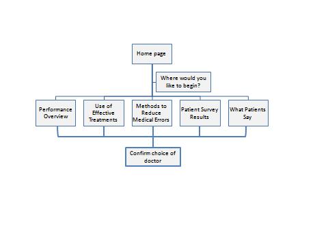
Figure 1. Structure of the SelectMD Site
Home Page
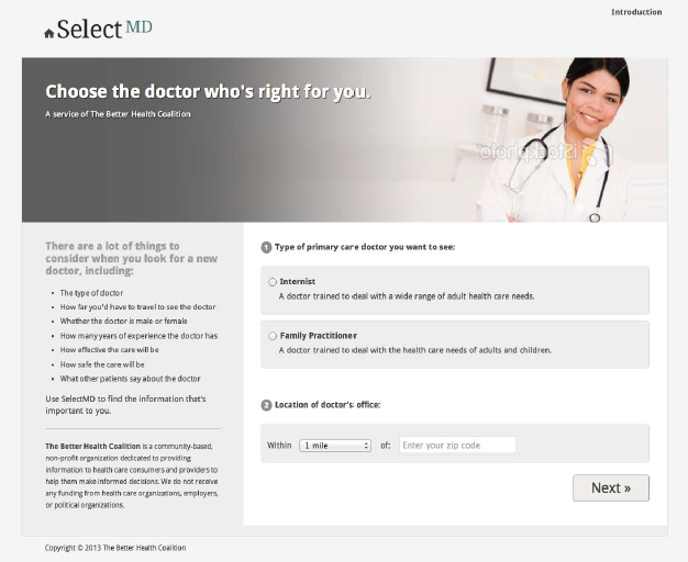
Figure 2 presents the home page common to all arms of the experiment. All respondents are first asked to choose a type of primary care doctor that they would like to consider; this is intended to get them thinking about selecting clinicians before they actually face the challenges of doing so. They then enter a distance from a specific zip code that establishes how far they are willing to travel to visit a primary care provider, and select the “Next” button to move to the next page.
Having respondents make these choices also enhances their sense of reality for the website, since real-world websites reporting on physician quality start with questions of this sort. Furthermore, it engages respondents in the exercise facing them, since they have begun to play an active role rather than just passively reading about their options. However, their responses to these initial questions do not affect what the respondent sees on other pages of the site.
Where Would You Like to Begin?
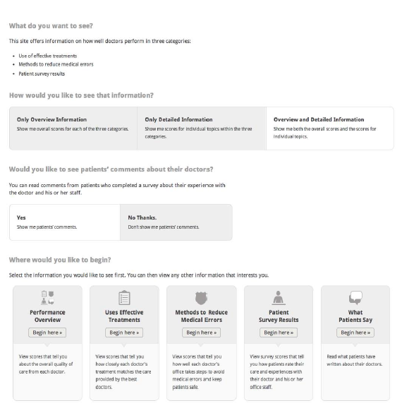
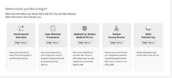
In all experimental arms, respondents will see a page (Figure 3) that lets them choose the kind of information they want to see first:
A Performance Overview, which presents summary (roll-up) scores for the three categories of comparative information and indicates the number of comments available.
One of three categories of comparative information, where the scores reflect performance on specific composite measures of quality.
A page with patients’ comments for each doctor.
Regardless of where they start, all respondents are free to navigate to any of the other pages provided in their experimental arm.
Variations: Because different arms of the experiment offer different sets of information to users, their starting choices are correspondingly altered.
Arm 1: Standardized measures only. This page does not include an option for viewing patients’ comments.
Arm 3: Roll-up only. Respondents in this arm are not given a choice of where to begin. The only page they can see is the Performance Overview, so they go to that page directly from the Home Page.
Arm 4: Drill-down (individual measures only). Respondents do not have access to the Performance Overview page.
Figure 3. Where Would You Like to Begin?
Tutorial
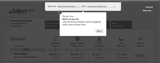
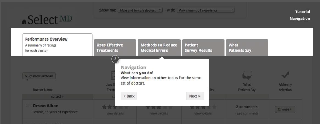
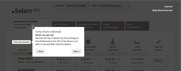
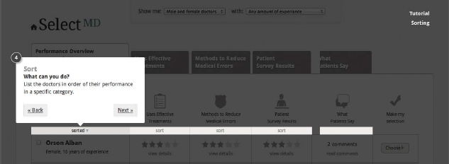
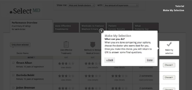
Once respondents have indicated a starting point for viewing the quality information, a short tutorial will automatically walk them through the available pages to highlight key functional elements that are available to help them manage the list of doctors. Figure 4 illustrates the five steps in the tutorial. The purpose of this tutorial is to compensate for the fact that respondents visit this site only once and thus lack the usual opportunity to learn about the site as they visit it over time. It is modeled on the type of tutorial that top-tier web companies (e.g., Amazon, Google) deploy when introducing new features on their websites.
In each step of the tutorial, respondents have the option of moving forward, moving back to reread a previous step, or leaving the tutorial to return to the main site.
Figure 4. Five Steps in the Tutorial
Pages Displaying Standardized Quality Metrics
Once the respondents have completed the tutorial, they will be taken to the content they chose to see first. No matter which content the respondents selected as their starting point, they will be able to move easily to the other content by using the tabs at the top of the page. Respondents can view the pages in any order and select a doctor from any page.
The following graphics display only the top portion of each web page. On the site, each page will offer information for a scrollable list of 12 physicians who are initially presented in alphabetical order. Respondents have the option of sorting the list by one of the quality measures shown on the page. They can also choose to make the list smaller by specifying the gender of the doctors and/or the doctors’ level of experience and viewing only the subset of clinicians who match their preferences for these attributes. All physician names were created with a random name generator and are designed to be neutral with respect to any racial/ethnic origins that names might otherwise imply.
The research team has designed the choice set and the scores associated with each doctor to signal two kinds of variation:
Variation in performance across physicians (i.e., overall, some doctors perform better than others).
Variation in performance in the measures reported for an individual doctor (i.e., a doctor who performs well in one area does not necessarily perform well in other areas); although comments for physicians who are higher rated in the patient experience measures tend to be more positive in tone, for every doctor there is some variation, with some comments being less positive than others.
Performance Overview
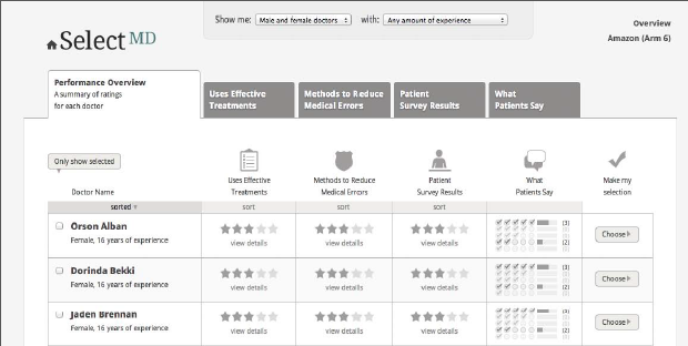
The Performance Overview provides a summary (roll-up) score for three areas of comparative information (Use of Effective Treatments, Methods to Reduce Medical Errors, Patient Survey Results) and shows the number of comments available for each doctor. On this page, respondents can choose to view detailed scores for individual doctors. In the first SelectMD experiments conducted several years ago, the vast majority of respondents chose to start with the Performance Overview page.
a presents the wireframe for the Performance Overview page with detailed (drill-down) scores revealed for one doctor.
Variations: As with the page on which users decide where to start, the performance overview page also varies across experimental arms, reflecting the different content that is available to users in that arm.
Arm 1: Standardized measures only. The Performance Overview page in Arm 1 does not include a column for “What Patients Say.”
Arm 3: Roll-up only. This page does not have tabs because respondents cannot see the measures for each category. In this arm, respondents can view the comments by clicking on “Read comments” in the table. See Figure 5b.
Arm 4: Drill-down (individual measures only). This page does not exist for this arm. No “Overall” (roll-up) score is provided for the three performance categories.
Arm 6: Amazon model. The “What Patients Say” column shows the distribution of positive-to-negative comments. See Figure 5c.
Figure 5a. Performance Overview
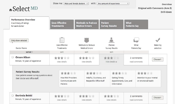
Figure 5b. Performance Overview for Arm 3 Only
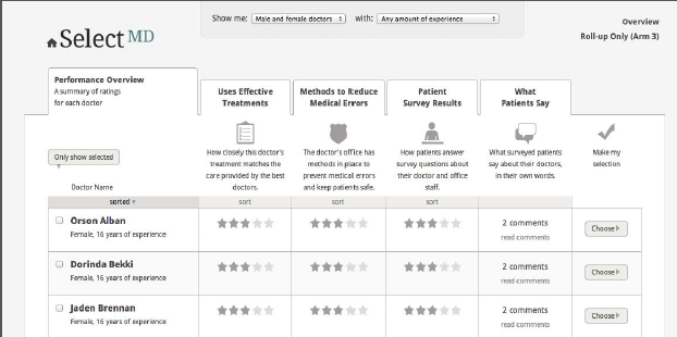
Figure 5c. Performance Overview for Arm 6 Only
Use of Effective Treatments
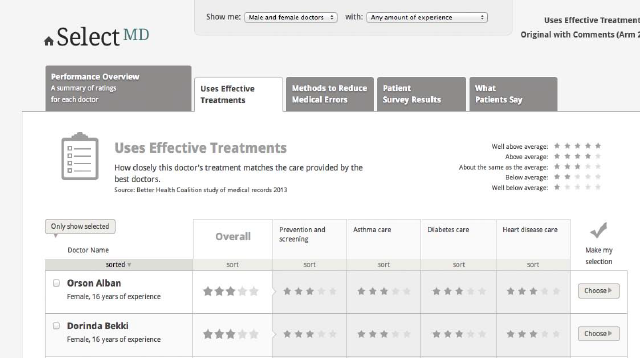
The Use of Effective Treatments page displays comparative scores for a summary (roll-up) measure and four composite measures that represent the clinical quality of care:
Prevention and screening
Diabetes care
Asthma care
Heart disease care
These composite measures are meant to resemble “all-or-nothing” measures derived from HEDIS data. Figure 6 presents the wireframe for the Use of Effective Treatment page.
Figure 6. Use of Effective Treatments
Methods to Reduce Medical Errors
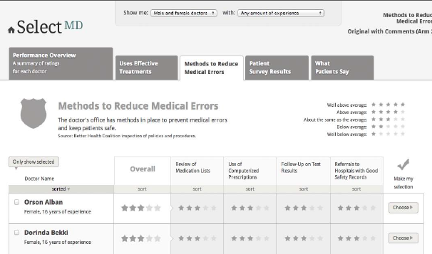
The Methods to Reduce Medical Errors page displays comparative scores for a summary (roll-up) measure and four measures that represent the safety of care:
Use of medication lists
Use of computerized prescriptions
Follow-up on test results
Referrals to hospitals with good safety records
These measures are derived from safety measures developed by the National Patient Safety Foundation, the Leapfrog Group and the Joint Commission. Figure 7 presents the wireframe for the Methods to Reduce Medical Errors page.
Figure 7. Methods to Reduce Medical Errors
Patient Survey Results
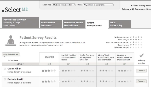
The Patient Survey Results page presents comparative scores for a summary (roll-up) measure and four composite measures from the CAHPS Clinician & Group Survey (CG-CAHPS)
How well doctors communicate with patients
Getting timely appointments and information
Helpful, courteous, and respectful office staff
Attention to your mental or emotional health
Figure 8 presents the wireframe for the Patient Survey Results page.
Figure 8. Patient Survey Results
Pages Displaying Patient Comments
As illustrated by Figure 9a below, when respondents click on the What Patients Say tab, they see a page that displays 4-6 written comments from patients about their experiences with the doctor and the office staff. Respondents click on the name of a doctor to see all comments for that doctor. The comments are presented as patients’ written responses to open-ended questions on a CAHPS-like survey of patient experience. As with most current patient commentary websites, individual accounts are presented on the website in random order.
The content for these comments has been drawn from two sources. One source is actual patient comments found on physician rating web sites. These comments were modified and masked so that no real names or identifying information is revealed. The other source of comments is a set of fabricated comments created by the researchers using words and phrases with known emotional valence (see Attachment E for more information about the construction of patient comments).
Variations on this page: The experiment includes two arms that explore alternative ways to help respondents make sense of patient comments and connect the substance of the comments to the doctors’ scores for Patient Survey Results.
Arm 6: Amazon model. The What Patients Say page includes a bar chart distribution based on patients’ assessments of the negative or positive nature of their comments. Each comment is presented with a rating of one-to-five checks that reflect that rating. See Figure 9b below.
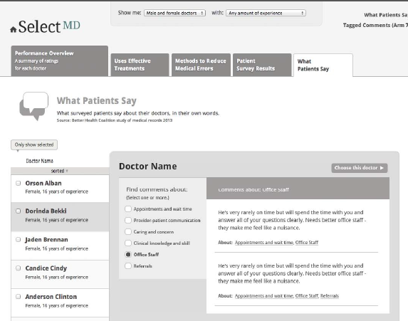
Arm 7: Tagged comments. The page includes a short list of topics addressed by the comments. If the respondent chooses one or more topics, the page refreshes to show only comments that have been tagged with the selected keywords. See Figure 9c below.
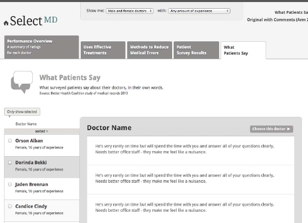
Figure 9b. What Patients Say in Arm 6
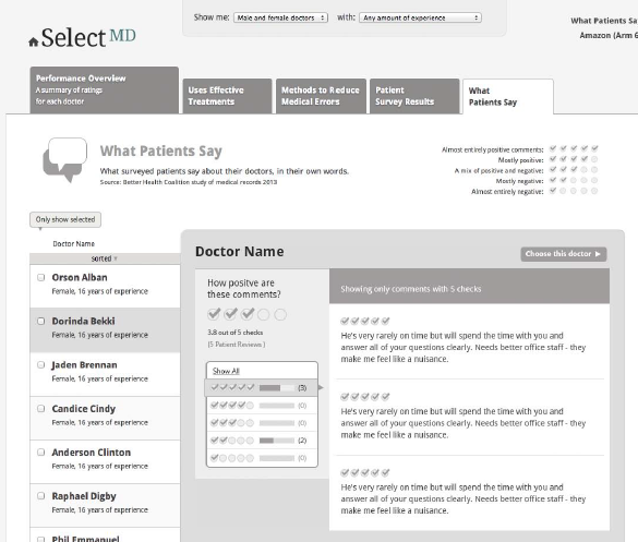
Figure 9c. What Patients Say in Arm 7
What Do You Want to See?
One additional web page is presented to respondents in Arm 5 only. This is the arm in which respondents can make two choices:
They can specify the level of aggregation at which the standardized metrics are displayed:
The scores for rolled-up measures only (as in Arm 3)
The scores for twelve separate quality measures (as in Arm 4)
Both (as in Arm 2).
They can decide whether they want to see the comments displayed at all.
In essence, they are choosing which arm of the experiment to enter, rather than being randomly assigned to a particular version of the website.
These respondents will go from the home page to a unique page that allows them to choose what information they want to see. This page presents the questions sequentially: respondents first select the level of aggregation for the standardized measures, then indicate whether they want to see comments. Once those questions are answered, respondents see the same “Where do you want to begin” question shown to other respondents (Figure 3) with whatever options are appropriate given the answers to the first two questions. If respondents change their responses to the first two questions, the options in the third row change accordingly.
Figure 10 show the questions will be presented to respondents in Arm 5.
Figure 10. What Do You Want to See?
Confirmation of Doctor Choice Screen
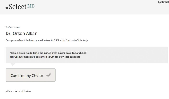
Respondents are able to select their preferred doctor from any place in the website, allowing them to (re)view the information they consider most relevant to their choice before making their selection. To ensure that this choice function is not triggered inadvertently and to give respondents a second chance for a more considered judgment, respondents are transferred to a choice confirmation screen once they make an initial choice (Figure 1) and asked to confirm that choice. Once respondents confirm their choices, they are returned to the GfK system to fill out the post-choice questionnaire. A respondent who disconfirms the initial choice is returned to the page where the choice was made.
Respondents must choose a doctor before they can go on the post-choice questionnaire. However, they may choose a doctor at any point in their review of the website; they do not have to view all of the pages before selecting a doctor, nor read all (or any) of the patient comments presented for that or any other doctor.
Figure 1. Physician Choice Confirmation
| File Type | application/msword |
| File Title | Physician Choice Experiment(s) |
| Author | Rybowski L |
| Last Modified By | Dale Shaller |
| File Modified | 2013-09-04 |
| File Created | 2013-09-04 |
© 2026 OMB.report | Privacy Policy
