Attachment D - CE Mobile Diary Phase II Testing Report
Attachment D - CE Mobile Diary Phase II Testing Report (11Mar14).docx
Consumer Expenditure Surveys: Quarterly Interview and Diary
Attachment D - CE Mobile Diary Phase II Testing Report
OMB: 1220-0050
Internal CE Document
(May be shared with CE/POC Team members at the Census Bureau)
Summary Report of the Phases II & III Usability Tests of the
CE Mobile-Optimized Web Diary
Brandon Kopp, Jean Fox, and Erica Yu
Office of Survey Methods Research
Nhien To
Division of Consumer Expenditure Surveys
February 2014
Executive Summary
In June 2013, ten usability testing sessions were conducted on the CE Mobile Diary using a high-fidelity wireframe instrument. Recommendations based on those tests were integrated into the production of a functioning, Internet-accessible version of the instrument. An additional 29 usability tests were conducted to assess the functionality of the new instrument. Due to project time constraints, these 29 tests were broken up into two phases. Twelve usability testing sessions were conducted in December 2013 and recommendations based on these tests were submitted to project staff and developers on December 20th (referred to as Phase II below). Several of these recommendations were enacted in the instrument and an additional round of 17 usability tests were conducted in February 2014 (referred to as Phase III below).
The main findings of Usability Testing Phases II and III are:
A significant number of participants, particularly those who self-identified as having a low or moderate amount of experience using a smartphone, had difficulty simply navigating to the site and logging in.
Participants had extensive difficulty with changing their password. None of the nine participants who attempted the task were able to complete it without triggering an edit, and only three successfully completed it. The most common problem was participants’ failure to read the password requirements.
Participants did not have much difficulty with the basic functions of the diary, once logged in, but had significant problems with entering data in a way that meets CE data requirements. In particular, participants were often confused about whether to itemize their purchases. More often than not, they attempted to enter total values for a shopping trip; several even combined multiple receipts into a single entry. This occurred despite a full “placement” explanation of data requirements by the experimenter.
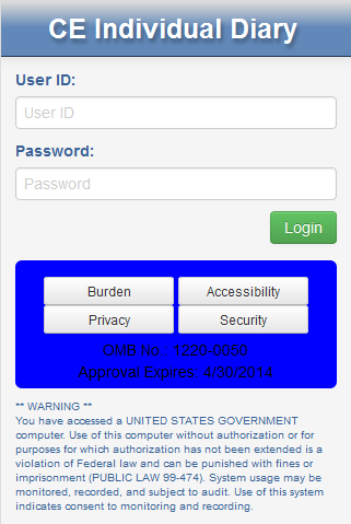
Of the issues noted during testing, the most worrisome are the problems participants had with simply logging in to the instrument. This process caused many participants difficulty and others were unable to log in without help from the test moderator. This becomes a larger potential problem when a Diary respondent will be expected to log in each time he/she uses the Diary. The burdensome nature of logging in will make it less likely that respondents will use the Diary as intended (i.e., fill it out at or near the time of purchase) or at all. Usernames and passwords should be simplified as much as possible while maintaining a reasonable level of security. As web/mobile data collection becomes more prevalent, Census, the Department of Commerce, NIST, and BLS should reevaluate the credentialing process to ensure password requirements are not negatively impacting response rates.
Before assigning a respondent to the CE Mobile Diary, survey administrators should screen respondents to ensure they not only have a smartphone but feel comfortable with navigating the phone’s web browser and entering data. Targeting more proficient smartphone users could help limit issues with Internet and Mobile Diary instrument navigation. Screening questions should target those who use their phone’s web browser frequently (not just applications). These questions should be developed in consultation with questionnaire design and Mobile Diary project staff. Ideally, these questions would be cognitively tested prior to implementation.
It is the opinion of the experimenters that the Mobile Diary should not be used as a standalone mode of response for the diary survey. The Mobile and Web Diaries should be linked and respondents should be able to access both during the diary period. This interoperability should be instituted as soon as possible, ideally for the CE Gemini Proof-of-Concept test.
While the above findings may seem pessimistic about the success of the Mobile Diary, it should be noted that testing was conducted with a small, convenience sample of participants. The primary use of usability testing is to identify potential issues, not to determine their prevalence in the CE Diary production sample. The rates of successful task completion are provided in this report only to provide background for the recommendations listed below. They should not be interpreted as applying to all potential CE Mobile Diary respondents.
Recommendations based on these issues are listed below. It is noted where changes that were recommended in Phase II have already been made. It is also noted where discussions with Census security and development stakeholders have shown certain changes are not allowed or feasible. The recommendations are focused strictly on change requests. If you would like further rationale for why these changes were recommended, please read the report or contact Brandon Kopp.
Recommendations |
||||||||
Overall
These participants also had trouble because a set of magnification buttons would appear over the Save button. They had to wait, not touching the screen, until the buttons disappeared.
If there is any way this can be handled programmatically, that would be helpful. For example, if the size of the fields could expand to compensate for the increased size of the text. Accomodating accessibility features (at least eventually) would be necessary for 508 compliance. Navigating To The Site
Login Screen After the “change password” task, logging in was the most difficult. This is particularly troublesome because any impediment gives respondents a ready excuse not to enter data. This task needs to be made easier. Below are several options:
Initial Setup Screen (start date selection) No change. Participants had no trouble with this task.
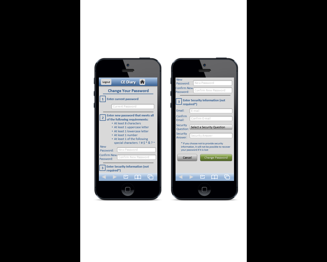
Change Password Screen This was, by far, the most difficult task for participants. None of the participants who were presented this task made it through without errors, several did not make it through at all. For those that did eventually complete this task, it took a long time (10 or more minutes).
Below is an illustration of what the screen may look like, given the recommendations above:
Data Entry Screens
Edit Screens
Info Screen
Changes to Protocol/Pamphlet/Placement (Not Instrument)
Future Changes Not all changes are expected to be made prior to the Individual Diaries test. If the Mobile Diary is deemed worthy of future use in the CE, then the following should be considered for testing and implementation in subsequent generations of the instrument.
|
Overview
The Consumer Expenditure Survey (CE) Program currently uses a paper diary to collect household expenditures. As part of ongoing improvements to the survey, the Bureau of Labor Statistics (BLS) and the Census Bureau (Census) have begun field testing a web-based diary instrument. The web diary may help some respondents with data entry and it has the potential to lead to more complete responses through periodic data checks by field representatives during the collection period. It does not solve one recurring data collection problem however; collecting accurate data on those purchases that do not yield a receipt and/or are forgotten before one returns home to enter items into the Diary. To help solve this issue, BLS and Census are designing a version of the web-diary specifically for use on a smartphone. The usability testing described below will provide feedback on an initial version of the mobile Internet optimized CE Diary survey.
Methods
2.1 Participants
Twenty-nine participants (14 female, 15 male) attended individual testing sessions that lasted about one hour. Participants were compensated $40 for their time. The twelve participants in Phase II were recruited by the Census Bureau and the seventeen in Phase III were recruited by BLS. One participant was removed from Phase III because his phone did not have a QWERTY keyboard (physical or virtual) which would have made it extremely difficult to complete the tasks as intended. While this participant did have a smartphone, he would likely have been screened out of the study if we had used the screening questions from the Individual Diaries Feasibility Test (IDFT) which ask if he accesses the Internet using his phone. This resulted in a total of 28 sessions
Participants in both phases were screened based on their prior experience with smartphones. Specifically, only those who reported owning a smartphone and having some experience with it were eligible to participate in this study. Experimenters made a special effort in Phase III to bring in participants who had a smartphone but had little experience using it. Nine participants reported having “A little” experience with smartphones, eleven participants reported having “A moderate amount” of experience, and nine reported having “A lot” of experience. Experimenters also made an attempt to bring in participants who had a range of smartphone operating systems (OS). This allowed us to see (1) whether performance on tasks differed across types of phone users and (2) whether there are significant differences in the way the instrument is displayed on different phone operating systems and browsers. See Table 1 for a breakdown of the study sample by OS type and experience levels.
Table 1: The sample sizes for each cell in the sample design.
|
|
How much experience do you have with using a smartphone? |
||
|
|
A Little |
A Moderate Amount |
A Lot |
Which operating system (OS) is on your device? |
iOS/Apple/iPhone |
3 |
2 |
4 |
Android/Google/Galaxy |
5 |
8 |
5 |
|
Blackberry/RIM Windows Palm Other Don’t Know/Not Sure |
1 |
0 |
0 |
|
OS Specific Technical Problems |
|
2.2 Procedure
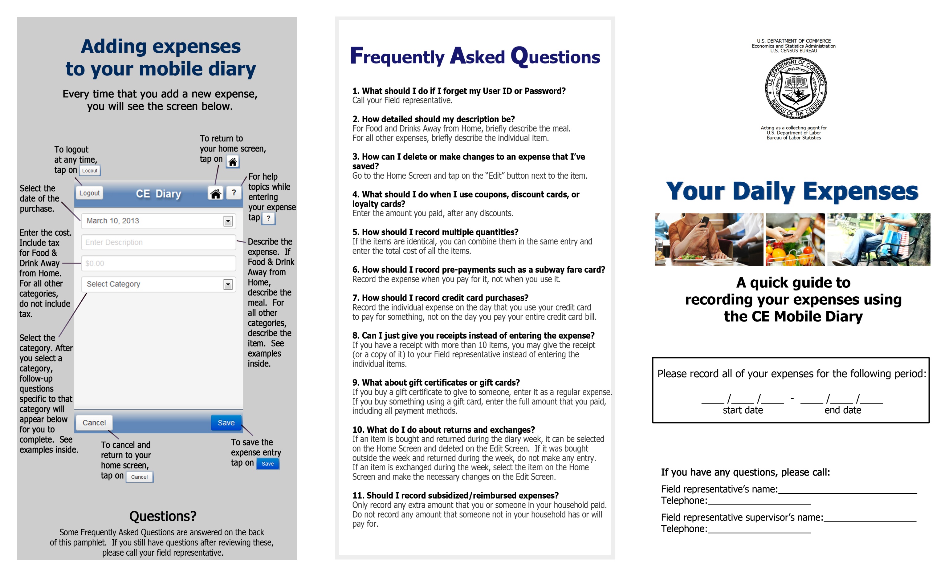
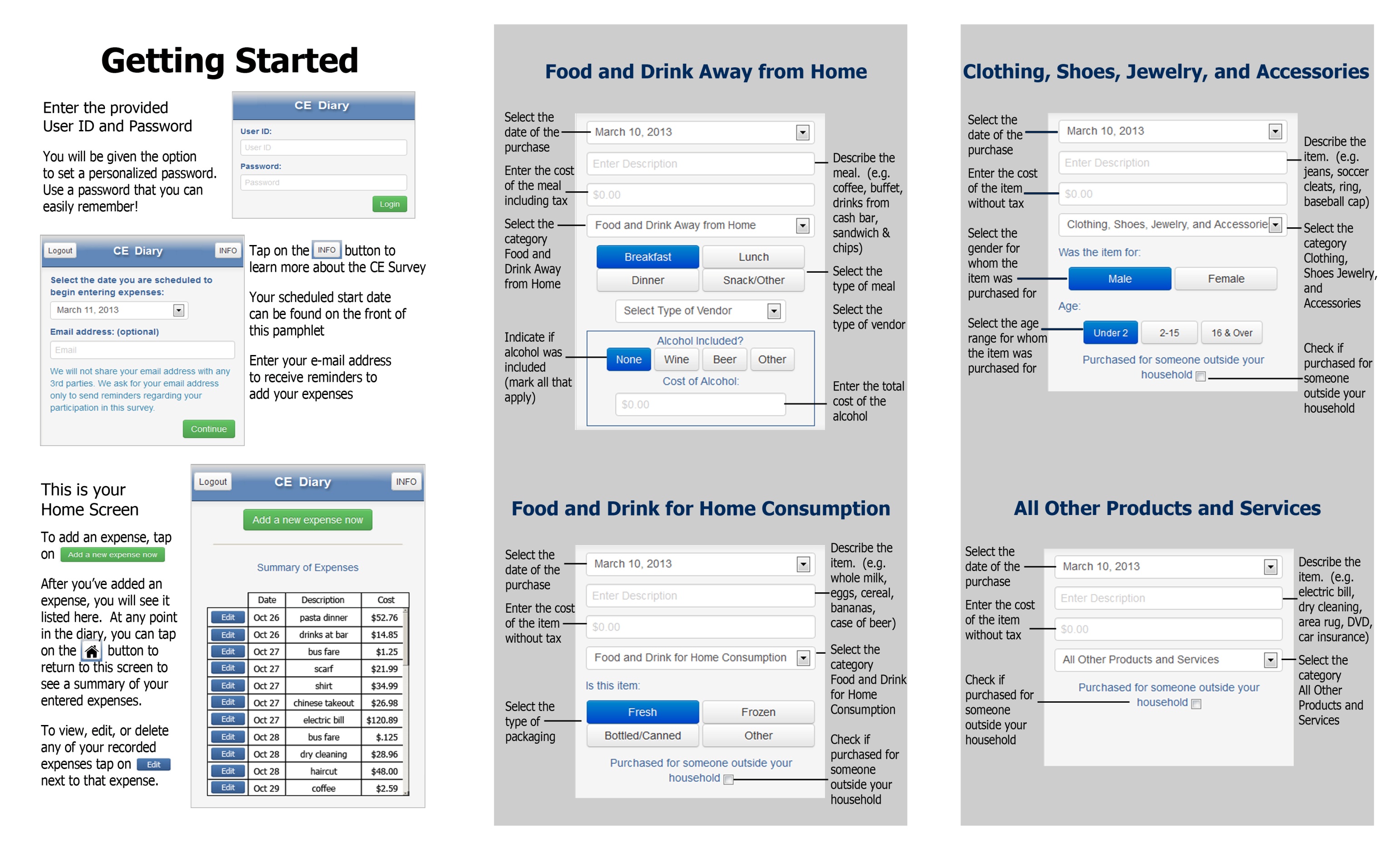
Participants came individually to the usability lab in the Office of Survey Methods Research at BLS. After the experimenter explained the purpose of the study and obtained informed consent, he explained the basic functions of the Diary instrument as well as the data needs for the Diary using a pamphlet designed for use in the upcoming IDFT (see Appendix B). This was meant to simulate Mobile Diary placement.
Participants in this study were asked to bring their own smartphone to the interview. That way, experimenters could ensure the participant was comfortable with the function of the operating system, the web browser, and the various keyboards. The participant was asked to place their smartphone on a sled that had a web camera suspended above it which gave the experimenter and observers a view of the participants’ screen and hands. Morae software recorded video of the participants’ smartphone screen and the audio from the participant and experimenter interaction.
The experimenter remained in the room with the participant and walked him or her through the tasks and debriefing questions (described below). Several observers monitored each session from an adjacent room. The observers’ task was to watch the webcam view of the participants’ screen, listen to the conversation between the experimenter and participant, and take notes on any difficulty the participant had completing each task and any feedback (positive or negative) they expressed during the testing session. Observers used a specially designed form to record their feedback.
During each testing session, the experimenter would read the task instructions and the participant would then attempt to complete the task. There were 13 tasks, as described in the next section. After the 13 tasks were complete, the experimenter asked a series of follow-up questions about the participant’s experience with the Diary.
2.3 Tasks
The 13 tasks used in this study covered the basic tasks CE Diary respondents would perform to complete the Diary survey using a mobile device. That is, they would need to navigate and log in to the Diary, perform the initial setup, enter a variety of purchases, and edit previous purchase entries. There was also a task for changing one’s password. Changing a password is not necessary for completion of the Diary, though it could make it more likely that a respondent will remember their password and thus use the Diary more often.
The tasks were divided into three blocks, shown below. The “Getting Started” block, by necessity, always came first. Blocks A and B were counterbalanced so that half of the participants received Block A then B and the other half received Block B then A.
Participants were read scenarios or given receipts for data entry for 11 of the 13 tasks. For two of the tasks, 4 and 9, participants entered expenses of their own. These non-directed tasks make the data entry more true to what a respondent’s experience would be with the Mobile Diary.
Due to technical issues with the change password function and time constraints, only 9 of the participants were asked to set a personalized password.
Getting Started
|
Task Name |
Text Read to Respondents |
1. |
Login |
Let’s get started. First, I’d like you to use this username and password to login to the diary… |
2. |
Start Date |
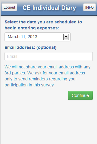
Next, you will see a screen asking you to select your start date. Please select October 21st as your start date. Below the start date, you will see that we ask for your e-mail address. You can skip that box. Please select the “Continue” button. |
3. |
Set Personalized Password |
Next you will be given the option to set a personalized password. You will be logging into the diary several times, so you will want to use something you can remember. Please do not use a password that you use somewhere else, like your email. It’s important that you don’t forget the password since we can’t quickly reset it, so do whatever you would normally do to keep track of a password. |
Block A
|
Task Name |
Text Read to Respondents |
4. |
Own Food |
Think back to the last food purchase you made. Please add that item to the diary as if the purchase was made on [DATE]. |
5. |
Enter Book for Friend, Enter Jeans for Self |
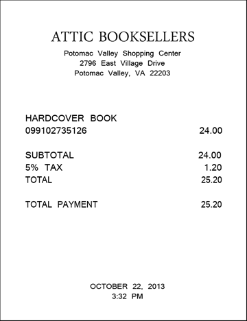
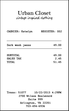
On [DATE], you go shopping and buy a book for a friend and a pair of jeans for yourself. Here are the receipts. Please enter these expenses into the diary.
|
6. |
Enter Car Insurance Bill
|
Later on [DATE], you pay your car insurance bill online. This is the billing statement. Please enter this expense into the diary.
|
7. |
Delete Pants |
The next day, on [DATE], you decide to return the pants that you had bought. Please go back and delete that item. |
8. |
Change Book Details |
You also decide that, rather than give the book to your friend, you are going to keep it for yourself. Please update that item to reflect that the book was purchased for you. |
Block B
|
Task Name |
Text Read to Respondents |
9. |
Enter Own Non-Food Purchase |
Think back to the last purchase you made, other than food. Please add that item to the diary as if the purchase was made on [DATE].
|
10. |
Enter Dinner, Enter Movie |
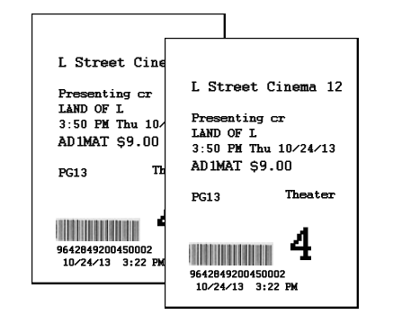
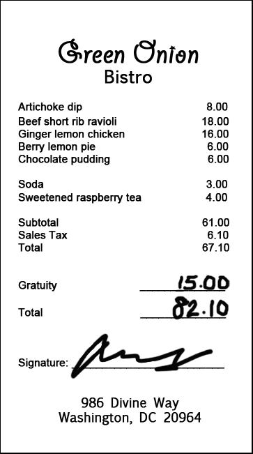
On [DATE], you treat a friend to dinner and a movie and you pay for both. You decide to enter the purchases into the diary as you’re waiting for the movie to begin. Here is your ticket stub and the receipt from dinner.
|
11. |
Enter Drinks |
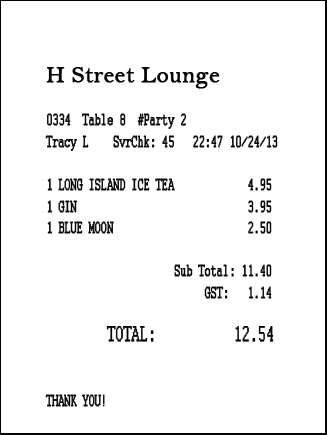
On the way home from the movie, you and your friend stop to get a couple drinks. Here is the receipt. Please enter this expense into the diary.
|
12. |
Edit Price of Drinks Purchase |
The next day you realize that you had left a $5 bill as a tip for the drinks you purchased, but forgot to enter that as part of the expense. Please change the entry to reflect the full price paid for the drinks. |
13. |
Enter Long Receipt |
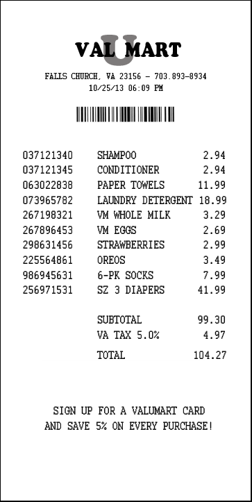
On [DATE], you go to the Val-U-Mart superstore to buy a few things for your house – enter your expenses from this receipt.
|
2.4 Test Metrics
2.4.1 Task Success. The session observers determined whether each task was completed successfully or not. Successful completion means that the participant completed the task as intended, without help from the experimenter. Not successful means a participant did not complete the task, completed the task in a way that would not lead to a valid response, or required help from the test moderator.
When only one observer was present, his or her rating of task success was used. When multiple observers were present, they did not always agree on their rating of task success. In this situation, the majority opinion was used. If there were an even number of observers and tie in ratings (e.g., one rates “Successful”, another rates “Not Successful”), an additional observer watched the video of that session and broke the tie.
2.4.2 Debriefing Questions. After the tasks had been completed, the experimenter asked participants several closed and open-ended questions regarding their experience with the mobile diary and their suggestions for improvements.
2.4.3 Other Quantitative Metrics. Ordinarily, the amount of time it takes to complete teach task and participants’ ratings of task difficulty would be reported in a usability test report. Several difficulties arose during the administration of the test that made it difficult to obtain meaningful measures of these constructs. For example, several participants had significant difficulties completing the tasks and were unable to complete them all. Also, the experimenter would occasionally modify the scope of a task (e.g., not requiring a respondent to start a task from the login screen) in order to get the participant through as many tasks as possible. Given these difficulties, only task success and participants’ answers to debriefing questions will be reported here.
Results
3.1 Task Success.
Overall, participants had moderate difficulty completing the tasks. The percentage of participants who successfully completed each task is shown in Table 2. On average, each participant successfully completed 66% of the tasks that they worked on (not all participants completed all tasks). This ranged from as low as 29% correct to one participant who successfully completed all of the tasks he worked on.
The percentage of successfully completed tasks did not increase linearly across the experience categories. Those who reported having “A Little” experience with smartphones successfully completed, on average, 65% of their tasks, those with “A Moderate Amount” of experience completed 59% of their tasks successfully, and those with “A Lot” of experience successfully completed 74% of the tasks. Many of those with little experience with smartphones proved to be more conscientious about the data requirements of the Diary. They were less certain about their skills and would refer to the pamphlet more often.
Table 2: Number of participants who completed a task (N) and the percentage who completed it successfully.
|
Task Name |
N |
Percent Successful |
1. |
Navigate & Login |
28 |
46% |
2. |
Start Date |
28 |
96% |
3. |
Set Personalized Password |
9 |
33% |
4. |
Own Food |
25 |
80% |
5. |
Book for Friend, Jeans for Self |
24 |
63% |
6. |
Enter Car Insurance Bill |
22 |
95% |
7. |
Delete Pants |
21 |
90% |
8. |
Change Book Details |
18 |
100% |
9. |
Own Non-Food Purchase |
28 |
93% |
10. |
Dinner, Movie |
26 |
35% |
11. |
Drinks |
25 |
48% |
12. |
Edit Price |
24 |
58% |
13. |
Long Receipt |
22 |
27% |
3.1.1 Navigating to the Site and Logging In. Participants had difficulty right from the beginning of the test. Only 46% were able to navigate to the site and log-in without some major problem. Although the majority of those who had difficulties with this task reported having little or moderate experience, two of the participants who reported a lot of experience also did not complete this task successfully. Most of these participants had difficulty logging in; mistyping their password two or more times. Several participants did not realize at first that the password is case sensitive, others hit the wrong keys by accident, and others had difficulty distinguishing between similar looking letters/numbers (e.g., l or 1, O or 0, etc.). When participants mistyped their password, they often believed there was something wrong with the credentialing system rather than believe they had typed in something incorrectly.
The protocol of the usability tests originally called for logging into the instrument multiple times. Almost every task was meant to start from the login screen. Since the instrument automatically logs users out after approximately 15 minutes, this would more closely match real-world scenarios. This additional login requirement for each task was quickly abandon when it was apparent that it would take up too much of the testing session, even for experienced users.
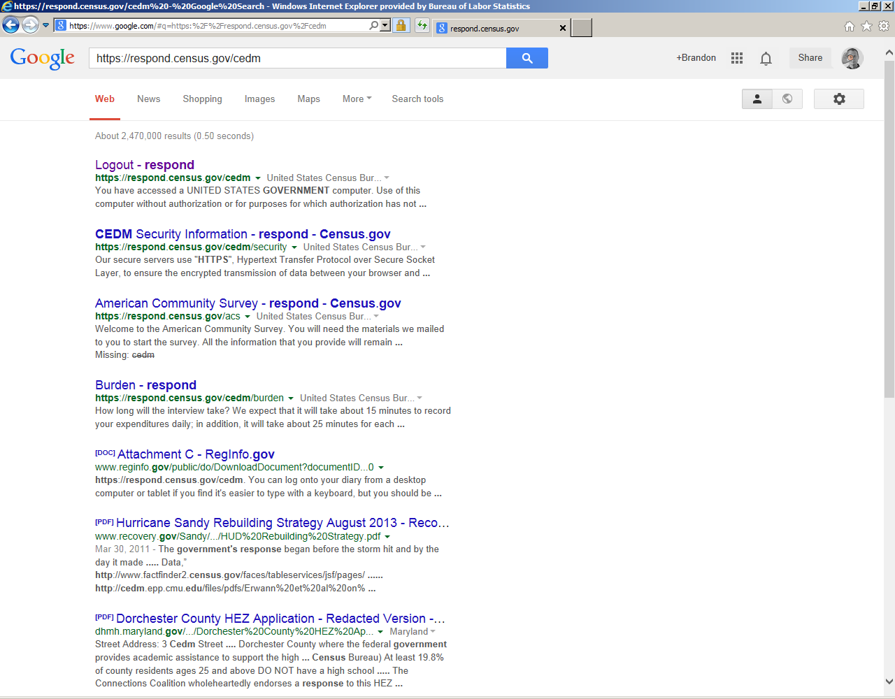
A smaller, though still significant group of participants had difficulty navigating to the website. The most common error here was that participants typed the URL into a search box rather than their browser’s navigation bar, this was especially common on Android phones which have a readily accessible Google search bar. The results of a Google search are shown in the screenshot below. The first result links to the correct URL, but the page title “Logout – respond” made some participants apprehensive about clicking on it. Several clicked on the second link because of the large text for CEDM, Census, and Respond. Another navigation error was people who would type in the URL but stop once they’d typed in “respond.census.gov” thinking that once they landed on that site, they’d be able to find a link to where they’re going.
Navigation and login problems should be particularly concerning to CE Mobile Diary stakeholders. First, these problems exist outside of the instrument so they are harder to address. Second, as was mentioned earlier, participants were quick to think that something was wrong with the instrument. These problems could result in a large number of calls to FRs or the help number. Even worse, initial difficulty could give respondents a reason to break-off from the Diary entirely. Finally, we are expecting participants to login to the Mobile Diary instrument perhaps dozens of times over the Diary period. While they will likely get better at this task over time, any difficulty they have will be magnified by the fact that they have to complete this burdensome/difficult task again and again.
3.1.2 Changing Password. Another difficult task for participants was changing their password. Performance on this task went so poorly, in fact, that testing was suspended after only a few cases in Phase II because it took up too much of the testing session and there was no way to navigate away from the page. The navigation issue was fixed in Phase III (as well as several other changes to the Change Password screen) but participants continued to have difficulty with it.
Of the 9 participants who attempted this task across both Phases, none of them made it through without triggering an edit message. The most common problem was that participants did not read the requirements for a valid password. None of the participants added a symbol to their initial password. The edit message caused them to focus on the requirements and choose a valid password. When the edit message appeared, several participants acknowledged that they had not read the requirements.
Many other edits were triggered throughout the testing (e.g., email addresses do not match, incorrect current password, failure to fill out required field) often more than one per participant. In the end, 3 participants (33% of those who attempted it) were able to successfully complete this task, but only after encountering at least one edit message. This task will likely confuse all users; of the three who successfully completed the task, one reported a lot of experience with using smartphones, one reported a moderate amount, and one reported a little experience.
In addition to difficulties with the task, several participants had difficulty just finding the Change Password screen. This was apparent especially in those who mentioned having difficulty seeing the small type on the screen. The small form factor of the Mobile Diary necessitates the use of an icon rather than text. The gear icon is likely still the best option, though it should be made larger.
3.1.3 Initial Setup Screen. The task of selecting a start date was very easy for participants. Only one participant was unable to complete this task without help from the experimenter. That participant, who reported little smartphone experience, was unfamiliar with how the dropdown menu worked.
3.1.4 Data Entry Tasks. As with Phase I of testing on the Mobile Diary, participants had considerable difficulty with data entry. In Phase I, participants’ task success was primarily rated on their ability to press the correct key sequence, put the item in the correct category, and complete all of the required fields. They were not strictly rated on how closely their answer met the needs of the CE Diary survey, because the data needs had not been explained to them. In Phases II and III, participants did receive a placement briefing from the experimenter explaining the key concepts of the diary (e.g., what types of items needed to be entered separately, what types of descriptions were needed, etc.) so their responses were evaluated more closely.
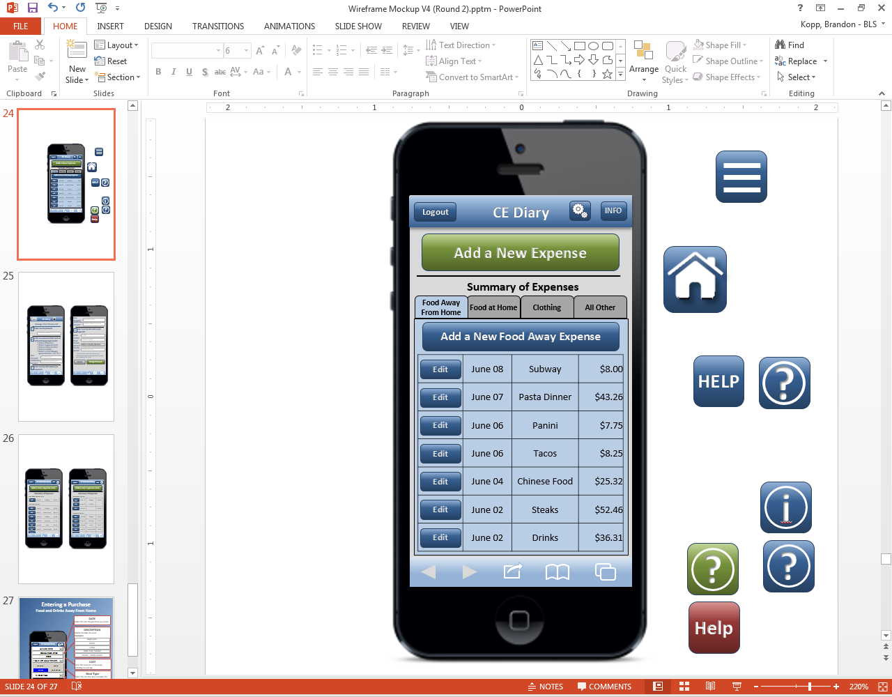
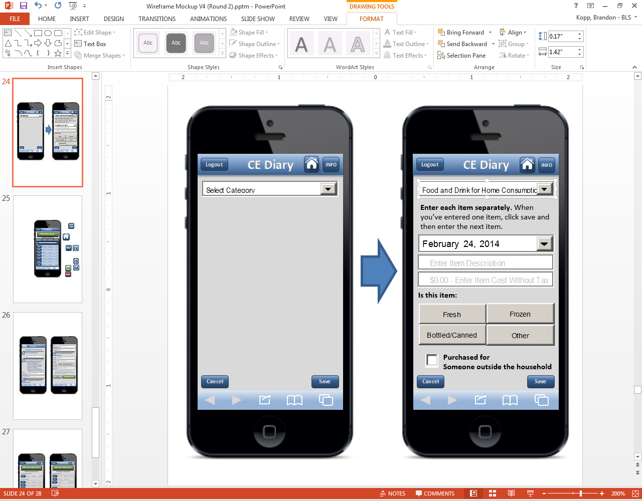
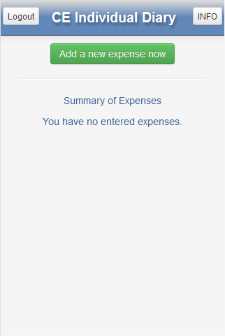
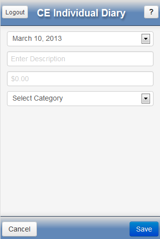
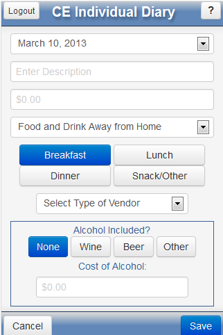
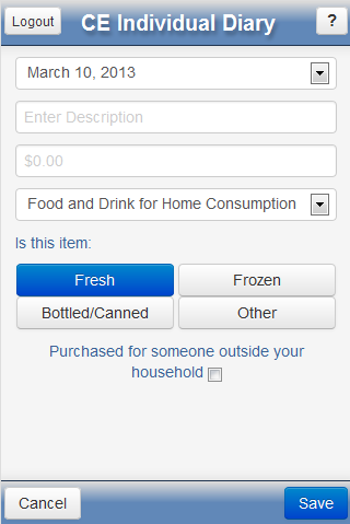
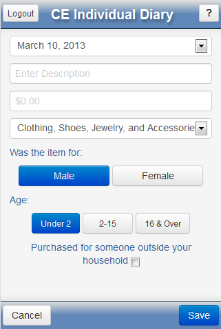
For the most part, participants understood the basic functions of the Diary. They knew to press “Add an expense” to start the process, how to use the dropdowns and data entry fields, and how to save an entry. Participants mostly struggled with meeting the complex data needs of the CE Diary. For testing purposes, participants were given some difficult situations. When participants were given a straightforward data entry task such as the car insurance entry, they performed quite well, with 95% completing the task successfully. Participants mainly struggled with multiple item receipts, with Food Away from Home purchases, and with gifts. The specific issues they had are listed in the Data Entry and Editing Problems box below.
3.1.5 Data Editing Tasks. Participants did not have much of an issue with editing responses. The deletion and item detail change tasks had 90% and 100% success rates, respectively. Participants did have trouble with editing the cost of alcoholic drinks, but this was mainly due to difficulty understanding whether the cost should be changed in the total cost field, the alcohol included cost field, or both.
Several participants did have trouble accessing the edit screen, but managed to successfully complete the task. Several times, the experimenter read the deletion task while the participant was on a blank data entry screen. Rather than navigate to the home screen and tap edit, the respondents used the browser’s back button. This effect was mitigated when the experimenter would ask the participant to navigate to the home screen or login screen prior to reading the task; starting a data editing task at one of these screens more closely approximates what a respondent would encounter in a real-life situation.
Data Entry and Editing Problems |
|
3.4 General Reactions
Participants were positive in their overall ratings (see Table 3). Thirteen participants rated the Mobile Diary as Extremely Easy or Very Easy to use. Only two rated the Diary as Somewhat Difficult to use. Confidence in completing the Diary fell roughly in the middle of the scale with an average rating of 2.56 out of 4. Almost all of the participants said that using the Diary would require at least some training.
Interestingly, only nine of the 28 participants who answered the follow-up questions said that they would complete entries right away; a key selling point of the Mobile Diary. The remainder of the answers specified some time later that they would likely complete the Diary; most likely later in the day they made the purchase. Twenty-four of the 28 participants said that they would keep a receipt if one was offered to them and use that when recording their expenses. Only five said that they would rely on memory and none of them said that as their sole answer.
Table 3: Frequency and average overall ratings of ease of use, confidence, and need for training. Note that for Question 3 regarding training, a lower score is preferable, while for the other two a higher score is preferred.
Question |
Response Options |
Frequency |
Average Score |
Was the mobile diary easy or difficult to use? |
Extremely Difficult (-3) |
0 |
1.33 |
Very Difficult (-2) |
0 |
||
Somewhat Difficult (-1) |
2 |
||
Neither Easy Nor Difficult (0) |
3 |
||
Somewhat Easy (1) |
9 |
||
Very Easy (2) |
10 |
||
Extremely Easy (3) |
3 |
||
|
|
|
|
How confident did you feel in filling out the entries in the diary? |
Not At All Confident (0) |
0 |
2.56 |
A Little Confident (1) |
4 |
||
Somewhat Confident (2) |
9 |
||
Very Confident (3) |
9 |
||
Extremely Confident (4) |
5 |
||
|
|
|
|
How much training do you think the average person would need to get started using the diary? |
None (0) |
2 |
1.30 |
A Little (1) |
17 |
||
A Moderate Amount (2) |
6 |
||
A Lot (3) |
2 |
||
|
|
|
|
When would you record your expenses? (check all that apply) |
Right away |
9 |
N/A |
Sometime the same day |
10 |
||
At the end of the day |
10 |
||
Sometime throughout the week |
3 |
||
At the end of the week |
2 |
||
Other |
0 |
||
|
|
|
|
How would you record your expenses? (check all that apply) |
Keep the receipts |
24 |
N/A |
When I don’t have receipt |
15 |
||
When I only have 1 expense |
2 |
||
Refer to paper notes |
6 |
||
Refer to budget application |
1 |
||
Enter expenses from memory |
5 |
3.5 Participant Recommendations
Throughout the survey and through direct, open-ended questions during the debriefing, participants offered the following recommendations for improving the Mobile Diary.
Participant Recommendations |
|
Conclusion
Despite the advanced stage of the instrument, participants in this usability test had significant difficulties entering data in a way that would be usable to the Consumer Expenditure program. Many of the issues participants are having with understanding CE data needs, in particular the itemized entry of purchases, are likely common across the web and paper diaries as well. The difference between the CE Mobile Diary and these other versions of the diary survey is that there is limited screen space to fit instructions and examples (similar to what is in the initial pages of the paper diary). This is an area that warrants further thought as the Mobile Diary progresses through testing. There will likely be need for additional written instructions within the instrument as well as a more extensive booklet of instructions and/or training videos. These issues may also be mitigated through placement procedures used by field representatives who have encountered these issues with the paper diary.
It is the opinion of the experimenters that a standalone Mobile Diary instrument will not work for CE data collection. If the Mobile Diary is to be successful, it should be linked and used with the Web Diary. Data quality and burden may be negatively impacted by mode, even for respondents who volunteer to use and are comfortable with the Mobile Diary. In our sample of participants, several individuals had little mobile experience and made many data entry errors but nonetheless expressed a preference for mobile over web or paper. The Mobile Diary could serve as a supplement to data entry or even the main source of data entry for household members with fewer expenses, but should not be considered the right or only solution for a whole household.
The mobile device is still a relatively new concept to people and the idea of using their phone or tablet for data entry and for something that doesn’t specifically benefit them is still foreign. A large number of participants (close to half) spontaneously mentioned that they thought the diary would be useful for them and that they would be interested in using it for budgeting purposes. That is, they didn’t understand that BLS needs their data for our purposes and that their access to the site would be cut off immediately after their diary period. Instead, they were focused on entering data in a way that they might find personally useful and their expectation was that they could use this to track their own expenses over time. These attitudes may shift over time, but in the short term may make it difficult to convince respondents to enter “wheat bread” instead of “groceries” because they don’t care about how much they spend on bread, let alone different types of bread.
On a slightly more optimistic note, it is likely that some of the issues outlined in this report can be addressed simply by devising the right set of screening questions to ensure only those with the prerequisite skills end up using the Mobile Diary. The performance of the screening questions in the IDFT will help understand who ends up being directed toward the Mobile Diary instrument.
4.1 Limitations
The main limitation of this study was the narrow range of participant demographics and phone types that were sampled. With the proliferation of smartphones, there are likely many different “types” of users. We sampled across perceived experience with phones, though the participants (especially those with limited experience) were mostly older, over 45. These are often our target survey respondents, but for an individual diary, a wider range of participants would have been preferable. It should also be noted that this usability test used a small, convenience sample of participants. The results outlined above are meant to highlight potential problems with the Mobile Diary, not to determine the potential prevalence of those problems.
We also tested only a narrow range of phones, operating systems, and browsers. While we tested the most popular operating systems (Android and iOS) there were enough technical issues with those and the few other devices we saw (e.g., a Tracfone, a Blackberry) that there are likely a significant number of issues we haven’t accounted for with this set of recommendations.
We would have liked to compare alternate versions of the Mobile Diary to ensure that our recommendations were based in evidence. Timing and resources did not allow for the development of multiple versions of the instrument, however.
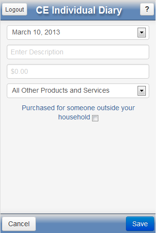
Appendix A: Mobile Diary Screenshots
Login |
Initial Setup |
Expense Summary |
|
|
|
Common Entry |
Food Away From Home |
Food At Home |
|
|
|
Clothing |
Other Expense |
Change Password |
|
|
|
Appendix B: Placement Protocol and Pamphlet
| File Type | application/vnd.openxmlformats-officedocument.wordprocessingml.document |
| Author | kopp_b |
| File Modified | 0000-00-00 |
| File Created | 2021-01-27 |
© 2026 OMB.report | Privacy Policy
