SOII Adobe Form
SOII_Adobe_2009.doc
Survey of Occupational Injuries and Illnesses
SOII Adobe Form
OMB: 1220-0045
December 3, 2009
TO: SOII-Adobe Team
FROM: Kathy Downey
Office of Survey Methods Research
RE: OSMR Review of the Revised SOII Adobe Form
Three other members of OSMR and I reviewed the SOII Adobe Fillable Form version dated 11-25-09. (The Adobe form was revised on 12-3-09.)
Overall, OSMR is very pleased that SOII is offering the Adobe fillable form to respondents. One important issue for the future is whether the Adobe form captures any metadata. In other words, is there an audit trail when a respondent had to correct the form or had keystroke errors? This is highly useful in determining which design elements may not be working and causing data quality or data entry issues. For example, by wiping the decimals during data entry (and not on submission), does this lead to increased corrections that have to be made by respondents?
Another issue is using the wording “significantly more than 15 cases” in the email and throughout the instructions. First, this wording is vague and confusing. We should be clear whether this means 16, 17, or 18 cases. Also, one reviewer suggested that the wording might raise a red flag that the establishment is in trouble. We could add “for assistance on completing this form” before “please contact…”
Additionally, one person tried to complete the form just using the tab key to move between fields. She noticed that the Tab key worked differently in different sections.
Our recommendations are detailed on the following pages.
Email to receive form
What
does “significantly” mean? It’s a little vague
and confusing. Is it 16, 17, 18?
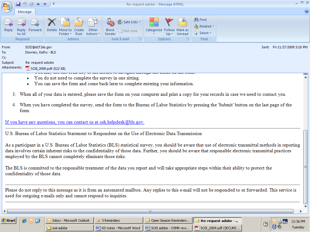
Do we know how this will
appear when it’s not HTML? Will the bullets become asterisks
or lose the formatting?
What
does “not in Preview” mean?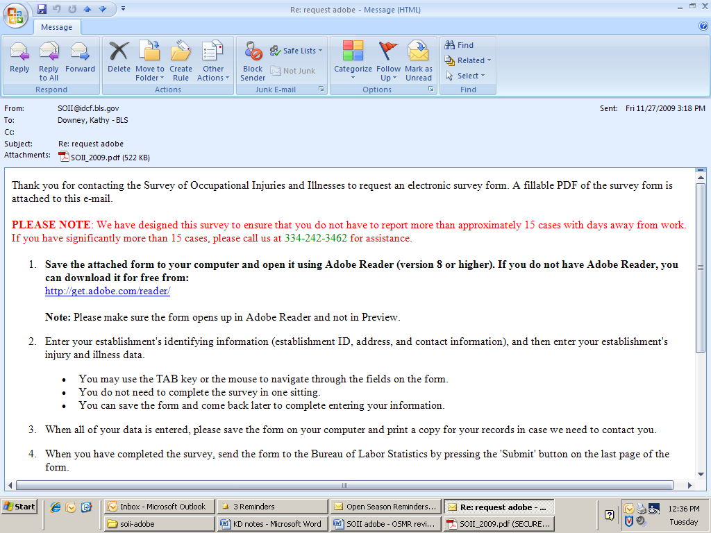
First page
Will the mandatory language
be used for certain establishments, like we do for the instruction
sheet? This might mean two versions of the form; therefore, its pros
and cons need to be weighed.
Add word Example.
The box needs some kind of title otherwise it looks like part of
the form.
Delete in
the fields below
or below.
They aren’t needed and it will add consistency.
On the instruction sheet,
there seems to be an extra line between these rows.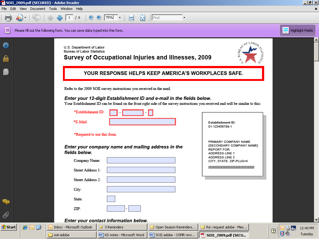


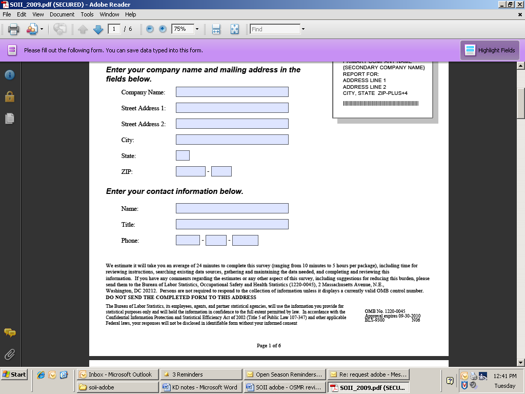
Establishment ID. Since the LDB number is long, we purposely entered an error to see what would happen. An error isn’t reported until Submit is clicked, which isn’t ideal.
Yellow highlights for errors. Right now, there is yellow highlighting when there is an error to the following fields: Establishment ID, E-mail, Zip, and Phone. There are two suggestions:
There should be consistency when the highlights pop. The whole row should highlight like it does for E-mail.
There could be more warning than just a color change. We could put “!error” or “Check this” next to the field.
First page continued
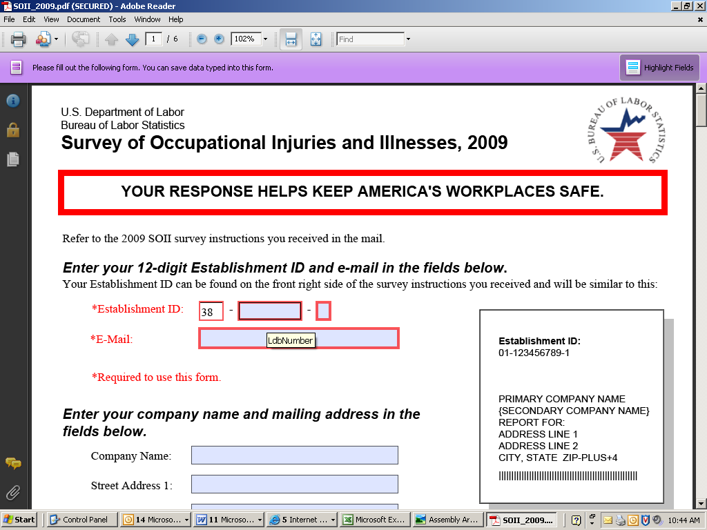

Word callouts. Will respondents know what LdbNumber is? Also, the word callout over state is StateFipsCode. Again, will respondents know what this means?
Second page
What is the purpose of these
black, horizontal bars?
These boxes should be aligned
and the same size. If the black lines are deleted, then they can be
aligned next to the question. The entries can be right justified.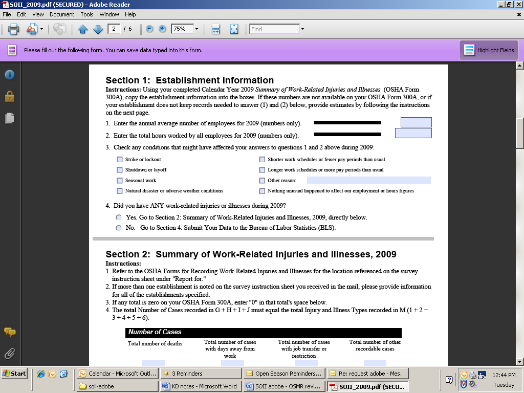


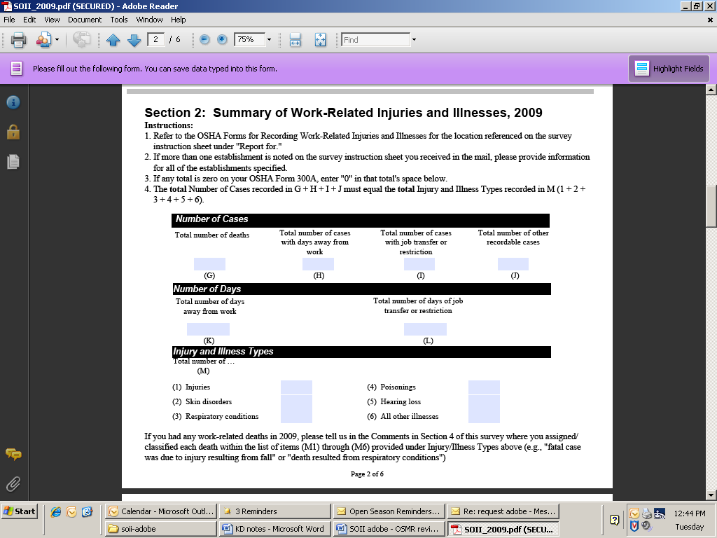
Inability to enter decimals. The decimals are wiped out during entry. However, this means that as someone enters “1,000.00” it registers as “100,000” incorrectly. Therefore, the respondent just entered 100 times what he or she meant. Hopefully, respondents check this and it isn’t submitted erroneously.
Callouts. Nice job on the callouts on this page.
Skip on # 4. In the future, it would be great if a No on item 4 would then take the person to the last page. (We don’t know if this may be a programming issue with Adobe.)
Totals for M1 to M6. It would also be great if in the future, that there is a validity check that value for H matches the totals for M1 to M6.
Metadata. As stated earlier, it would be great to capture metadata (e.g., an audit trail). This would be highly useful in determining which design elements are not working and may lead to data quality or data entry issues.
Tab key entry.
In Section 1, Q3, the tab key moves from option to option (Left to right, then to the next row), and the space bar either selects or deselects the option. That's how we expect check boxes to work.
In Section 1, Q4, the tab key takes you to the first option and you use the space bar to make a selection. You then use the arrow keys to change the selection. This is fine for radio buttons.
Second page continued
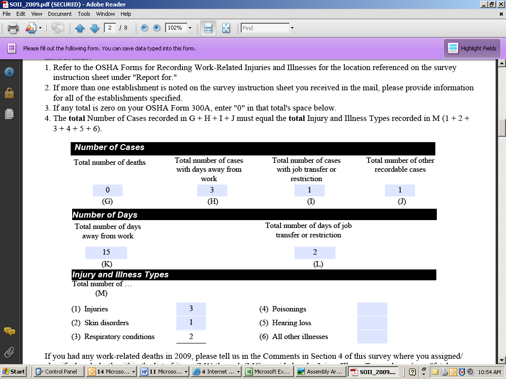
Note entries. This was done purposely to see if there was an edit. One did appear after Submit was clicked.
Third page – average number of employees
Break up paragraphs into
smaller chunks.
Move the rounding instruction
to here
to save space.
Align ‘all’ under
‘total’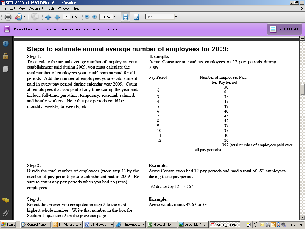


Number of Steps. It doesn’t seem that three steps are required. Space on the page could be saved by reducing the number of steps, and moving parts of the example. For example:
Example
392 divided by 12 = 32.67 Round up to 33.
Rewrite of Step 1 Paragraph. Instructions should not be buried in paragraphs. To ensure that they’re read or seen, break them out as shown below.
Step 1 (see example for monthly pay periods on right)
Determine the number of paid employees per pay period.
Count full-time, part-time, temporary, seasonal, salaried, and hourly workers.
Sum the number of employees for all pay periods.
Step 2
Divide the total number of employees from Step 1 by the number of pay periods.
Round the result to the highest number.
Third page – total hours worked
Mention the complete
breakdown: 28 full-time, 5 part-time
This implies only full-time
employees are of interest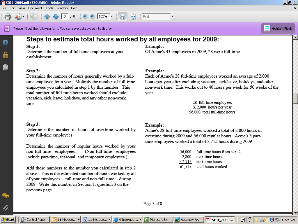


Overly detailed instructions. The instructions seem too fragmented, which could lead to their being ignored. The examples can help convey the instructions. See suggested changes below.
Step 1
Estimate the hours worked by:
Full-time employees
Other employees (part-time, seasonal, temporary)
Include:
Overtime
Exclude:
Vacation
Sick leave
Holidays and any non-work time
Tying the worksheet to the previous page. If this page was an actual worksheet as opposed to instructions, the data entry fields for this page could then be used to populate items 1 and 2 on previous page.
Fourth page
What does “significantly
more than 15 cases” mean? Would you report 16, 17, 18? Also,
the wording might raise a red flag that the establishment is in
trouble. We could add “for assistance on completing this
form” before “please contact…”
Note typo: Should be worker’s
This instruction could use a
header (see suggestion below)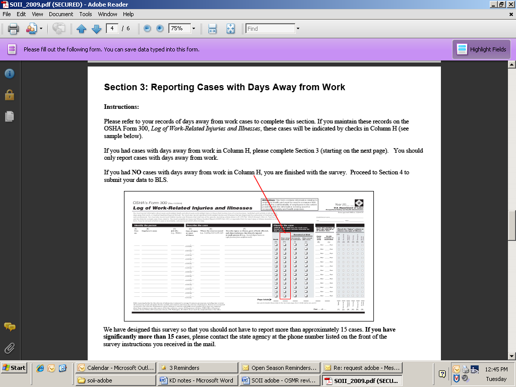


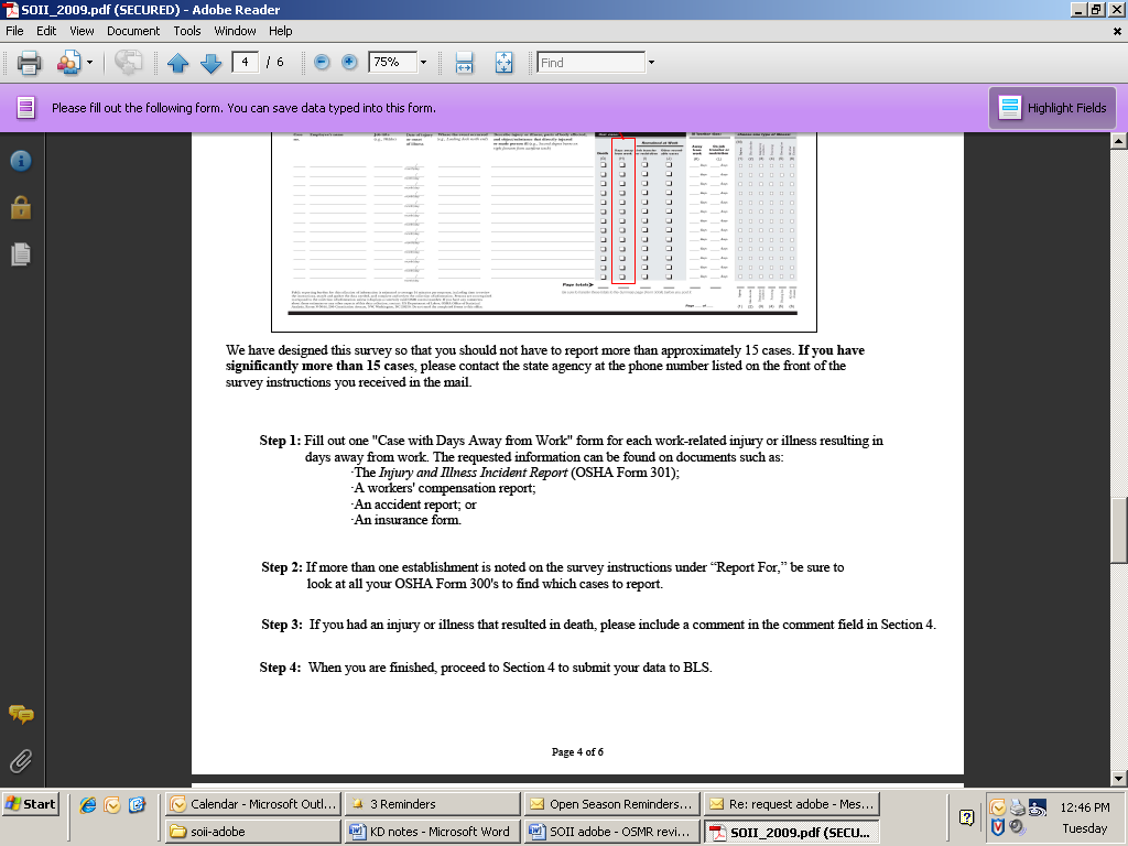
Ambiguous instructions. Be clear about the maximum upper limit of cases that are to be reported.
Instruction for Column H needs a header. Since respondents may skim headings, a critical instruction is buried under the heading Instructions, so it could be missed, despite the red box. See suggested change below.
What if you have “no cases away from work?” (Column H is blank)
If you had no cases with days away from work, you are done. Please go to Section 4 and submit your data to BLS.
Fifth page
Having “XX-Month”
show (when the drop-down is used) seems strange for a MM format.
When you click Add
New Case there is
no confirmation. I kept clicking until I noticed the total number
of pages was incrementing.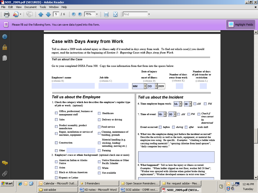


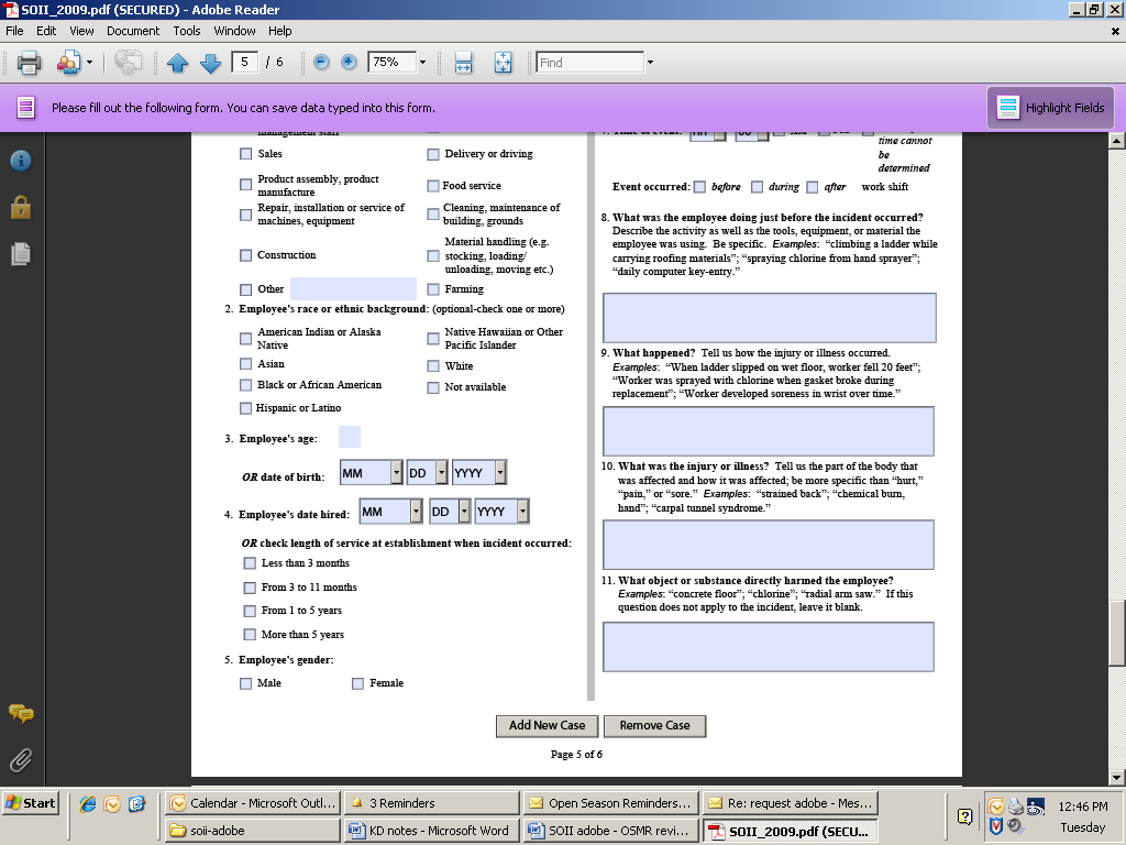
Unconventional display of date. The format calls for MM, but that is not what is displayed. For example, it displays “05-May” for May. An alternative would be to use numbers with no zeros. That way, respondents can use the digit to enter the month. Right now, entering “1” could give you one of three months (10, 11, 12). Obviously, this isn’t a show stopper, but it could confuse someone.
Lack of confirmation. When Add New Case was clicked, nothing seemed to happen. The only way to tell was to finally notice the total number of pages incrementing. Can the “page 5 of 6” be highlighted some way when it changes?
Radio buttons versus checkboxes. For items that are “check all that apply,” checkboxes should be used. For items that are “check one,” radio buttons (such as Q4 and Q5) should be used.
Tab key entry.
It tabs across the top of the page, through the employee name, title, etc. That's what we expect. Then, you move to Q1, option 1. You can make a selection by pressing the space bar, as with the previous check boxes. However, when you hit the tab key again, you go to the field for "other." Once you make a selection in this question, you can't clear out all the options. To move between the options, you have to use the arrow keys. This question functions like the radio buttons in Q4 above. It should probably use radio buttons anyway.
For Q2, the tab button moves the cursor down the first column, then down the second. In Section 1, Q3, the cursor moved across the row, then to the next row. We prefer the method in Section 1.
When you tab to a date field (month or day), you can press the arrow keys to move through the options. However, to start, you have to hit the down arrow twice to get to 01. The first time, nothing seems to happen. We’re not sure why you need to hit it twice.
Last page
Confirmation from whom? It
should say who is sending the confirmation email.
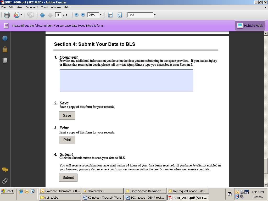
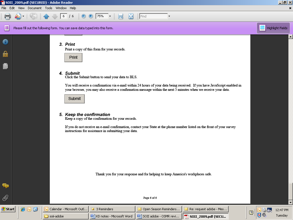
Confirmation email. We didn’t see the text of the confirmation email after submitting the data.
Example of error message for Establishment ID
Example of error message.
The form takes you back to the ID, which is good.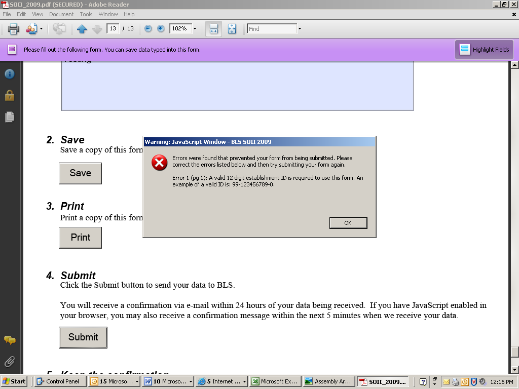

Example of other error messages (after Establishment ID error)
Clicking No
takes you back to the right section, which is good.
The font size seemed too
small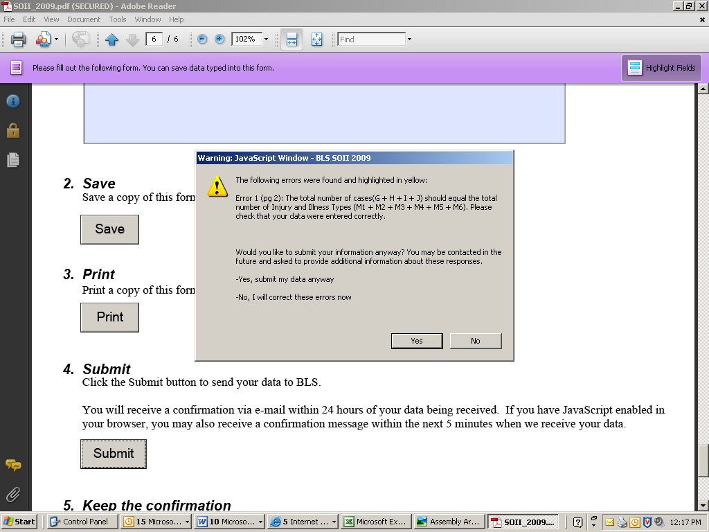


Change the wording of the error message. We should encourage them to fix errors. The default for this is Yes, both grammatically and in the highlighting of the button, which is to submit the data anyway. The wording should be something like:
“Would you like to correct your information now? If errors remain, you may be contacted
in the future to provide additional information.”
Size of font in error message. It’s not easy to read.
Confirmation Page
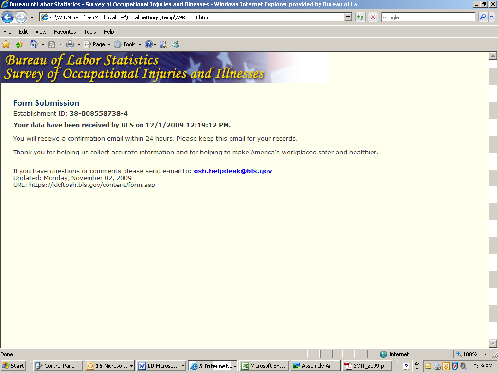
Can this say Confirmation
of Form Submission?
OSMR review Adobe
form – v2 Page
| File Type | application/msword |
| Author | BLS User |
| Last Modified By | Mario Daniel Anthony Turse |
| File Modified | 2010-04-05 |
| File Created | 2010-04-05 |
© 2026 OMB.report | Privacy Policy