Lead Letter Focus Group Addendum
Lead Letter Focus Group Addendum.docx
National Household Survey on Behavioral Health (NHSBH)
Lead Letter Focus Group Addendum
OMB: 0930-0110
Lead Letter Focus Group Addendum
January, 2024
Introduction
The contractor conducted a series of focus groups to assess a revised version of the NSDUH lead letter which was designed by the Behavioral Insights Team (BIT) and the contractor in 2022. During the focus groups, moderators presented members of the NSDUH target population with the current NSDUH lead letter and the revised lead letter for comparison and comments. The contractor conducted a total of eight virtual focus groups for each Census region. Given the potential for additional data collection in Puerto Rico, the contractor conducted one virtual Spanish language focus group with residents of Puerto Rico. This made the total nine focus groups.
This addendum provides an overview of the methodology, recruitment procedures, participant selection, and a summary of findings from the focus group discussions.
Methodology
During the focus group sessions, the moderator asked structured questions and probes, for continuity among groups, but also allowed participants to add spontaneous comments on the materials. To facilitate these group discussions, the contractor prepared a moderator’s guide including various structured probes. The qualitative information derived from the focus groups included both overall reactions to the two versions of the lead letters as well as specific feedback on individual elements.
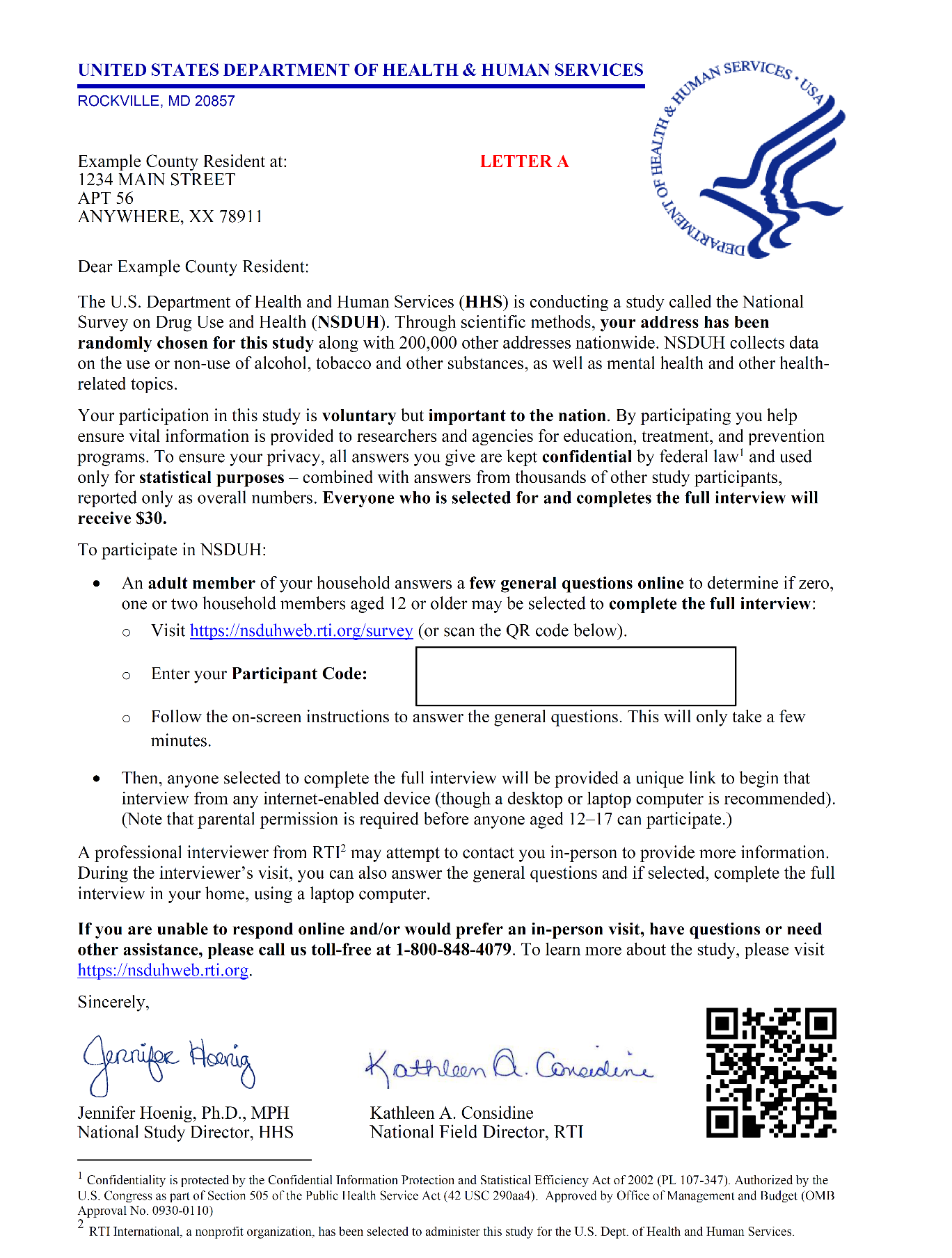
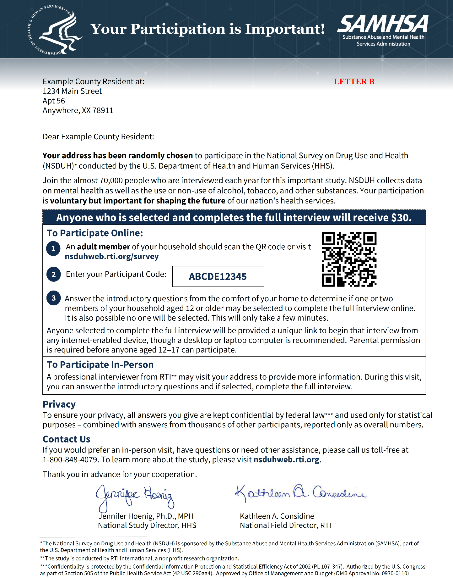
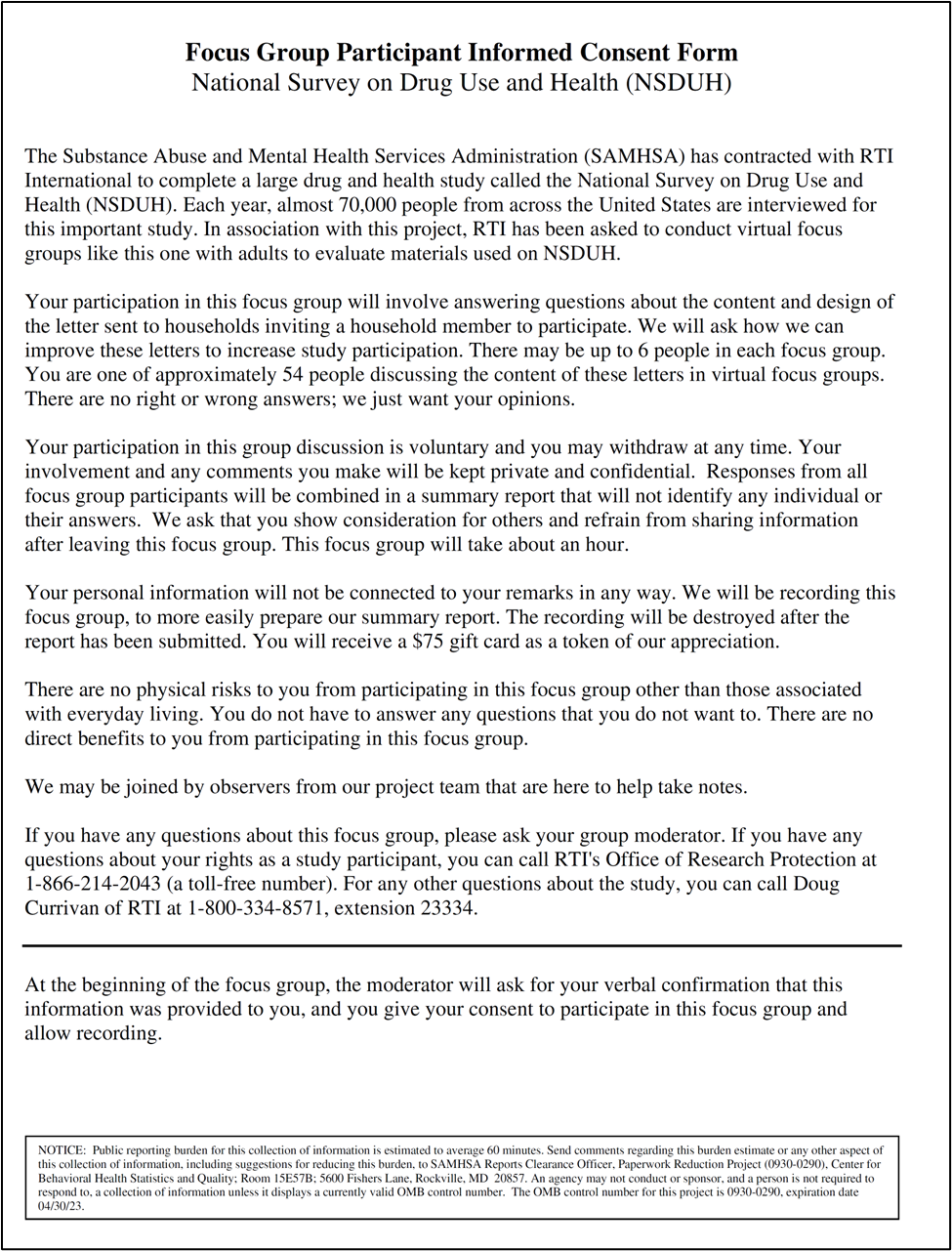
The contractor sent participants hardcopy versions of the lead letters (Version A: Current and Version B: Revised – see Appendix A and B) via FedEx about 2 days prior to the focus group discussions. Included in the package was the informed consent form (see Appendix C), which the moderator reviewed at the beginning of the discussion, along with the letters. To ensure participants could review the documents in their entirety, PDF versions of the letters were also sent with the confirmation emails when participants confirmed they would join a focus group. A signed version of the consent form was not required; instead, participants provided passive consent by remaining in the focus group after the form was reviewed.
During the development of focus group materials, the contractor designed a recruitment advertisement and recruitment screener. After SAMSHA approved the moderator guide, focus group materials, recruitment ad, and recruitment screener, the contractor translated these materials into Spanish for the Spanish-language focus groups.
A team of experienced moderators and notetakers were provided with training on the methods, logistics, recruitment, selections, and administration of the focus groups along with preparation of summaries and analysis. The lead methodologist conducted the two-hour training session and reviewed the moderator’s guide in detail during this session.
Because the goal was to complete at least one focus group in each of the four Census regions and Puerto Rico, the focus groups were allocated to regions and languages as follows:
Region 1 Northeast – 2 English focus groups
Region 2 Midwest – 2 English focus groups
Region 3 South – 1 English focus group, 1 Spanish focus group
Region 4 West – 1 English focus group, 1 Spanish focus group
Puerto Rico – 1 Spanish focus group
The contractor planned for each virtual focus group to be comprised of six participants, for a total of approximately 54 participants. Each focus group lasted 60 minutes and each participant was provided a $75 electronic gift card for participating. A moderator and notetaker were present at each focus group and each discussion was audio recorded. SAMHSA observers were invited to attend the focus groups, which were conducted via Zoom. The nine focus groups were completed in October-December 2023. Focus group locations and the number of participants are shown in Table 1.
Table 1: Focus Group Locations and Participants
-
FG#
Region
Language
Participants
Date of focus group
1
South
English
6 participants
Sunday, October 22
2
West
English
6 participants
Thursday, October 26
3
Midwest
English
6 participants
Thursday, November 2
4
Midwest
English
6 participants
Wednesday, November 8
5
Northeast
English
7 participants
Friday, November 17
6
Northeast
English
7 participants
Tuesday, December 12
7
South
Spanish
7 participants
Saturday, December 9
8
Puerto Rico
Spanish
7 participants
Thursday, December 14
9
West
Spanish
6 participants
Thursday, December 14
Participant Recruitment
Overall, participant recruitment went smoothly as there were no challenges since there were no specific quotas that participants were required to fill, beyond region and language. Participants needed to be 18-years of age or older and reside in each planned focus group Census region. However, efforts were made to ensure participant diversity in terms of demographics, including gender, age, level of education, race, and ethnicity.
The contractor recruited participants via online ads, with Amazon Mechanical Turk (MTurk) being the primary site for recruitment. Several MTurk campaigns were developed for each selected Census region. Interested participants were then directed to complete the short online screening instrument. In addition to MTurk, word-of-mouth contacts and local sites like Nextdoor.com were utilized. The study was also promoted by contractor staff living in the various regions by asking them to pass information on to people they may know who might be interested. The contractor mainly recruited Spanish participants through personal networks, churches, and local online groups.
A total of 58 people participated among the 9 focus groups. The demographic characteristics of the focus group participants are shown in Table 2.
Table 2: Virtual Focus Group Participant Characteristics (n=58)
-
Demographic
Participants
Gender
Male
Female
Non-Binary
25
32
1
Age
18-25
26-34
35-49
50+
6
13
18
21
Education
Less than high school
Completed high school / GED
Some college
Associates
Bachelors
Post-Bachelors
1
9
7
3
25
13
Race
White
Black/AA
Asian
American Indian/Alaska Native
Mixed
Other
36
5
9
3
2
3
Ethnicity
Hispanic
Non-Hispanic
23
35
Results
The following sections summarize findings from the nine focus groups.
4a. Current Letter (Letter A) Findings
Overall, participants found the current letter looked “stiff” and “bland.” Participants noted the letter felt quite long and they would likely skim over the content rather than read it carefully. Some participants suggested rewriting the letter to be presented in a compelling way. Others suggested using bullet-points and reducing the length and overall word count. Some participants felt it looked like “spam” and the fact that it was addressed to “resident” did not help with legitimacy. Several participants commented there was too much bolded text, so it was hard to focus on what was important.
Comments provided by participants included one participant that remarked, “It doesn’t inspire. It just feels cold and that would make me not want to participate. There’s also a lot of bolding which means the bolding becomes less important.” Another participant stated, “I would say it’s bland. It’s not that easy to tell what’s important just glancing at it. I would read it because it’s from something official, but I wouldn’t necessarily do anything with it. I might just toss it.” Another participant stated, "I would just say, just by reading the content, to me, the verbiage is pretty easy to understand. It is pretty dense (lots of information!). So, to me it's great that we do have that box around the participant code, but it would be nice to break it up a little bit, either a little bit more spacing or lines or something."
In terms of positive features of the current letter, participants noted the letter felt legitimate and official. They liked that the letter included the name of the study and the logo for the U.S. Department of Health and Human Resources and was easy to identify that it was a government study. One participant stated, “I do like the design of the letter and the font. It does feel legitimate to me because it says the Unites States Department of Health and Human Services at the top and includes a logo.”
The participants seemed split in whether they would use the QR code or type in the URL. Many participants noticed the QR code is at the bottom of the letter and felt it would be better positioned in the middle next to the URL. One participant explained, "At the bottom right (at the end) you have the QR code. The code should be at the beginning. You don’t have much time to read this letter... I almost didn’t even notice the QR code. Placing it at the top or in the middle should be more effective."
4b. Revised Letter (Letter B) Findings
Most participants liked the design and content of the revised letter. They felt it was eye catching and laid out well, felt clean, refreshing, and more modern. The participants felt that while this letter seems lengthy, it was easier to “scan” to understand what is being presented. One participant stated, “I think the segments help pull your eye to the key pieces of information when you’re scanning to then see if you want to read a bit deeper. You have a box around selection, participating online, so that segments that middle section. Then you have a header for ‘Privacy,’ a header for ‘Contact us.’ I think that makes it a bit cleaner.”
Many participants provided positive comments regarding how information was laid out in grids. For example, a participant stated, “I like that there is a separation between ‘to participate online’ and ‘to participate in person.’ I don’t think it’s broken down anywhere in the other letter like that.” Another participant stated, “I would say it’s the same content just presented slightly differently. I prefer the way that this [revised letter] is laid out. I find it easier to read. The only difference that I really see is the inclusion of the SAMHSA logo which kind of throws me off. I wonder why its included on one but not the other.”
There were many negative comments surrounding the top banner, dark blue shading, and header “Your Participation is Important!” as many felt this seemed like “spam.” One participant explained, “I think this letter looks more like junk mail. I think it’s because of the header at the top that says, ‘Your participation is important’ and the font doesn’t look as professional to me as the previous letter.” Another participant stated, “I’m looking at the logo at the top, I don’t know who SAMHSA is. I would prefer the government logo on there.” Another participant states, "It's cleaner and easier to look at the layout. My recommendation would be to put the letterhead from the letter A to make it look more formal and professional and that is coming from SAMHSA."
Several participants noted the location of the QR code. One participant explaining, "Visually it feels like more logically organized. It makes it clear like it’s a survey opportunity. The QR code is next to where it’s mentioned." However, several participants noted that the length of the overall survey is not presented.
Overall, participants really liked the letter and how it was presented but did not like the banner, the dark blue shading, and the removal of HHS logo with inclusion of SAMHSA as they felt HHS is more known and recognizable. One participant noted, “The one thing against this letter is that it's less identifiable as a government agency. Especially the ‘SAMHSA.’ It wouldn’t sound to me like a government agency. The HHS logo is hitting but I’m not familiar with the logo. It [revised letter] looks like a flyer from some private company, but it communicates much quicker what it wants to communicate.”
4c. Comparison of the Current and Revised Letters Findings
Overall, participants seemed to favor the revised letter over the current letter. They did note that elements of the letter should be included in the revised letter to further improve the design. Participants noted that their eyes are automatically drawn to the middle box where it has all the information they need to know, without having to read the entire letter. One participant stated: "Letter B is easier to pick up more info, more visually logically designed. The main reason I like this one is you can more easily pick up the necessary information on what is about.” A few other participants noted the page was “broken down in steps.” Another participant stated: "I definitely prefer letter B because it looks more professional and it’s quicker to read. It’s succinct, to the point and more organized."
The fewer participants that preferred the current letter explained that they liked the clean, “government-feel” that it provides. They felt it looked more official which was important to them.
Several participants noted the top banner of the revised letter should be replaced with the banner from the current letter. They prefer the HHS logo rather than SAMHSA and felt it would be more recognizable. One participant said: "I definitely prefer letter B because it looks more professional and it’s quicker to read. It’s succinct, to the point and more organized... I would just swap up the letterheads and the graphics."
The participants preferred the layout and grids used in the revised letter. They also noted the font looked slightly larger in the revised version which they liked. A few participants also liked the wording, “future of nation’s health services.” A few participants noted the indentation in the current letter in how to participate. They preferred that the revised letter has similar indentations.
Participants also noted they preferred the headers such as “To Participate Online”, “To Participate In-Person”, “Privacy” and “Contact Us” and felt those items should be preserved in the letter because it makes it easy to find what might interest you.
4d. Conclusion
At the conclusion of each group discussion, the moderators asked a few additional questions:
What factors noted in the letters would most influence whether or not you would participate?
Is there other information you would like to have about the survey before deciding to participate?
The
participants explained that factors influencing their decision to
participate include the monetary incentive, feeling “heard,”
and helping attract more programs for people who need help with
mental health conditions or drug addiction.
Participants did express an interest in knowing the time burden for the full interview, given that this is not included in the letters. Participants also expressed interest in a better explanation of the selection process. Others wanted to know when and where the main interview could be completed. These participants were unsure whether the survey could be completed online or in person. Another participant wanted to know more about how the data are being used.
Additional feedback on the letter suggested an issue with not being compensated for the screener. One participant stated,” My issue is that it says anyone that is “selected” will get $30. I’m not going to fill out a survey to not get compensated. I don’t do free screeners. I would probably get excited when I get this letter, but I would have to have nothing going on to give my time for free.”
Recommendations
As most participants found the revised letter easier to read and inclusive of better design elements, this design should be considered in future changes to the NSDUH lead letter. As noted in the findings, some elements of the current letter should be retained. SAMHSA should also consider using a similar header on the revised letter as the one in the current letter, preserving the HHS logo rather than the SAMHSA log.
Other considerations for potential revisions to the lead letter include:
Revisit the dark shading around the box with the URL/QR code. Consider a slightly lighter, more appealing blue color.
Consider indenting the information within the boxes to be more visually appealing.
Consider reviewing all text to determine ways to reduce the wording – making it slightly more streamlined.
Participants really wanted to know the overall length of the full interview.
If SAMHSA approves, one next step would be for RTI to create a mock-up of a new letter that (1) retains key elements of the current letter to maintain legitimacy and (2) adds a few design elements preferred by focus group participants.
Appendix A: Lead Letter A (Current Lead Letter)

Appendix B: Lead Letter B (Revised Lead Letter)

Appendix C: Informed Consent Form

| File Type | application/vnd.openxmlformats-officedocument.wordprocessingml.document |
| Author | Flanigan, Tim |
| File Modified | 0000-00-00 |
| File Created | 2024-09-06 |
© 2026 OMB.report | Privacy Policy