SOI-348 - User Research for Exempt Organizations on the IRS.gov Website; SOI-349 - User Research for Tax Professionals on the IRS.gov Website
Cognitive and Psychological Research
SOI-348
SOI-348 - User Research for Exempt Organizations on the IRS.gov Website; SOI-349 - User Research for Tax Professionals on the IRS.gov Website
OMB: 1545-1349
Attachments
Participant Consent Form
Facilitator Guide
Sample Mockups (Topical Overview)
Participant Consent Form
The purpose of this study is to help us evaluate a new design for the IRS.gov Web site. We would like you to help us identify ways we can improve the organization, structure and labeling of information to make finding information easier. By participating in this study, you will help us shape the future of the IRS.gov Web site.
This session will take approximately 1.5 hours. You will be given paper copies of several web pages, and asked to mark things that you like and dislike, and to make suggestions for improvements. You will be asked to discuss your findings with the group. The session will be recorded using microphones, and a video camera.
You may ask questions at any time, but please note that due to the type of information we are trying to collect, we may not be able to fully answer your question until the end of the discussion.
If you do not want to be in this study, you do not have to participate. You do not have to answer any questions you do not want to, and you may stop at any time without any consequences. All information that you provide in this research study will be kept private and any report of this research will not identify you personally in any way.
If you agree to help us, please sign below.
(
 Signature)
(Date)
( Print
Name)
Paperwork Reduction Act (PRA) Statement:
The Paperwork Reduction Act requires that the IRS display an OMB control number on all public information requests. The OMB Control Number for this study is OMB #1545-1349. Also, if you have any comments regarding the time estimates associated with this study or suggestions on making this process simpler, please write to the:
Internal Revenue Service
Tax Products Coordinating Committee
SE:W:CAR:MP:T:T:SP
1111 Constitution Ave. NW
Washington, DC 20224
Facilitator Guide
(Facilitator) We have been working on some revised page layouts and how to present information on the site. This afternoon we are going to show you rough layouts of two different types of pages and ask for your input on several aspects of the page layout.
For this exercise, it’s important to remember that we’re not evaluating the graphic design or even the interaction flow with the site. We are focusing on the underlying structure, organization, and labeling of information. If we get that right, then we will have the flexibility to use it in any design.
We are concentrating on what is the best way to organize, label, and lay out the content on these pages.
For each layout, we will walk through it as a group so that you can understand what the different features represent. As part of this walk-through, we will review a few questions about the layout. Then we will ask you to work in groups of 3 - 4 that you had this morning to answer these questions.
As part of the process of answering these questions and providing us with feedback, feel free to write on and mark up a copy of the layouts to illustrate your answers.
Landing Page
[Introduction: 2 minutes]
Please remember – we are mostly interested in assessing the organization and the structure of the content on the pages, NOT the interaction design, or the visual design.
For today, the top navigation is a given. Although it most likely will change in the eventual redesign of the site, for today’s feedback we will assume that it is the default global header and navigation for the site.
Walkthrough: [3 minutes]
You should each have a set of handouts for the Landing Page. These handouts include
a description of the page (which we will walk through in a minute)
a set of questions that you will discuss in small groups, and
a copy of each of the eight pages in the set of mock-ups.
The first page in the set is the default landing page.
Left Navigation (all pages)
The intent of this design of the left navigation is to provide consistent structure and labels across all landing pages, but allow sections of the navigation to be specific to the topic or section. For example,
The topics section would display links to topics specific to that section.
Forms and Publications would take you to a page of forms and pubs that are specific to small business.
Each of the subsequent pages shows the information you would see for each of those navigation options.
Content section of the landing page
The top section highlights audience-specific information.
The middle section would include the most critical tasks for the SB/SE audience
The bottom section provides a list of broader topics. These links would go to overview pages that would introduce the resources on that topic.
Let’s briefly review the type of questions for the Small Group exercises as a whole group, to answer any questions that you might have before you begin.
As you work in your small groups, please record your answers to the questions on one of the sheets of questions, and note any changes on the mock-ups that illustrate your answer. We would like to collect those items from the group.
You don’t have to answer all of the questions – if you start to focus on one area for discussion about what should change, that’s acceptable – as long as you share your recommendations with us.
After the group sessions, we will ask each group to report out on the most significant findings or recommended changes they discovered in the process.
Please ask us questions as you work – we are here as a resource to you.
For Small Groups: [5 minutes]
Left Navigation – we are evaluating:
Section headings
Navigation labels
Approach to organizing the resources and reference materials
Content Section
Are the content sections distinct; is this organization helpful?
Labels of the sections
Order on page
Overall page layout
For each page (landing page and second-level pages):
Amount of information
Right information?
Overall layout:
Any critical information missing?
Did you notice the breadcrumbs? Would they help you with understanding where you are in the IRS.gov site?
[Work in groups – 25 minutes]
[Report out of groups – 10 minutes]
Post-Small Group Questions
What did you think of the list of topics under “Topics?”
Which ones would you not include?
Which critical ones are missing?
Overview Pages
[Intro: 5 minutes]
You should each have a set of mock-ups that say “Topical Overview Page Mockups.” The package includes
A description of the mockups
A set of questions to work on in small groups
The set of page mockups
This next set of mock-ups is for pages that present information on a specific topic. Based on customer input and content analysis, we see a trend that taxpayers have a basic set of questions that apply to most topics:
What is it?
Does this apply to me/Do I qualify?
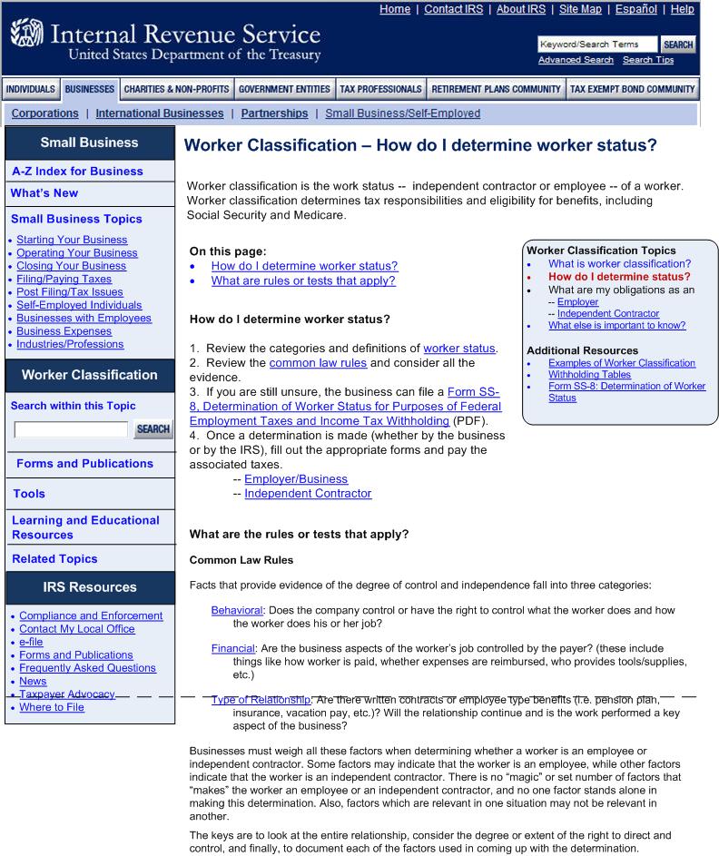
How do I do it? (topic-specific tasks)
What else should I know (what is the impact, what are the repercussions, what are the cautions and warnings)?
The format highlights other useful tools and resources on the topic.
Navigation:
The same navigation labels would appear on the left – but only if resources on the topic are available. If no resources of that type exist, the label does not appear.
For Discussion in the Small Groups:
[Review questions: 5 minutes]
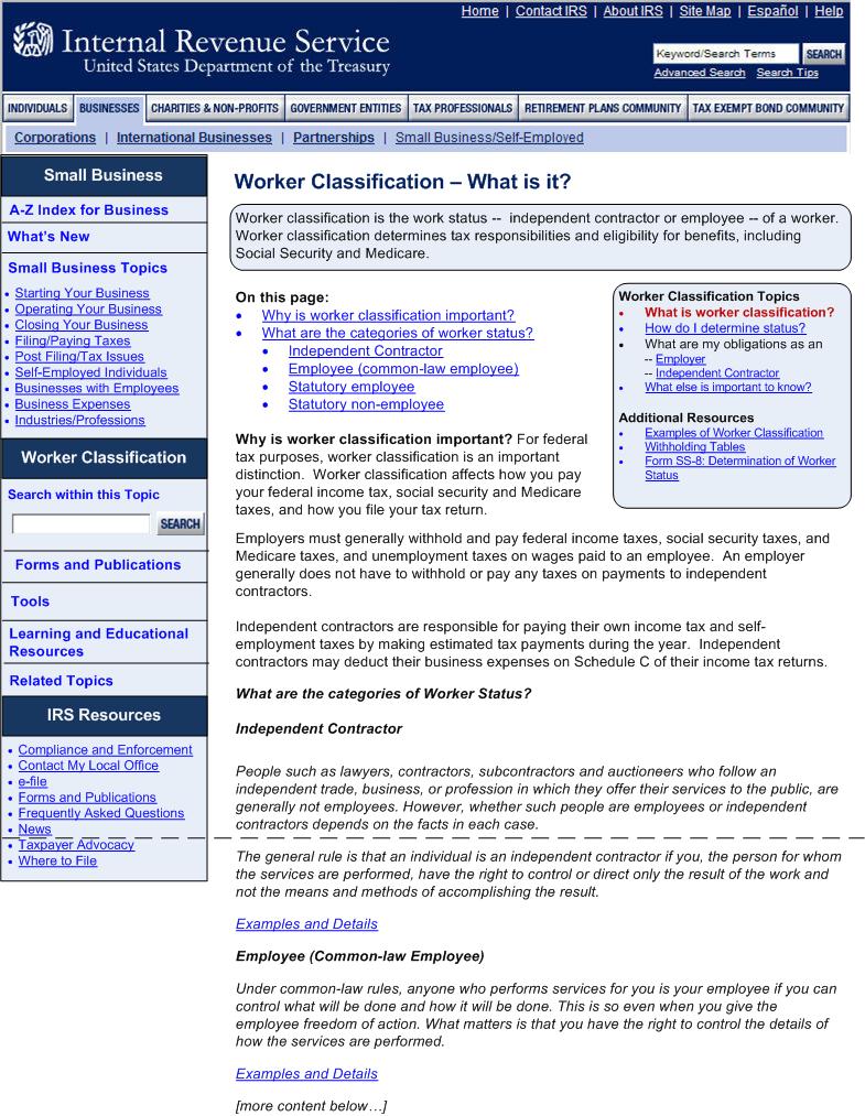
Scenario: You want to find out if your workers are independent contractors or employees. You have entered the term “worker classification” as a search query. You select the first item in the search results is this page: “Worker Classification – What is it?”
Content Organization:
Organization of content
Amount of content on page
Left Navigation:
Headings
Labels
Organization of resources
Specific features
Page Layout:
Placement of specific features and content
[Work in groups: 25 minutes]
[Report out of groups: 10 minutes]
Sample Mockups (Topical Overview)
General Description of the Page Elements:
This next set of mock-ups is for pages that present information on a specific topic. Based on customer input and content analysis, we see a trend that taxpayers have a basic set of questions that apply to most topics:
What is it?
Does this apply to me/Do I qualify?
How do I do it? (topic-specific tasks)
What else should I know (what is the impact, what are the repercussions, what are the cautions and warnings)?
The format highlights other useful tools and resources on the topic.
Left Navigation:
The same navigation labels would appear on the left – but only if resources on the topic are available. If no resources of that type exist, the label does not appear.
For example, the SB/SE Landing Page included navigation buttons for “Events and Dates” and “Partners and Organizations.” No resources of those types are available for Worker Classification, so those buttons do not appear.
Content Organization on Pages:
The first four pages organize the content by the basic questions that taxpayers have on each topic.
The remaining pages represent the page that would display for each option in the left navigation (i.e., Forms and Publications, Learning and Educational Resources, Tools). The resources and references on these would be specific to the topic of the page (i.e., Worker Classification).
For Small Group Discussion:
Scenario: You want to find out if your workers are independent contractors or employees. You have entered the term “worker classification” as a search query. You select the first item in the search results is this page: “Worker Classification – What is it?”
Content Organization:
Does the organization of content (that is, by these types of questions) make sense?
Is the amount of information on each page overwhelming, not enough, or about right?
Do the pages present the right information for you to make a decision about where to go?
Left Navigation: (on the main page and as it behaves across the second level pages)
Do the headings with the dark background communicate a separation in the sections of the navigation? Is the distinction intuitive – that is, does it help you understand what to expect in each section?
Do the navigation labels accurately reflect what their pages provide? What changes would you make to the labels?
Is this organization of resources logical and helpful for finding specific types of information? What categories would you add? Would you delete any categories?
Did you notice the “Search within the Topic” feature? What would you expect that feature to provide?
Page Layout:
Are the “On this page” and “Worker Classification Topics” features in a logical place on the page? Do they help you understand what you might find?
Is the critical information above the fold?

Figure 1: Overview Page -- What is it?

Figure 2: Overview Page -- How do I...?

Figure 3: Overview Page -- Does this apply to me?

Figure 4: Overview page -- What else is important to know (impact, repercussions, warnings, etc.)

Figure 5: Forms and Publications

Figure 6: Overview Page – Tools

Figure 7: Overview Page -- Learning and Educational Resources

Figure 8: Overview Page -- Related Topics
| File Type | application/msword |
| File Title | OMB Package |
| Author | mdsloa00 |
| Last Modified By | qhrfb |
| File Modified | 2009-05-15 |
| File Created | 2009-05-13 |
© 2026 OMB.report | Privacy Policy