Various Demographic Area Pretesting Activities
Generic Clearance for Questionnaire Pretesting Research
omb1311AFFenc8
Various Demographic Area Pretesting Activities
OMB: 0607-0725

Usability Studies of the American FactFinder Web Site: Baseline compared with Follow-Up
Submitted by:
Erica Olmsted-Hawala, Victor Quach, & Jennifer Romano Bergstrom,
Center for Survey Measurement (CSM)
Submitted to:
Marian Brady
Data Access and Dissemination Systems Office (DADSO)
ABSTRACT
At the end of 2008 and the beginning of 2009, the U.S. Census Bureau’s Human Factors and Usability Research group conducted a baseline usability evaluation of the legacy version of the American FactFinder (AFF). In June of 2011 and June-July of 2012, follow-up to the baseline usability studies were conducted on the new redesigned AFF. Tasks were developed to gain an understanding of whether users understood the Web site’s search and navigation capabilities as well as some table and map functions. Results highlight that performance and satisfaction for novice users decreased when on the new redesigned AFF as compared to the legacy site. Performance for experts was about the same on the legacy and on the new redesigned AFF, though satisfaction decreased on the new site. Usability problems are described for each study, and include user issues with the search capabilities of both the legacy and the new redesigned AFF site. This report provides a complete summary of the baseline and follows up usability evaluations, including methods, findings, and comparisons of the three designs of the AFF Web site interface: the legacy version, and the evolving interface of the new AFF. The report also includes suggestions for improving the new site and the team response.
This report is released to inform interested parties of research and to encourage discussion of work in progress. Any views expressed on the methodological issues are those of the authors and not necessarily those of the U.S. Census Bureau.
At the end of 2008 and the beginning of 2009, the U.S. Census Bureau’s Human Factors and Usability Research group conducted a baseline usability evaluation of the legacy version of the American FactFinder (AFF). In June of 2011 and June-July of 2012, follow-up to the baseline usability studies were conducted on the new redesigned AFF. The testing evaluated the success, efficiency and satisfaction of novice and expert users with the legacy and the newly designed AFF Web site. Testing took place at the Census Bureau’s Usability Laboratory in Suitland, MD.
Purpose: The purpose of the baseline and follow up studies was to discover how the new AFF site performed for users as compared to the legacy site.
Method: Twenty-three (10 novice 13 expert) individuals were recruited to participate in the baseline usability study, 10 novices were recruited to participate in the first follow up (June 2011) to the baseline and 18 individuals (10 novice 8 expert) were recruited to participate in the second follow up to the baseline (June-July 2012). Participants were recruited from State Data Center conference attendees that took place at the Census Bureau Headquarters, by referral, or through a participant database maintained by the Usability Lab. All participants had at least one year of experience navigating Web sites and using a computer. Each participant sat in a small room, facing one-way glass and a wall camera, in front of an LCD monitor equipped with an eye-tracking machine. After finishing the tasks, all participants completed a satisfaction questionnaire and answered debriefing questions. Members from the AFF design team, composed of members from the Data Access and Dissemination Systems Office (DADSO) and IBM, observed several sessions from a television screen and monitor in a separate room.
Participants completed the same tasks in each round of testing so that comparisons could be made. Some tasks assessed how participants would locate information on the Web site, some assessed how participants manipulated data tables, and some assessed how they manipulated maps. While they worked, participants described their actions and expectations aloud while the test administrator observed and communicated from another room.
High-Priority Results:
In general, user performance, with respect to accuracy, efficiency and subjective satisfaction decreased with the new AFF Web site, as compared to the legacy Web site. Novices’ accuracy, efficiency, and satisfaction decreased for the majority of tasks in 2011 and 2012. Experts’ accuracy and efficiency on tasks in 2012 increased, but satisfaction decreased from the 2008 baseline. Usability issues include difficulties with the how to get started (new AFF) difficulties with search (legacy and new AFF), difficulties with the overlays and understanding how the site functions with the “Your Selections” and the “Search Results” areas (new AFF). A complete list of usability issues and suggested recommendations are included in the results section of the report.
Table of Contents
1.0. Introduction & Background 11
2.2 Participants and Observers 14
2.3 Facilities and Equipment 15
2.3.2 Computing Environment 15
2.3.3 Audio and Video Recording 15
2.4.1 Script for Usability Session 15
2.4.3 Questionnaire on Computer and Internet Experience and Demographics 15
2.4.5 Satisfaction Questionnaire 16
2.6 Performance Measurement Methods 17
2.7 Identifying and Prioritizing Usability Problems 17
3.3 Participant Satisfaction 20
3.4.1 Baseline Positive Findings 33
3.4.2 2011 Follow-Up Positive Findings 33
3.4.3 2012 Follow-Up Positive Findings 33
3.5.1 Baseline Study Usability Issues 33
3.5.1a High-Priority Issues 33
3.5.1b Medium Priority Issues 38
3.5.1c Low Priority: Issues 40
3.5.2a High-Priority Issues 42
3.5.2b Medium-Priority Issues 51
3.5.3a High-Priority Issues 52
3.5.3b Medium-Priority Issues 61
Appendix A: Tasks from 2008, 2011, & 2012 68
Appendix B: Participant Demographics 73
Table 14. Novice 2008 participants’ self-reported computer and Internet experience in 2008-2009. 73
Table 15: Novice 2011 participants' self-reported computer and Internet experience in 2011. 74
Appendix E. Questionnaire on Computer Use and Internet Experience 82
Appendix F. Final Satisfaction Questionnaire Baseline and 2011 Follow Up 85
Appendix G: Debriefing Questionnaire for Baseline and Follow Up AFF Usability Tests 88
Appendix H: Participant Accuracy Scores 90
Table 19. Novice 2008 Baseline Accuracy Scores 90
Table 20. Novice 2011 Accuracy Scores 91
Table 21: Novice 2012 Accuracy Scores 92
Table 22: Expert Baseline Accuracy Scores 93
Table 23: Expert 2012 Follow Up Accuracy Scores 94
Appendix I: Participant Efficiency Scores 95
Table 28: Expert 2012 Follow Up: Time in minutes (m) and seconds (s) to complete each task 99
Appendix J: Participant Satisfaction Scores 100
Table 29. Novice 2008 Baseline Satisfaction Results (1 = low, 9 = high). 100
Table 30. Novice 2011 Follow-Up Satisfaction Results (1 = low, 9 = high). 101
Table 31: Novice 2012 Follow-Up Satisfaction Results (1 = low, 9 = high). 102
Table 32: Expert Baseline Satisfaction Results (1 = low, 9 = high). 103
Table 33: Expert 2012 Follow-Up Satisfaction Results (1 = low, 9 = high). 104
Figure 1: Screen shot of Baseline American FactFinder Web site. 9
Figure 2: Screen shot of First Follow-Up American FactFinder Web site (June 2011). 10
Figure 3: Screen shot of Second Follow-Up American FactFinder Web site (June 2012). 10
Figure 11: Reference map of Fairfax, VA from AFF site, using the FactSheet option. 34
Figure 13: Top navigations on the Baseline AFF Web site. 37
Figure 15: The geography overlay covered the main search results. 39
Figure 16: The “getting data” implies the search is getting data. 40
Figure 17: “Search within Results” confused some participants 42
Figure 18: The “Quick Search” off the main page often led to a “no results found.” 43
Figure 20: Screen shot of initial home page that was tested in Iteration 2 (June 2009). 44
Figure 21: Results listed appear to have no relationship to search query: “poverty states 2000.” 46
Figure 22: Suggested wording when users have not entered or chosen any options 49
Figure 24: One participant honed in to the View button after reading these instructions. 52
Figure 25. Suggested message/wording when the “Narrow your search” feature is unavailable. 54
Figure 26: These results are irrelevant to the participant’s query. 55
Figure 27: Health Insurance is returned after a search on health clubs. 56
Figure 28: Users expecting search results may overlook Community Facts 58
Figure 29: Help focuses on the use of FactFinder rather than the contents 59
Figure 30: Participant types Mexico into the Geography box in QS 60
Figure 31: All Counties within Virginia could mean the overall statistic for Virginia 61
Figure 32: Lack of Filtering for American Indian Reservations 61
Table 8: Accuracy Scores for Baseline and 2012 Follow-Up Assessments for Expert Participants 28
Table 9: Efficiency Scores for Baseline, and 2012 Assessments for Experts – Including Failures 29
Table 12: Novice Tasks throughout the Years 68
Table 13: Expert tasks throughout the Years 70
Table 14. Novice 2008 participants’ self-reported computer and Internet experience in 2008-2009. 73
Table 15: Novice 2011 participants' self-reported computer and Internet experience in 2011. 74
Table 19. Novice 2008 Baseline Accuracy Scores 90
Table 20. Novice 2011 Accuracy Scores 91
Table 21: Novice 2012 Accuracy Scores 92
Table 22: Expert Baseline Accuracy Scores 93
Table 23: Expert 2012 Follow Up Accuracy Scores 94
Table 28: Expert 2012 Follow Up: Time in minutes (m) and seconds (s) to complete each task 99
Table 29. Novice 2008 Baseline Satisfaction Results (1 = low, 9 = high). 100
Table 30. Novice 2011 Follow-Up Satisfaction Results (1 = low, 9 = high). 101
Table 31: Novice 2012 Follow-Up Satisfaction Results (1 = low, 9 = high). 102
Table 32: Expert Baseline Satisfaction Results (1 = low, 9 = high). 103
Table 33: Expert 2012 Follow-Up Satisfaction Results (1 = low, 9 = high). 104
Usability Studies on the American FactFinder: Baseline and Two Annual Follow-Up to the Baseline Studies
1.0. Introduction & Background
The user interface is an important element to the design of a Web site (Nielsen, 1999; Krug, 2006) For a Web site to be successful, the user interface must be able to meet the needs of users in an efficient, effective, and satisfying way. It is the job of the user interface to provide cues and affordances that allow users to get started quickly and to find what they are looking for with ease.
This report specifies the methods, materials, that the Center for Survey Measurement (CSM) Usability Laboratory used to evaluate the usability of the American Fact Finder (AFF) Legacy site (Baseline, shown in Figure 1), the newly launched (2011 Follow-Up, shown in Figure 2) and the live site after some tweaks had been made to the interface (2012 Follow up, shown in Figure 3). The report also provides results of user performance metrics, identifies usability problems and recommendations to improve the evolving user interface of the Web site.
AFF is a free online tool that allows users to find, customize and download Census Bureau data on the population and economy of the United States. AFF is available to the public, and a multitude of diverse users search the site for a vast range of information. AFF underwent a major redesign, and a series of usability tests assessed successive iterations of the Web site (see Romano Bergstrom, Olmsted-Hawala, Chen & Murphy, 2011 for a review). We gathered baseline usability data on the legacy AFF site and conducted a follow-up test when the new site was launched, and then a year later once some design tweaks had been implemented. This paper reports the findings from the baseline 2008 study and compares it with the results from the two follow-up usability studies (conducted in mid 2011 and mid 2012). Where available, the paper highlights the responses from our sponsor, Data Access and Dissemination System Office (DADSO), and IBM (henceforth referred to as the Design Team) to the findings.
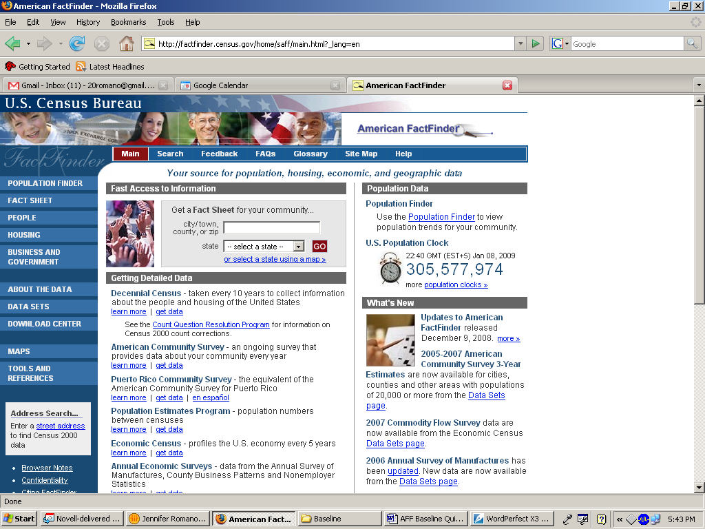
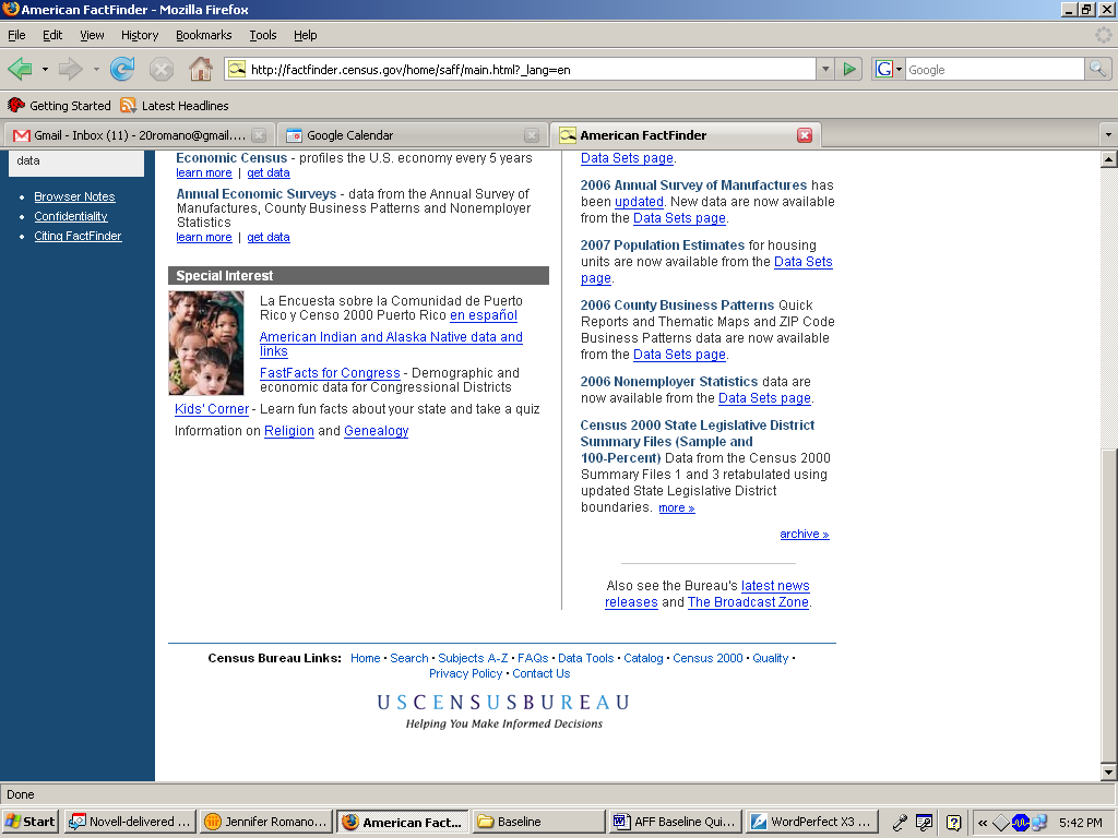
Figure 1: Screen shot of Baseline American FactFinder Web site.
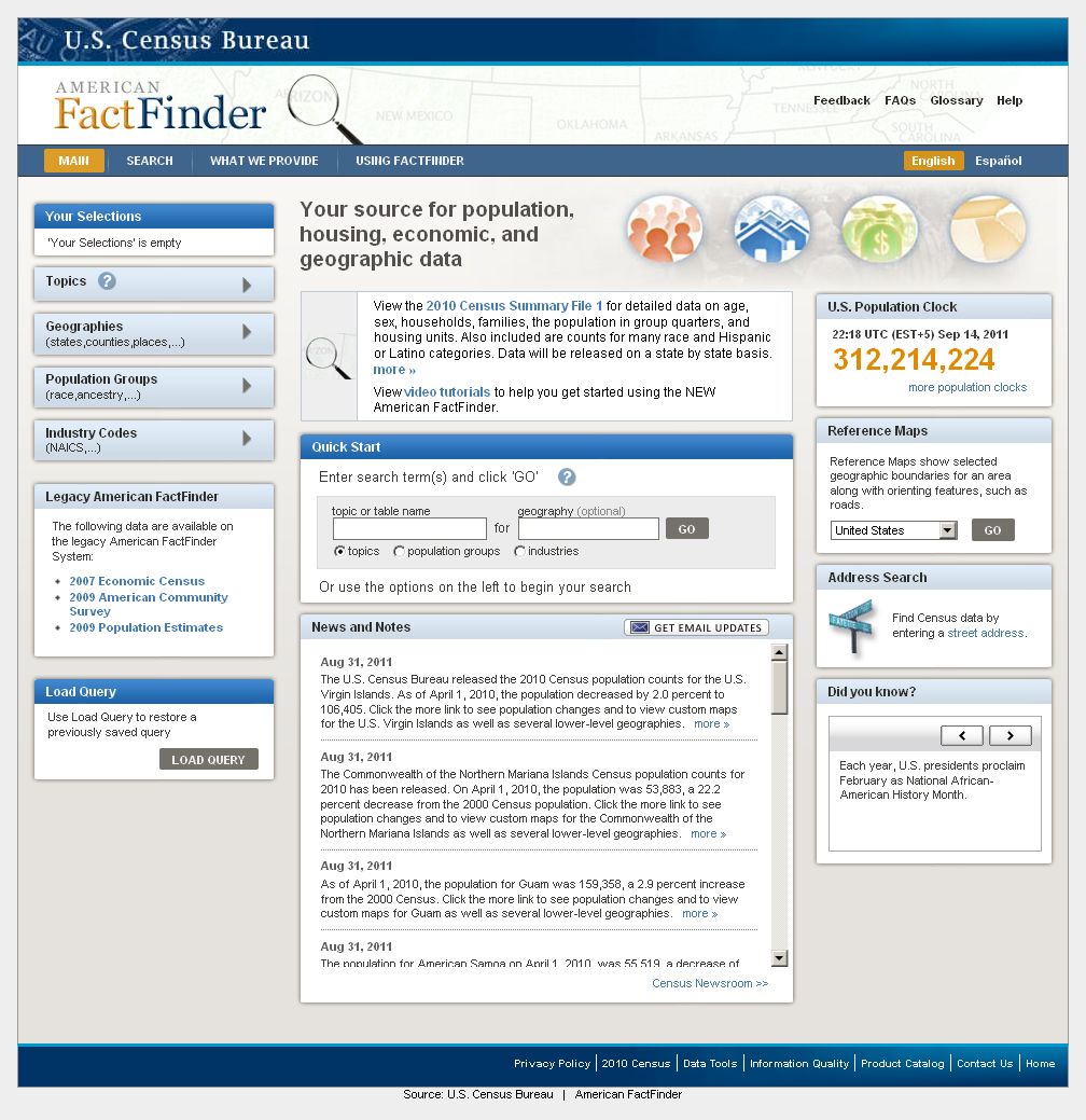
Figure 2: Screen shot of First Follow-Up American FactFinder Web site (June 2011).
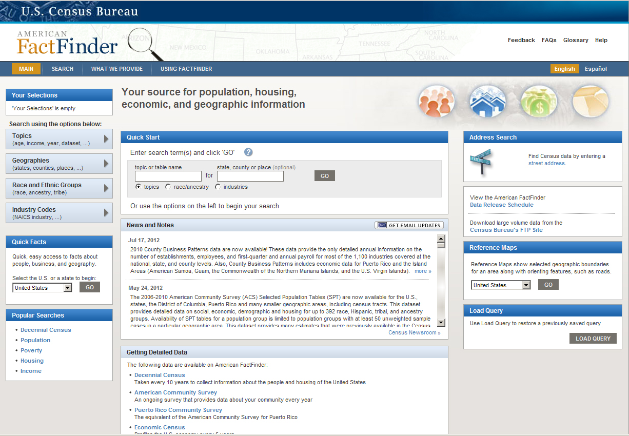
Figure 3: Screen shot of Second Follow-Up American FactFinder Web site (June 2012).
2.0. Method
Working collaboratively, members of the Design Team and the Usability Team created the tasks, which were designed to capture the participant’s interaction with and reactions to the design and functionality of the AFF Web site. Each task established a target outcome for the user but did not tell the user how to reach the target. We designed the tasks with the goal of using them throughout the series of iterative tests (Romano Bergstrom et al., 2011), as well as throughout the follow-up tests. See Appendix A for the tasks.
2.2 Participants and Observers
Baseline: We conducted usability testing on the baseline AFF Web site from November 25 to December 8, 2008 with ten novice participants. Participants were recruited through a database maintained by the Usability Lab. One participant was removed from the analysis due to inexperience navigating the Internet, as observed during the usability test. The remaining nine novice participants were considered knowledgeable in navigating the Internet and using a computer. The mean age for novice participants was 37.22 years (range 18-60), and the mean education level was 15.22 years of schooling (range 10-18 years). All novice participants were unfamiliar with the AFF Web site. The baseline study of the experts was conducted at two different time periods, however the data and the interface did not change during that time. The first five expert usability sessions were conducted in February of 2009. The remaining seven expert sessions were conducted in October 2009 when the State Data Centers (SDC) and the Census Information Centers (CIC) personnel were in town for the annual conference at the Census Bureau. All expert participants were SDC or CIC members and all were experienced in using the Internet and the American FactFinder Web site. One participant was removed because the power went out and the session could not go forward, thus the analysis is on the twelve expert users. The mean age for expert participants was 46.5 years (range 31-61), and the mean educational level was 18.16 years of schooling (range 16-22).
2011 Follow Up: We conducted usability testing of the 2011 Follow-Up AFF Web site, solely with novice users from June 8 to June 17, 2011. Eight novice-level participants were recruited through our database, and two participants were new interns that fit our novice criteria. One participant was removed from the analysis due to low education level, and we wanted these results to be comparable to the Baseline test results. The remaining nine participants were considered knowledgeable in navigating the Internet and using a computer. The mean age for participants was 38.56 years (range 21-73), and the mean education level was 16.22 years of schooling (range 10-18 years). All participants were unfamiliar with the AFF Web site.
2012 Baseline Follow Up: We conducted usability testing of the 2012 Follow-Up AFF Web site with novice and expert users from June 7 to July 17, 2012. Ten novice-level participants were recruited through our database, and ten expert-level participants were recruited from a combination of State Data conference attendees, emails targeting expert users, our database, and a few internal employees who use AFF in their daily work. All novice participants were unfamiliar with the AFF Web site. The mean age1 for novice participants was 42 (range 16 – 72), and the mean education level was 14.9 years of schooling (range 11-18 years). All expert participants were either familiar with the AFF Web site or other similar statistical data sites. The mean age for expert participants was 44.6 years (range 28-57), and the mean education level was 18 years of schooling (range 16-22 years). See Appendix B for participants’ self-reported computer and Internet experience.
2.3 Facilities and Equipment
Testing took place in the Usability Lab (Room 5K502) at the U.S. Census Bureau in Suitland, MD.
2.3.1 Testing Facilities
The participant sat in a 10’ x 12’ room, facing one-way glass and a wall camera, in front of a standard monitor that was on a table at standard desktop height. During the usability test, the test administrator (TA) sat in the control room on the other side of the one-way glass. The TA and the participant communicated via microphones and speakers.
2.3.2 Computing Environment
The participant’s workstation consisted of a Dell personal computer with a Windows XP operating system, a standard keyboard, and a standard mouse with a wheel. The screen resolution was set to 1024 x 768 pixels, and participants used the Firefox browser.
2.3.3 Audio and Video Recording
Video of the application on the test participant’s monitor was fed through a PC Video Hyperconverter Gold Scan Converter, mixed in a picture-in-picture format with the camera video, and recorded via a Sony DSR-20 Digital Videocassette Recorder on 124-minute, Sony PDV metal-evaporated digital videocassette tape. One desk and one ceiling microphone near the participant captured the audio recording for the videotape. The audio sources were mixed in a Shure audio system, eliminating feedback, and were then fed to the videocassette recorder.
2.4 Materials
2.4.1 Script for Usability Session
The TA read some background material and explained several key points about the session. See Appendix C.
2.4.2 Consent Form
Prior to beginning the usability test, the participant completed a consent form. See Appendix D.
2.4.3 Questionnaire on Computer and Internet Experience and Demographics
Prior to the usability test, the participant completed a questionnaire on his/her computer and Internet experience and demographics. See Appendix E.
2.4.4 Tasks
In the Baseline study, novice participants performed 10 pre-determined tasks on the Web site (Appendix A). The tasks were developed by members of the Design Team and the Usability Team to assess the ease of use and accuracy of finding information on the AFF Web site. Seven of the tasks were considered “simple,” and three were considered “complex”. Expert participants performed six pre-determined tasks on the Web site. All expert tasks were more complex than the novice tasks.
In the First Follow-Up study (mid 2011), novice participants performed six pre-determined tasks on the Web site. These tasks were originally developed for the Baseline study with the intention that we would reuse them in subsequent Follow-Up studies. However, the tasks were modified slightly to reflect content that was available on the site. For example, a year range was modified from 2000 to 2010 because 2010 data had been loaded into the site but 2000 data had not. Four of the tasks were considered “simple,” and two were considered “complex.” In the First Follow-Up study we did not have expert users.
In the Second Follow-Up study (mid 2012), novice participants performed 10 per-determined tasks on the Web site, however due to the increased amount of time that it was taking to complete the tasks, not all participants were able to complete all 10 tasks. The tasks were slightly modified to reflect content that was available on the site. Expert participants performed the same (with minor changes) six tasks that had been used in the 2008 Baseline study.
Tasks used in the Follow-Up studies of 2011 and 2012 are comparable with the tasks used in the original 2008 Baseline study, where the tasks differ it is noted in Appendix A.
2.4.5 Satisfaction Questionnaire
Members of the Usability Lab created the Satisfaction Questionnaire, which is loosely based on the Questionnaire for User Interaction Satisfaction (QUIS, Chin, Diehl, & Norman, 1988). In typical usability tests at the Census Bureau, we use satisfaction items that are tailored to the particular user interface we are evaluating. In the first two studies, the Satisfaction Questionnaire included 10 items worded for the AFF Web site, in the 2012 Follow-Up study, the satisfaction questionnaire had been modified slightly. See Appendix F for the questionnaires.
2.4.6 Debriefing Questions
After completing all tasks, the participant answered debriefing questions about his/her experience using the AFF Web site. See Appendix G.
2.5 Procedure
Following security procedures, external participants individually reported to the visitor’s entrance at the U.S. Census Bureau Headquarters and were escorted to the Usability Lab. Internal participants met the TA at the Usability Lab. Upon arriving, each participant was seated in the testing room. The TA greeted the participant and read the general introduction. Next, the participant read and signed the consent form. After signing the consent form, the participant completed the Questionnaire on Computer and Internet Experience and Demographics. The TA left the Satisfaction Questionnaire on the desk beside the participant and left the testing room. While the TA went to the control room to perform a sound check, the participant completed the Questionnaire on Computer and Internet Experience and Demographics. The TA then began the video recording. The Internet browser was pre-set to the AFF Web site (http://factfinder.census.gov for the Baseline and http://factfinder2.census.gov for the Follow-Up studies). The TA instructed the participant to being by reading the first task aloud and to proceed.
While completing the tasks, the TA encouraged the participants to think aloud and to share their thoughts about the Web site following a traditional or speech communication think-aloud protocol (Olmsted-Hawala, Murphy, Hawala, & Ashenfelter, 2010). The participant’s narrative allowed us to gain a greater understanding of how the participant used the Web site and to identify issues with the site. If at any time the participant became quiet, the TA reminded the participant to think aloud, using prompts such as “Keep talking,” and “Um hum?” During the sessions, the TA noted any behaviors that indicated confusion, such as hesitation, backtracking, and comments. After survey completion, the TA asked the participant to complete the Satisfaction Questionnaire.
While the participant completed the Satisfaction Questionnaire, the TA met with the observers to see if they had any additional questions for the participant. The TA then returned to the testing room to ask debriefing questions (Appendix G). This debriefing provided an opportunity for a conversational exchange with participants. The TA remained neutral during this time to ensure that they did not influence the participants’ reactions to the Web site. At the conclusion of the debriefing, the TA stopped the video recording. Overall, each usability session lasted approximately 60 minutes. Participants who were not government employees were given $40 each.
Typically, goals are defined prior to usability testing. However, since these tests were a baseline and follow-up to the baseline, the goal was to see how well the evolving new site performed compared to the legacy site (as tested in the baseline). Thus, no usability goals were set. Instead, we make performance comparisons between the sites in terms of participant accuracy, efficiency and subjective satisfaction, and we identify areas of the AFF Web site that were problematic and frustrating to participants.
2.6 Performance Measurement Methods
For the baseline (2008) and Follow-Up usability studies (2011 & 2012) the performance measurements consisted of task accuracy, task efficiency and subjective satisfaction.
2.6.1 Accuracy
After each participant completed a task, the TA rated it as a success or a failure. In usability testing, successful completion of a task means that the design supported the user in reaching a goal. Failure means that the design did not support task completion.
2.6.2 Efficiency
After all usability tests were complete, the TA calculated the average time taken to complete each task. Average times were calculated across all participants for each task and across all tasks for each participant.
2.6.3 Satisfaction
After completing the usability session, each participant completed the tailored ten-item satisfaction questionnaire. Participants were asked to rate their overall reaction to the site by circling a number from 1 to 9, with 1 being the lowest possible rating and 9 the highest possible rating. Other items on the questionnaire included assessing the screen layouts, the use of terminology on the Web site, the arrangement of information on screens, ease of navigation, and the overall experience of finding information. See Appendix F. The Usability Team calculated ranges and means for the various rated attributes of the Web site.
2.7 Identifying and Prioritizing Usability Problems
To identify design elements that caused participants to have problems using the Web site, the TA recorded detailed notes during the usability session. When notes were not conclusive, the TA used the videotape recordings from each session to confirm or disconfirm findings. By noting participant behavior and comments, the Usability Team inferred the likely design element(s) that caused participants to experience difficulties. The team then grouped the usability issues into categories based on severity and assigned each problem a priority code, based on its effect on performance. The codes are as follows:
High Priority – These problems have the potential to bring most users to a standstill. Most participants could not complete the task.
Medium Priority – These problems caused some difficulty or confusion, but most participants were able to successfully complete the task.
Low Priority – These problems caused minor annoyances but did not interfere with the tasks.
3.0 Results
In this section, we discuss the findings from the usability studies. We present the qualitative and quantitative data, usability issues, and possible future directions based on the Design Team’s responses to the findings.
3.1 Participant Accuracy
Participant accuracy is divided up into novice accuracy scores and expert accuracy scores.
3.1a Novice
In the Baseline study, the overall accuracy score for novice participants on the simple tasks was 55% and the overall accuracy score for novice participants on the complex tasks was 27%. Accuracy scores for simple tasks ranged from 29% to 100% across participants, and accuracy scores for complex tasks ranged from 0 to 100% across participants. For simple tasks, accuracy scores ranged from 22% to 89% across tasks, and for complex tasks, accuracy scores ranged from 22% to 38% across tasks. Accuracy scores for complex tasks were low compared to typical usability studies (we generally aim for an 80% accuracy goal). It appears that participants struggled the most with the complex tasks. Almost half of the participants (44%; 4 out of 9) did not complete the complex tasks correctly.
In the 2011 Follow-Up study, the overall accuracy score for novice participants on the simple tasks was 29%, and the overall accuracy for complex tasks was 28%. Accuracy scores for simple tasks ranged from 0 to 94% across participants, and accuracy scores for complex tasks ranged from 0 to 100% across participants. For simple tasks, accuracy scores ranged from 11% to 44% across participants, and for complex tasks, accuracy scores ranged from 11% to 44% across participants. Accuracy scores for simple tasks mostly decreased from the baseline to the 2011 Follow-Up; however, there was one simple task that showed a slight increase in performance. For the two complex tasks tested in the Baseline, one showed an increase in accuracy, and one showed a decrease in the 2011 study.
In the 2012 Follow-Up study, the overall accuracy score for novice participants on the simple tasks was 14%, and the overall accuracy for novice complex tasks was 54%. Accuracy scores for simple tasks ranged from 0% to 68.8%, and accuracy scores for novice complex tasks ranged from 0% to 100% across participants. For simple tasks, accuracy scores ranged from 0% to 80% across participants, and for novice complex tasks, accuracy scores ranged from 16.7% to 90% across participants. Accuracy scores for the simple tasks decreased from the baseline. One complex task improved in the 2012 testing, because the Quick Start feature worked effectively for participants.
Table 1 and Figure 4 illustrate the comparison of accuracy scores across the three studies (e.g., Baseline, 2011 and 2012 Follow-Up studies). As can be seen in the visuals, participants in both the 2011 and 2012 studies had more difficulties with the simple tasks than participants in the Baseline. This highlights a need for a simple route into data for novice participants. See Appendix A for the tasks and Appendix H for accuracy by participant.
3.1b Expert
In the Baseline study, the overall accuracy score for expert participants was 47%. Accuracy scores ranged from 0% to 100% across participants, and from 36 to 69% across tasks.
No testing was done with experts on the 2011 Follow-Up study since resources were re-focused on iterative usability tests aimed at improving the design of the new AFF interface.
In the 2012 Follow-Up study, the overall accuracy score for expert participants on the tasks was 49.22%, Accuracy scores ranged from 0 to 100%, across participants. And from 37.50% to 72.20% across tasks.
Accuracy scores appear to have ncreased from Baseline to 2012 Follow-Up, although the increase may not be statistically significant. The wide range of performance by participants seems to indicate that success with American FactFinder can be improved with more extensive use of the site, as the SDC and CIC participants who have been using the interface on a more constant basis outperformed other expert users.
See Table 8 and Figure 6 for accuracy score comparisons from Baseline to 2012 Follow Up. See Appendix A for the tasks and Appendix H for detailed accuracy by participant.
3.2 Participant Efficiency
Participant efficiency is separated into novice efficiency scores and expert efficiency scores.
3.2a Novice
In the Baseline study, the average time for novice participants to complete simple tasks (for correctly completed tasks only) was 3 minutes 45 seconds, and the average time novice participants took to complete complex tasks was 5 minutes 55 seconds. Time to complete simple tasks ranged from 28 seconds to 14 minutes 30 seconds, and time to complete complex tasks ranged from 1 minute 38 seconds to 13 minutes 56 seconds, across participants. This timing calculation was based on 44 simple-task responses (79%) and 9 complex-task responses (35%) that were answered correctly. The task failures were not included in the efficiency scores.
In the 2011 Follow-Up study, the average time to complete simple tasks (for correctly completed tasks only) was 6 minutes 46 seconds, and the average time to complete complex tasks was 4 minutes 37 seconds. Time to successfully complete simple tasks ranged from 45 seconds to 14 minutes 29 seconds, and time to successfully complete complex tasks ranged from 2 minute 9 seconds to 10 minutes 54 seconds, across users.
In the 2012 Follow-Up study, the average time for novice participants to complete simple tasks (for correctly completed tasks only) was 6 minutes 46 seconds, and the average time novice participants took to complete complex tasks was 6 minutes 15 seconds. Time to successfully complete simple tasks ranged from 1 minute 10 seconds to 9 minutes 58 seconds, and time to successfully complete complex tasks ranged from 2 minutes 42 seconds to 8 minutes, across participants.
Time to complete tasks took longer for the simple tasks in both the 2011 and 2012 Follow-Up studies than they did in the Baseline study. For the 2011 Follow-Up study, of the two complex tasks tested, one showed an increase in time and the other showed a decrease in the amount of time it took to complete the task2. Time to complete complex tasks also took longer in the 2012 Follow-up study than in the Baseline.
See Table 3 and Table 5 for comparison of efficiency scores across the three studies and Appendix I for detailed participant efficiency scores.
3.2b Expert
In the Baseline study, the average time for expert participants to complete tasks (for correctly completed tasks only) was 9 minutes 02 seconds. Time to successfully complete tasks ranged from 3 minutes, 38 seconds to 23 minutes 3 seconds.
In the 2012 Follow-Up study3, the average time for expert participants to complete tasks (for correctly completed tasks only) was 6 minutes 13 seconds. Time to successfully complete tasks ranged from 2 minutes 24 seconds to 14 minutes 25 seconds. Compared to the legacy site tested in the 2008 Baseline, the new site, tested in the 2012 Follow-up study proved quicker for participants who were successful in completing their tasks.
See Table 9 and Table 10 for comparison of efficiency scores across novice participants in the Baseline and 2012 Follow-Up study and Appendix I for detailed participant efficiency scores.
3.3 Participant Satisfaction
Participant satisfaction below is separate by novice and expert satisfaction ratings.
3.3a Novice
In the Baseline study, the average satisfaction score of novice participants’ overall reaction to the site was 6.22 out of 9, which is above the median point on the scale. The highest mean rating was 6.78 on forward navigation (range: impossible - easy). Fifteen percent of the individual participant mean ratings were below the 5-point median. Ratings below the mid-point of the scale indicate issues that may affect many users.
In the 2011 Follow-Up study, the average satisfaction score of participants’ overall reaction to the site was 3.33 out of 9, which is below the median and lower than participants’ satisfaction in the Baseline study. Consistent with the Baseline study, the highest rating was for forward navigation, with an average rating of 6.13 out of 9. The lowest rating of 2.11 out of 9 was on the overall ease or difficulty of finding information on the site.
In the 2012 Follow-Up study, the average satisfaction score of novice participants’ overall reaction to the site was 3.20 out of 9, which is below the median; lower than participants’ satisfaction in the Baseline study and only slightly lower than the 2011 Follow-Up. The highest rating was for arrangement of information on the screens at 6.10. The lowest rating of 1.60 out of 9 was on the overall ease or difficulty of finding information on the site.
For the 2011 Follow-Up study participants’ self-rated satisfaction decreased for all satisfaction questionnaire items when compared to the Baseline. It was much the same with the 2012 Follow-Up study with the exception of “arrangement of information on the screen” which was higher in 2012 than in Baseline. When compared to the 2011 Follow-Up study some participants were more satisfied with the 2012 version when it came to “information displayed on the screens” and “arrangement of information on the screens”. For other items such as “overall reaction to the web site,” ratings across both Follow Up studies were similar (3.33 in 2011 and 3.20 in 2012). In general, these lower satisfaction scores in both Follow-Up studies, indicate a greater sense of dissatisfaction with the new AFF Web as opposed to the Legacy site. Further, these scores indicate that there are some ongoing frustrations with the new design of the AFF Web site.
See Table 7 and Figure 5 for a comparison of novice satisfaction scores from Baseline to the Follow-Up studies. See Appendix J for detailed user satisfaction results.
3.3b Expert
In the Baseline study, the average satisfaction score of expert participants’ overall reaction to the site was 6.5 out of 9, which is above the median point of the scale. The highest mean rating was 6.92 out of 9 on information displayed on a screen (range Inadequate to Adequate). The lowest rating was 5.17 out of 9 on whether tasks can be performed in a straight-forward manner (range Never to Always).
In the 20124 Follow Up, the average satisfaction score for expert participants’ overall reaction to the site was 4.60 out of 9, which is lower than the median and lower than participants’ satisfaction in the Baseline study. The highest mean rating was 5.50 out of 9, for forward navigation. This was a decrease from 6.42 from the Baseline. The lowest mean rating was a 3.80. This was a decrease from 5.17 in the Baseline.
In the 2012 Follow-Up study, participants’ self-rated satisfaction decreased for all satisfaction questionnaire items. This indicates a lingering sense of dissatisfaction with the new site, even though expert performance from Baseline to 2012 Follow Up appears to have increased in 4 out of 6 tasks.
See Table 11 and Figure 7 for comparison of satisfaction scores from Baseline to 2012 Follow Up. See Appendix J for detailed user satisfaction results.
Novice Tables and Figures
Table 1: Accuracy Scores for 2008 Baseline and 2011 and 2012 Follow-Up Assessments for Novice Participants
|
TASK |
|
|||||||||||
Simple Tasks |
Complex Tasks |
||||||||||||
Iteration |
1 |
2 |
3 |
4 |
5 |
6 |
7 |
8 |
9 |
10 |
Overall success rate |
Simple tasks success rate |
Complex tasks success rate |
2008 Baseline |
89% |
56% |
78% |
78% |
67% |
67% |
33% |
22% |
22% |
38% |
55% |
67% |
27% |
2011 Follow Up |
44% |
21% |
|
|
|
25% |
38% |
11% |
|
44% |
29% |
29% |
28% |
Difference in performance from 2008 |
45% D |
35% D |
|
|
|
42% D |
5% I |
11% D |
|
6% I |
26% D* |
38% D* |
1% I* |
2012 Follow Up |
80% |
0% |
11% |
22% |
0% |
32% |
25% |
17% |
0% |
90% |
35% |
14% |
54% |
Difference in Performance from 2008 |
9% D |
21% D |
67% D |
56% D |
67% D |
35% D |
8% D |
5% D |
22% D |
52% I |
20% D |
53% D |
27% I |
NOTE: I = Increase in accuracy. D = Decrease in accuracy.
Table 2: Repeated Tasks Accuracy Scores for 2008 Baseline and 2011 and 2012 Follow-Up Assessments for Novice Participants
|
TASK |
|
|||||||
Simple Tasks |
Complex Tasks |
||||||||
Iteration |
1 |
2 |
6 |
7 |
8 |
10 |
Overall success rate |
Simple tasks success rate |
Complex tasks success rate |
2008 Baseline |
89% |
56% |
67% |
33% |
22% |
38% |
51% |
61% |
30% |
2011 Follow Up |
44% |
21% |
25% |
38% |
11% |
44% |
29% |
29% |
28% |
Difference in performance from 2008 |
45% D |
35% D |
42% D |
5% I |
11% D |
6% I |
22% D* |
32% D* |
2% D* |
2012 Follow Up |
80% |
0% |
32% |
25% |
17% |
90% |
41% |
34% |
54% |
Difference in Performance from 2008 |
9% D |
21% D |
35% D |
8% D |
5% D |
52% I |
17% D |
32% D |
24% I |
*Calculated from the repeated tasks mean.
Simple
tasks
Complex
tasks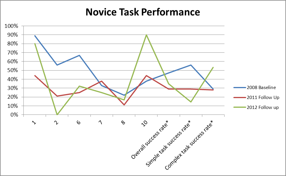
Figure 4:
Accuracy Scores from 2008 Baseline and 2011 and 2012 Follow-Up
Assessments, novice participants only.
Participants had more
difficulties with the simple tasks in the 2011 and 2012 Follow-Up
studies than they did in the Baseline study.
Table 3: Efficiency Scores (amount of time per task) for 2008, 2011, and 2012 Novices – Including Failures
|
TASK |
|
|||||||||||
Simple Tasks |
Complex Tasks |
||||||||||||
Iteration |
1 |
2 |
3 |
4 |
5 |
6 |
7 |
8 |
9 |
10 |
Overall* |
Simple tasks* |
Complex tasks* |
2008 Baseline |
1m59s |
4m31s |
2m07s |
2m03s |
5m |
6m52s |
5m15s |
6m49s |
5m59s |
4m47s |
4m32s |
3m58s |
5m52s |
2011 Follow Up
|
4m32s |
9m20s |
|
|
|
9m35s |
7m21s |
7m33s |
|
6m08s |
7m25s |
7m42s |
6m50s |
Difference in performance from 2008^ |
2m33s I |
4m49s I |
|
|
|
2m43s I |
2m6s I |
44s I |
|
1m21s I |
2m23s I |
3m03s I |
1m3s I |
2012 Follow Up |
3m04s |
6m22s |
6m57s |
5m24s |
5m38s |
7m52s |
6m47s |
5m35s |
5m48s |
4m16s |
5m46s |
6m |
5m12s |
Difference in performance from 2008 |
1m05s I |
1m51s I |
4m50s I |
3m19s I |
38s I |
1m I |
1m31s I |
1m13s I |
11s D |
31s D |
1m27s I |
2m02s I |
40s D |
NOTE: I = Increase in time, it took longer to complete the task. D = Decrease in time, it took a shorter amount of time to complete the task.
^ We usually do not include failures in the calculated time to complete tasks, but since the performance was so low in the Follow-Up study, we calculated these times here.
Table 4: Efficiency Scores (amount of time per tasks repeated in 2008, 2011, and 2012) Novices – Including Failures
|
TASK |
|
|||||||
Simple Tasks |
Simple Tasks |
||||||||
Iteration |
1 |
2 |
6 |
7 |
8 |
10 |
Overall* |
Simple tasks* |
Complex tasks* |
2008 Baseline |
1m59s |
4m31s |
6m52s |
5m15s |
6m49s |
4m47s |
5m02s |
4m39s |
5m48s |
2011 Follow Up
|
4m32s |
9m20s |
9m35s |
7m21s |
7m33s |
6m08s |
7m25s |
7m42s |
6m50s |
Difference in performance from 2008^ |
2m33s I |
4m49s I |
2m43s I |
2m6s I |
44s I |
1m21s I |
2m23s I |
3m03s I |
1m3s I |
2012 Follow Up |
3m04s |
6m22s |
7m52s |
6m47s |
5m35s |
4m16s |
5m59s |
6m01s |
4m56s |
Difference in performance from 2008 |
1m05s I |
1m51s I |
1m I |
1m31s I |
1m13s I |
31s D |
1m27s I |
2m02s I |
40s D |
Table 5: Efficiency Scores for 2008, 2011, and 2012 Novices - Correct Responses Only
|
TASK |
|
|||||||||||
Simple Tasks |
Complex Tasks |
||||||||||||
Iteration |
1 |
2 |
3 |
4 |
5 |
6 |
7 |
8 |
9 |
10 |
Overall* |
Simple tasks* |
Complex tasks* |
2008 Baseline |
1m45s |
2m02s |
2m07s |
39s |
3m24s |
3m09s |
4m06s |
8m01s |
10m49s |
4m14s |
4m02s |
2m28s |
7m41s |
2011 Follow-Up |
3m58s |
10m26s** |
|
|
|
9m34s |
7m26s |
4m7s** |
|
4m44s |
6m42s |
7m51s*** |
4m26s**** |
Difference in performance from 2008 |
2m12s I |
8m24s I |
|
|
|
6m24s I |
3m19s I |
3m54s D |
|
30s I |
2m49s I |
5m05 I |
1m42s D |
2012 Follow-Up |
2m35s |
- |
- |
2m45s |
- |
9m58s |
7m46s |
8m |
- |
4m25s |
5m55s |
5m46s |
6m13s |
Difference in performance from 2008 |
50s I |
-
|
- |
|
- |
6m49s I |
3m40s I |
1s D |
- |
11s I |
2m02s I |
3m I |
06s I |
NOTE: I = Increase in time, it took longer to complete the task. D = Decrease in time, it took a shorter amount of time to complete the task.
NOTE: Efficiency scores may be skewed due to a limited number of successes
*Mean does not include the tasks from Baseline that were not included in the Follow-Up study.
**Based on 1 correct response out of 9 possible correct responses.
***Based on 10 out of 36 possible correct simple task responses.
****Based on 5 out of 18 possible correct complex task responses.
Table 6: Efficiency Scores for tasks repeated in 2008, 2011, and 2012 Novices - Correct Responses Only
|
TASK |
|
|||||||
Simple Tasks |
Complex Tasks |
||||||||
Iteration |
1 |
2 |
6 |
7 |
8 |
10 |
Overall* |
Simple tasks* |
Complex tasks* |
2008 Baseline |
1m45s |
2m02s |
3m09s |
4m06s |
8m01s |
4m14s |
3m53s |
2m46s |
6m07s**** |
2011 Follow-Up |
3m58s |
10m26s** |
9m34s |
7m26s |
4m7s** |
4m44s |
6m42s |
7m51s*** |
4m26s**** |
Difference in performance from 2008 |
2m12s I |
8m24s I |
6m24s I |
3m19s I |
3m54s D |
30s I |
2m49s I |
5m05 I |
1m42s D |
2012 Follow-Up |
2m35s |
- |
9m58s |
7m46s |
8m |
4m25s |
5m55s |
5m46s |
6m13s |
Difference in performance from 2008 |
50s I |
-
|
6m49s I |
3m40s I |
1s D |
11s I |
2m02s I |
3m I |
06s I |
***Based on 10 out of 36 possible correct simple task responses.
****Based on 5 out of 18 possible correct complex task responses.
Table 7: Self-Rated Satisfaction Scores for 2008, 2011, and 2012 Novices (1 to 9 where 1 = low and 9 = high)
|
Satisfaction Questionnaire Item |
|||||||||
Iteration |
Overall reaction to site: terrible - wonderful |
Screen layouts: confusing - clear |
Use of terminology throughout site: inconsistent - consistent |
Information displayed on the screens: inadequate - adequate |
Arrangement of information on the screens: illogical - logical |
Tasks can be performed in a straight-forward manner: never - always |
Organization of information on the site: confusing - clear |
Forward navigation: impossible - easy |
Overall experience of finding information: difficult - easy |
Census Bureau specific terminology: too frequent - appropriate |
2008 Baseline |
6.22 |
6.22 |
6.22 |
6.56 |
5.33 |
5.44 |
6.33 |
6.78 |
5.78 |
6.78 |
2011 Follow Up |
3.33 |
2.89 |
5.67 |
3.33 |
4.00 |
2.67 |
2.56 |
6.13 |
2.11 |
4.56 |
Difference in Satisfaction ratings from 2008 |
2.89 D |
3.33 D |
0.55 D |
3.23 D |
1.33 D |
2.77 D |
3.77 D |
0.65 D |
3.67 D |
2.22 D |
2012 Follow Up |
3.20 |
4.10 |
5.00 |
4.40 |
6.10 |
2.60 |
3.60 |
5.10 |
1.60 |
3.90 |
Difference in Satisfaction ratings from 2008 |
3.02 D |
2.12 D |
1.22 D |
2.16 D |
.77 I |
2.84 D |
2.73 D |
1.68 D |
4.18 D |
2.88 D |
NOTE: D = Decrease in rating
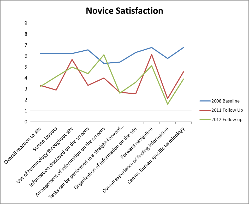
Figure 5:
Satisfaction ratings from Baseline and Follow-Up Studies.
Novice
participants are more dissatisfied with the new AFF as compared to
the Legacy site.
Scoring was on a 9-point scale where 1 = low
and 9 = high.
Expert Tables and Figures
Table 8: Accuracy Scores for Baseline and 2012 Follow-Up for Expert Participants5
|
Tasks |
|
|||||
Iteration |
1 |
2 |
3 |
4 |
5 |
6 |
Overall success rate |
Baseline |
42% |
50% |
36% |
41% |
69% |
44% |
47% |
2012 Follow Up |
50% |
40% |
43% |
79% |
72% |
38% |
54% |
Difference in performance |
8% I |
10% D |
7% I |
38% I |
3% I |
7% D |
7% I |
NOTE: I = Increase in accuracy. D = Decrease in accuracy.
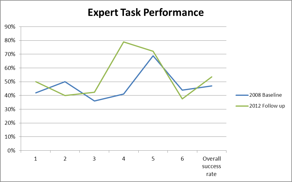
Figure 6: Accuracy Scores from Baseline and 2012 Assessments for expert participants only. 2012 Performance improved on 4 out of 6 tasks.
Table 9: Efficiency Scores for Baseline, and 20126 for Experts – Including Failures
|
Tasks |
|
|||||
Iteration |
1 |
2 |
3 |
4 |
5 |
6 |
Overall |
Baseline |
11m04s |
07m44s |
06m22s |
08m12s |
09m29s |
10m41s |
08m55s |
2012 Follow Up |
08m26s |
07m29s |
08m00s |
05m32s |
08m00s |
05m37s |
07m11s |
Difference in performance |
2m38s D |
14s D |
1m38s I |
2m40s D |
1m29s D |
5m04s D |
1m45s D |
NOTE: I = Increase in time. D = Decrease in time.
Table 10: Efficiency Scores for Baseline, and 20127 for Experts – Correct Responses Only
|
Tasks |
|
|||||
Iteration |
1 |
2 |
3 |
4 |
5 |
6 |
Overall |
Baseline |
14m45s |
07m58s |
05m21s |
07m25s |
09m48s |
10m12s |
09m15s |
2012 Follow Up |
07m04s |
06m28s |
06m34s |
04m43s |
08m16s |
04m55s |
06m20s |
Difference in performance |
7m41s D |
1m30s D |
1m13s I |
2m42 D |
1m32s D |
5m17s D |
2m 55s D |
NOTE: I = Increase in time. D = Decrease in time.
NOTE: Efficiency scores may be skewed due to a limited number of successes
Table 11: Self-Rated Satisfaction Scores for Baseline and 20128 Follow-Up for Experts (1 to 9 where 1 = low and 9 = high)
|
Satisfaction Questionnaire Item |
|||||||||
Iteration |
Overall reaction to site: terrible - wonderful |
Screen layouts: confusing - clear |
Use of terminology throughout site: inconsistent - consistent |
Information displayed on the screens: inadequate - adequate |
Arrangement of information on the screens: illogical - logical |
Tasks can be performed in a straight-forward manner: never - always |
Organization of information on the site: confusing - clear |
Forward navigation: impossible - easy |
Overall experience of finding information: difficult - easy |
Census Bureau specific terminology: too frequent - appropriate |
Baseline |
6.5 |
6.083 |
6.67 |
6.92 |
5.17 |
5.58 |
6.25 |
6.42 |
5.67 |
6.58 |
2012 Follow Up |
4.60 |
5.30 |
5.00 |
5.00 |
5.10 |
3.80 |
4.50 |
5.50 |
3.70 |
4.90 |
Difference in Satisfaction rating |
1.90 D |
.78 D |
1.67 D |
1.92 D |
.07 D |
1.78 D |
1.75 D |
.92 D |
1.97 D |
1.68 D |
NOTE: D = Decrease in ratings.
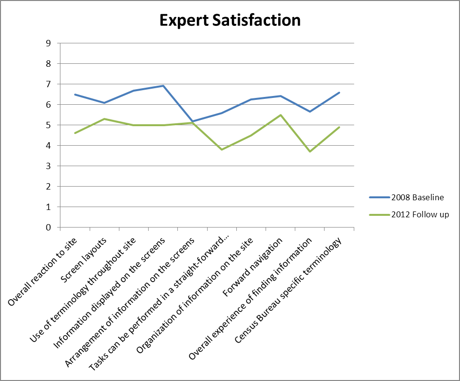
Figure 7:
Satisfaction ratings from expert participants in the Baseline and
2012 Follow-Up Assessment.
Expert participants were more
dissatisfied with the 2012 Web site.
Scoring was on a 9-point
scale where 1 = low and 9 = high.
3.4 Positive Findings
3.4.1 Baseline Positive Findings
During the test, most users attended to the left navigation and used it often. During debriefing, most users said that they liked the left navigation and found it to be useful and helpful to complete tasks.
During debriefing, most users said that they liked the overall layout and colors of the Main page of the Web site.
Users said that they liked that there was a lot of information available to them, overall.
Users attended to and used the Fact Sheet on the Main page. During debriefing, many users commented that they liked the Fact Sheet.
Most users described the tasks as being pretty easy to complete.
3.4.2 2011 Follow-Up Positive Findings
Participants said that they liked that there was a lot of information available to them on the site.
One participant with a BA in Political Science was able to understand how the interface worked and consequently was successful in searching for content and finding the specific information he was interested in.
One participant said, about the look and feel of the page, that it looked like it would be useful.
One participant said that she was immediately able to see a topic that she was looking for.
3.4.3 2012 Follow-Up Positive Findings
The Quick Facts and Popular Tables on the main page appears to be a way for novice users to get to simple data. We noticed some novice participants using these links. Some novice participants noticed them only after other areas of the main page (i.e., Quick Start) did not work for them. It is likely that once some learning takes place on the site that novice participants would more quickly use these two areas of the main page to get quick data.
Participants saw the type ahead and occasionally clicked on one of the suggestions.
Dataset in Topics helped three expert users complete the majority of the tasks.
Geography List was useful for expert users. One user commented, “[I] really like the list feature. It’s time-saving.”
3.5 Usability Problems
3.5.1 Baseline Study Usability Issues
3.5.1a High-Priority Issues
Testing identified two general high-priority usability issues. Medium and low-priority findings follow.
1. The Search function was not helpful to participants. Users said that they wanted the search function to help them when they could not find answers, but it seldom did. Users tend to use their knowledge and experience from other Web sites to make inference about new experiences with Web sites (Forsythe, Grose & Ratner, 1998, p.27). Many users begin every online activity “with a Google search” (Krug, p.85). People in this study said they expected search to work like a Google search.
Sometimes, when participants entered items in the search box at the AFF site, no results were returned. For example, for Novice Task 9, (i.e., Which country Idaho increased exports to from 2003 to 2004) two participants tried to use the search function to find the information. One novice participant typed “Idaho export 2003” in the search box, and it returned no results. However, in Google, when one enters “Idaho export 2003” in the search box, many (about 729,000) results are returned. See Figure 8 for a screen shot of the AFF site and the Google site when performing this search.
Other times, when participants used search in AFF, the massive number of results was overwhelming and not helpful. The titles were oftentimes the same for every item on the search results, and the explanation for each item was not informative. For example, for Novice Task 2, (Which three states had most people living in poverty) three participants tried to use the search function to find the information. One participant typed into the search “poverty in 2006.” Many results were returned; however, the information associated with the results was not helpful to the participants in enabling them to determine which selection would have the information they were seeking. In Google, when a user enters a term, such as “poverty in 2006,” a brief explanation follows the titles of the search results, which gives the user enough information to make inferences about the content of the search results. See Figure 9 for a screen shot of the AFF site and the Google site when performing this search. As shown, the first two results on Google are Census Bureau products, but the explanation that Google provides is much more informative to users than are the explanations that the AFF Web site provides.
For expert users, the search also did not work the way they anticipated it would. Most experts also expected the search to be similar to Google, thus said they were frustrated when the search returned “no results.” In addition, expert users had some difficulty when using the keyword search. Expert participants did not notice the option to check the synonyms box when they were searching and many times came up with a “no results” response when searching for a topic that should have had related content (e.g., On expert task 6 the number of health clubs in a few VA counties). A number of experts searched the NAICS for data on “gyms” or “health clubs” and found “no results.” All experts understood that they were doing a NAICS search and just had to get the right key word to match what NAICS coded it, but only one expert appeared to know about checking the synonyms box. In fact, another expert user recommended creating a synonym-type search but thought it would need OMB approval and it would be a long and difficult process to get approved. Two other experts mentioned that if they had been in their work environment they would have turned to a book they have of all NAICS codes.) One SDC employee said about the search “[it] is clumsy; you almost have to know the exact table you want. It could be improved.”
a.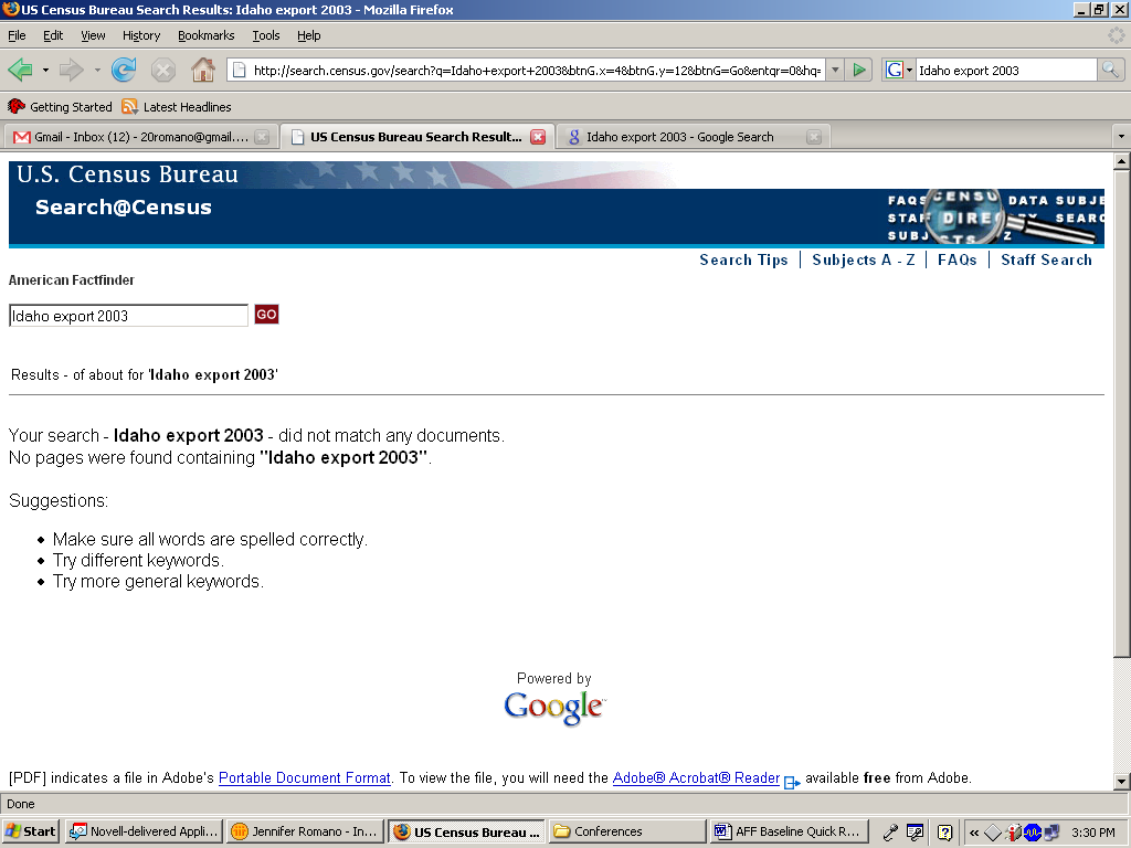
b.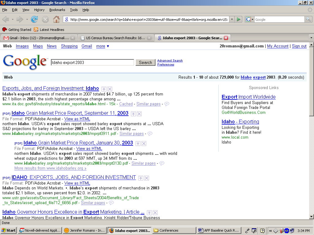
Figure 8: Screen shot of AFF site (a.) and Google site (b.) when performing a search for “Idaho export 2003.”
a.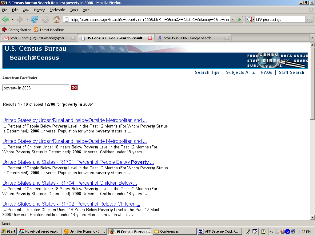
b.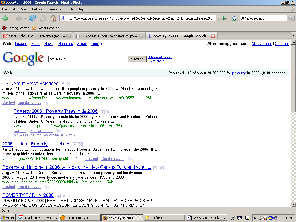
Figure 9: Screen shot of AFF site (a.) and Google site (b.) when performing a search for “poverty in 2006.”
Recommendation: Improve the search capabilities. Automatically search using synonyms so that user defined terms return related content. Improve the algorithm that determines the results so more results are returned when users enter common words and phrases. As users are expecting the search function to work like other search functions on other sites, the way users enter terms into a search box should be allowed and anticipated. Improve the titles and the explanations that follow each item in the search results. One participant recommended providing a synopsis of the results. Another participant recommended having a search box on every page.
Team Response: In the new AFF, the Search will work completely differently. Users will type a geography and topic, and the system will find that intersection. It will be a clearer path of refining results once you have them. Users will also be able to add ways to narrow results, and the system will give suggestions/hints on how to narrow results.
2. Manipulating and working with maps was not easy. Reference Maps were difficult to use and the grey writing on the maps (against the grey background) was difficult to read. Three novice participants tried to obtain a city map by typing in the city name in the address box but were frustrated when they could not access the city map and instead were prompted for a zip code. The only way to get to a specific city is to zoom in on a specific area of the map, which many novice participants said was frustrating and took a long time. See Figure 10 for a screen shot of the current maps on AFF. One novice participant typed Fairfax, VA in the Fact Sheet box and then clicked on Reference Map. This participant did not have any problems with the map, although the map they received had little detail. See Figure 11 for the map found by using this alternate navigation.
Both expert and novice participants mentioned how the maps were “clunky” or not as easy or as precise as what they were familiar with, such as Google maps or MapQuest maps. Participants said Census maps should be more up to date and follow these other models. One novice participant went so far as to say the Census maps looked “archaic.”
Some experts struggled with being able to identify different parts of the county, not seeing or understanding how to use the different icons of the map, such as the identify icon, or the select icon. As well, two experts opted to right click and save the image that way as they did not know how to download the map in any other way that would keep the image as a map (i.e., they missed or did not understand the “download as pdf” option).
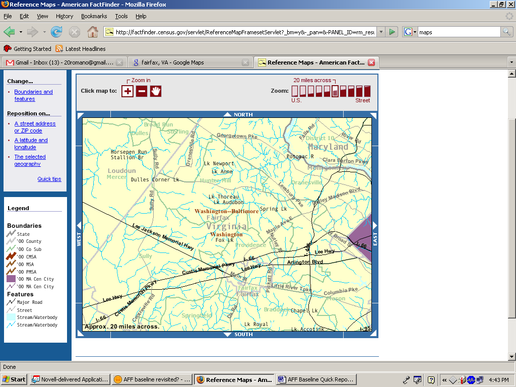
Figure 10: Reference map of Fairfax, VA from AFF site, using the Reference Map option from the left navigation.
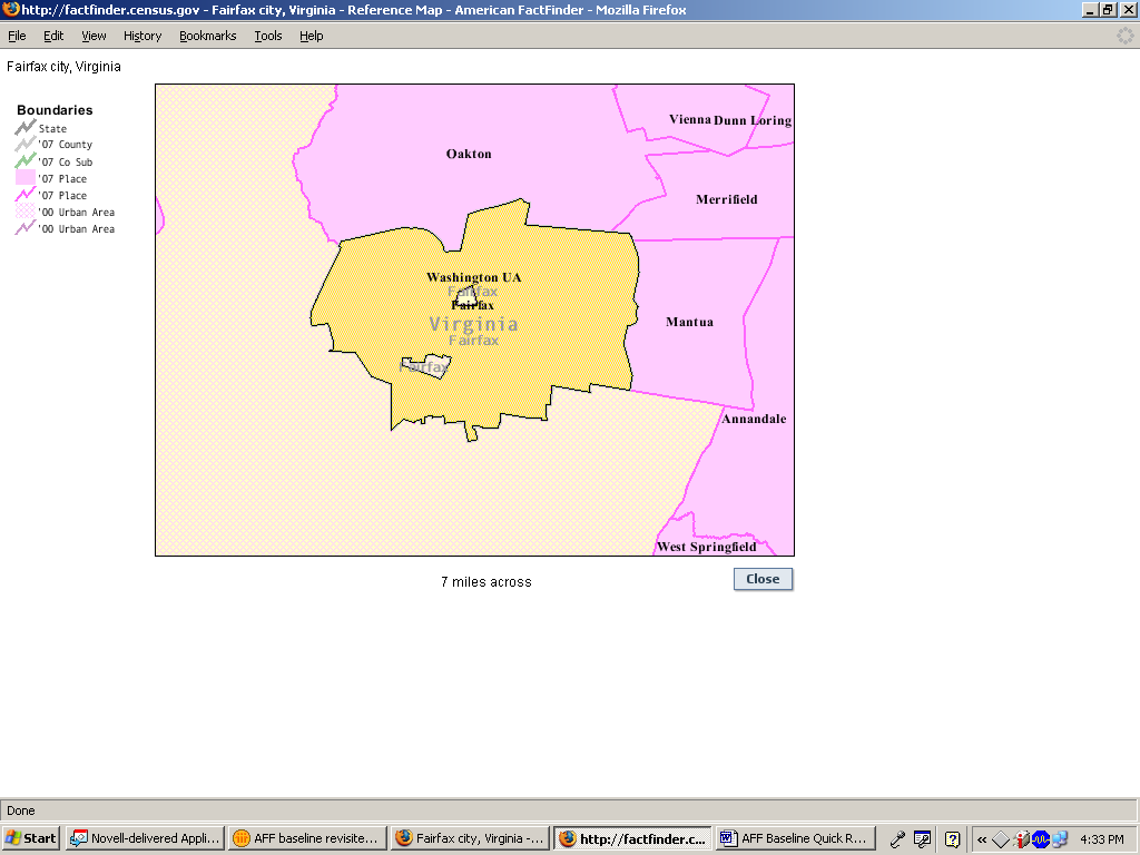
Figure 11: Reference map of Fairfax, VA from AFF site, using the FactSheet option.
Recommendation: Keep maps updated to reflect what users expect from maps, given their experience with Google maps, GPS and map Web sites, such as Mapquest.com. We agree with our participants who said that our maps look old and outdated and reflect poorly on the Census Bureau. Tweaks to the current maps could include a sharper visual contrast for foreground text than is currently displayed. Include an option to select a specific city without needing the zip code.
Team Response: The colors in this system are limited to 256 different colors. The new AFF will not have this limit, and the maps will look different from the current maps. Users will be able to type in an address or geography, and as they move over a map, that area will highlight. There will be base maps that have minimal boundaries and features for users, but not so much information that it is cluttered. The navigation will feel more like modern maps, such as Google; users will be able to draw a box or circle around an area and see all points within that area.
3.5.1b Medium Priority Issues
3. Information in the center of the Main page is not used. Most participants did not attend to or use the links and information in the center of the main page. During debriefing, when asked about this area, some participants said that they thought it looked too confusing. There is currently a lot of white space on the right side of the page that is not being used at all. See Figure 12.
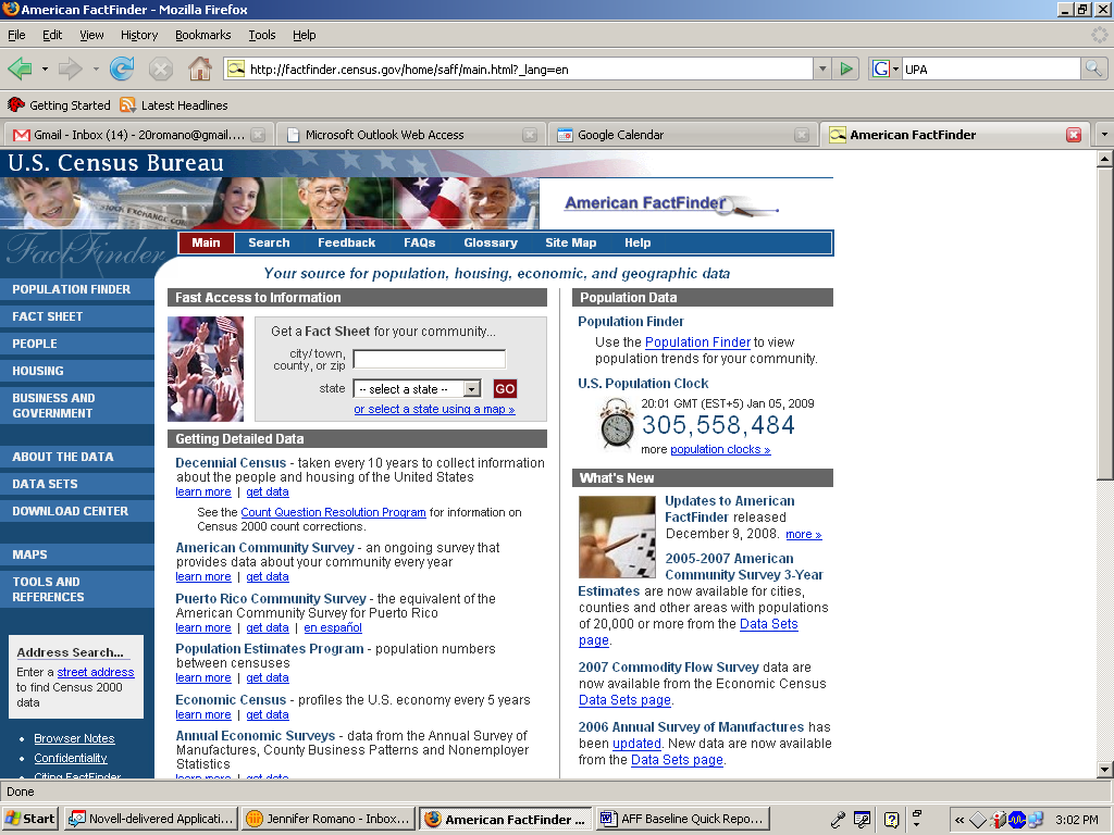

Figure 12: Screen shot of the American FactFinder Main page and the center area that was not attended to by novice users.
Recommendation: Make better use of the space on the page. Use more white space in the center of the page to organize the center information. Use less white space on the right side of the page: expand the information so that it stretches to the right.
Team Response: The new design is completely different and does not have this area on the main page.
4. Census jargon is used throughout the Web site. Normally, this is a recurring, high-priority issue in the Usability Lab’s evaluations of Web sites (see Romano-Bergstrom, Chen & Holland, 2011). However, this usability study, few participants commented on Census jargon. The participants that did comment said confusing words included: NAICS, SHP, ASM, GS, data revision notices, 2004 value and 2004 percent share.
Recommendation: Eliminate Census jargon and use words that are typical for novice users. At the very least, define acronyms and unfamiliar terminology.
5. The “Data Sets” pathway forces expert users down a particular, somewhat rigid path. If the expert user makes a choice that does not lead them to the content they were after, the user must back out and start all over which can be time consuming and frustrating.
Expert users did not always know which data table/product would contain the information they needed. Users could choose from many different table types within the data sets tab, such as custom table, detailed tables, subject tables, etc. and once the user selected one of the tables then they were prompted to enter additional geographical information before seeing what content was in the table. This led to many instances where expert users wasted time going through all the steps to load a particular table only to find that it was not the table they needed. Participants would then have to back out, choose a different table type and then go through the whole process again to add back in their specific geographic interest to check if this new table would have the content they were after. For some tasks, this procedure was repeated more than three or four times before the user was satisfied with the table. Each time they had to add back in the geography which was time consuming and, users said, frustrating.
Recommendation: Allow users to access the data tables without needing to know what data set or specific table it comes from. Allow users to specify the topic they are interested in regardless of whether they have identified their geographical level or not. Allow users to verify that the content displayed is in fact the content they are after, before the user has to make additional steps, such as identifying the geographical level.
6. Many of the expert participants were often expert in either the Demographic or the Economic content, not, typically, with both.
If the expert user was not familiar with economic data, for example, they would struggle more with finding the content they were after. Experts who were not familiar with the economic data made sure to mention that they did not use the economic data in their work and thus were not familiar with
How the interface worked
What the differences were in the data products, or
Which data product to choose
Recommendation: Make it easier for a user to choose the content they are after rather than first having them know which data set the content resides in. For example, do not require the user to know what content would be in the Economic Census area, versus what content would be found in the County Business Patterns area.
7. Experts did not use the various AFF functionalities, opting instead for the familiarity of what they knew, such as .xls
If the expert participant had not done something with the AFF interface before, such as changing the data class, moving the rows in a table around, or saving and reloading the data table, it was not immediately obvious how the user was supposed to do it. Most users reported that instead of working within the AFF window, they would typically download the content to an .xls spreadsheet and manipulate the data there. A few experts were able to eventually figure out how to change a data class on a map, but this was not the case for all users.
Recommendation: It appears that most expert users prefer to download the maps in a more common format (such as .xls) which they are familiar with and can use on their own time. Allow users to continue to download content. Also if some of the functionality of the new AFF involves manipulating the data with the AFF tool, consider this a lower priority as users may ignore this capability and opt to download the data rather than learn a new feature or online tool when the one they know (e.g., .xls) works. For functionality that a user would not be able to do in xls, such as changing the data class on a map, make sure to have useable instructions on how to use a particular tool.
3.5.1c Low Priority: Issues
8. The top navigation was seldom used. This type of finding is usually a high-priority issue (Romano Bergstrom et al., 2011) because the top navigation bar is often critical to the user’s success in finding target information. However, on the AFF Web site, the links on the top navigation were not useful to participants. During debriefing, when asked about the top navigation, participants commented that, aside from the Search feature, they did not use it. Rather, participants tended to use the left navigation the most. See Figure 13 for a screen shot that highlights the top navigation.


Figure 13: Top navigations on the Baseline AFF Web site.
Perhaps our task questions, aside from when users went into search, were not answerable by the top navigation links. These links are certainly secondary to the main topic-based navigation (on the left) that most users tried. So the top navigation links (Main, Feedback, FAQs, Glossary, Site Map, and Help) were not relevant to the participants in this study. However, because we were not asking task-based questions that required users to click on some of the links at the top in order to find what they were looking for, when participants did not click up there, it did not matter, and thus the finding is given a low priority. Future studies should include task questions targeting some of the top navigation links, if the task is representative of what users come to the site to do.
Recommendation: Move items that are seldom used, such as “Feedback” and “Site Map,” from the top navigation to a more subtle location, such as the bottom navigation. Remove FAQs, since they are also located on the bottom of the screen, and it is redundant to have them on the screen twice. Also, include a link to American FactFinder-relevant FAQs on the Help screen, since people who are looking at FAQs are seeking help. Add links to the top navigation that are useful to users, such as adding a link for maps or data. These would provide users with alternate routes of finding important and frequently sought information.
Other User Feedback
Participants said they found it puzzling that information about Puerto Rico was so prominent on the Main page. One participant recommended moving it below the fold of the page. Another recommended that it be placed in the Archived data.
A few participants commented that there did not need to be so many pictures on the Main page.
A number of experts mentioned that they wanted the Advance Query restored.
Many experts immediately accessed the data through the Data Sets link in the lower left -hand navigation column.
3.5.2 2011 Follow-Up Study
3.5.2a High-Priority Issues
Testing identified a number of high-priority usability issues in the 2011 Follow-Up study.
9. Using the geography overlay was overly complex and confusing. Participants did not understand how to get a specific geography (e.g., Maryland) for a topic they were interested in. This contributed to participants not finding the information they were looking for.
Participants often experienced difficulties adding in geographies. For example, most users did not know that once they clicked on the state, they had added it to the “Your Selections” box. The lack of feedback caused participants to click on the state numerous times, but still they did not notice that the state had been added to their selections. Many participants tried to add their specific geography (e.g. Maryland) by either clicking on the blue link label or checking the box. One participant said, after clicking the check box and clicking on the Add button, “I’m trying to see if it changed anything.” The participant did not notice that her state had been added. One participant said, “It says it was added to my selections but I don’t know what that means.” One participant said, after opening the Geographies overlay, “I know I want to go here. But once I get here, I don’t know what to do.” Another participant said, after selecting 4 states of interest and then clicking Add, “I’m not sure where they went. Humm now I’m confused.” See Figure 14.
Participants did not understand that their search was being updated beneath the overlay. Users missed seeing that the results were underneath, even though the overlay is more opaque than in Iteration 39 testing and slightly moved down. These changes seem to have been too subtle. See Figure 15.
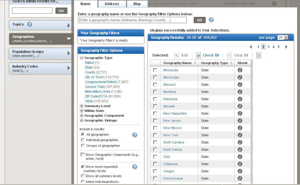

Figure 14: Screen shot of page after adding VA. Label “Virginia successfully added to Your Selections” was meaningless. Nothing appeared to have changed.
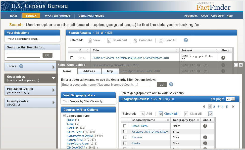

Figure 15: The geography overlay covered the main search results.
Participants search on anything related to their topic in the geography search box, including many other things in addition to geographies. They use the search field as a Google-like search, typically after the other searches on the site (“Quick Start” and “Search within Results for…”) failed to get them any information related to their search.) See more on this in issue # 11 below.
The geography filters section was confusing. None of the participants who ended up adding their geography to the “Your Geography Filters” understood what it was for. When participants do a search on a single geography in the Name search, the result appears in the “Your Geography Filters” but this is not what participants are expecting. Participants said they were expecting to get data about the geography that they had just searched on. The “getting data” box appears after the participant has searched and this implies that the geography overlay will include data. See Figure 16. Participants said that they were expecting to get some type of information about Maryland (after typing Maryland into the Name search). After Maryland appeared in “Your Geography Filters” participants were confused and said they got nothing.
Note: The population overlay works much the same way as the geographic overlay in that it hides the data beneath the overlay. Participants who opened the population overlay also missed that the data was updating beneath the overlay. Thus any fix to the geography overlay would also be relevant to the population overlay.
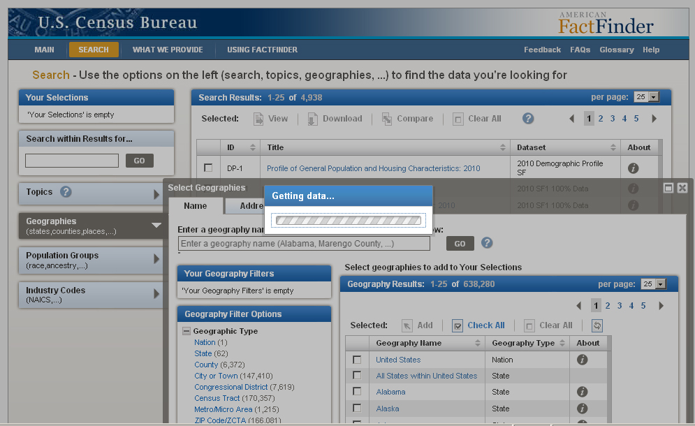

Figure 16: The “getting data” implies the search is getting data.
Discussion: These problems with the geography are similar to what participants experienced in Iteration 3 testing. Thus we can see that the fixes the design team implemented did not go far enough. The overlay (though more opaque and slightly moved down) is still covering most of the results. One fix that was demonstrated to the team was a slow motion action of the geography being loaded into the “your selections” box. The team thought that this might work to both show users what their action of loading a geography was, as well as highlighting to users where the “your selections” was located and how that area was connected to their geography search. During 2011 Follow-Up testing the feature, we were told, was working, but it worked so quickly that no participant saw the movement.
Recommendation: Simply the geography overlay. Make it apparent that when a participant clicks on a state (or other geo level) that something has happened, and that the content now will all be about their specific geography.
We recommend doing some low-fidelity testing focusing on the geography interface. We could have a few different alternate versions mocked-up and then see which one works better for most participants. Some suggested alternate geography interfaces:
Add a button to the "Your Geography Filters" that says "Add Search Term". When you click the button it takes whatever is in the geography filters and places it in "Your Selections" and closes the Geography window.
Put the complexities of the geography tool, even the “Your Geography Filters” section deeper in the interface, (a few clicks in), or as a tab on the interface so that most general users who do not need obscure geographies do not get lost with the overly complex interface.
Have the “Your Selections” always in view so that once the geography has been added, it is clear that this has happened. Slow down the animation that was demonstrated to the team so that users will see it. Once the animation is slower, have the chosen geography move all the way into the “Your Selections” box, not to some location above the fold (if the participant happens to be scrolled down on the page).
Move the "Your Selections" box to where the “Your Geography Filters” box is currently. And have a Step 1) Choose your geography (state, county ,etc.)
Step 2). Click Get ResultsAdd a button to the "Your Geography Filters" that says "Add Search Term". When you click the button, have it take whatever is in the geography filters, place it in "Your Selections" and close the geography window.
Team Response to user issues with overlays10: As part of the on going design process, IBM is making an effort to minimize the use of overlays. IBM will also explore the feasibility of allowing users to reposition overlays, though allowing the user to move an overlay then requires them to manage the placement of the overlay, which could present another set of usability challenges. Closing or minimizing the overlay when the user clicks anywhere outside the overlay is a common web UI interaction, which IBM will explore the feasibility of implementing.
10. Participants don’t understand the “Your Selections” area. Some participants did not see that their search terms were in the “Your Selections” area, other participants did notice their search terms were there but did not understand how it was related to the rest of the site. Consequently, most participants were not able to understand the main functionality of the site.
One user tried to click on labels in the “Your Selection” area—while he did notice the “Search Results” area, he did not understand how they were connected to what he was searching on. When he was asked at the end of the session what he was trying to do when he clicked on an item in the “Your Selection” area, he said that he was trying to see if it would take him to data. What was listed in the “Search Results” area was not relevant to what he had searched on, so instead he thought he needed to work within the “Your Selections” area because that at least had terms that he understood. It is likely that he was led to believe that the “Your Selections” area was where the results would appear because that was the only area that had relevant terminology (the terms he had searched on). All the links in the “Search Results” area were too confusing and often NOT related to his search query. See more on issues with label names in Finding # 13 below.
The connection between the “Your Selections” and the geographies is not clear. For example, one participant said “it says Maryland was successfully added to my selections and I’m thinking what is my selections?” This participant continued, “I’m not sure how to get state and education together.”
Discussion: These problems with the “Your Selections” are similar to what participants experienced in Iteration 3 testing. At that time we did not recommend keeping the “Your Selections” present on the screen at all times because we thought other fixes might remedy the problem. Since the problem is still so severe for participants, and understanding how “Your Selections” works with the rest of the site is crucial to participants comprehension of the site, we think it important to make a more noticeable change such as modifying the design to keep the “Your Selections” tool in view at all times on the site.
Recommendation: Keep the “Your Selections” in view on the screen at all times—we anticipate that this will help users make the connection of its functionality to the rest of the site. Do not have a topic disappear when a different topic is loaded in the “Your Selections” area. If the topic is no longer an option, consider another way to indicate that they there is no data on that specific topic,(e.g. make the label not clickable, such as graying it out and putting a zero in parenthesis next to it.) Consider adding simple instructions to the interface that explains a bit about what users need to do with the “Your Selections” area: For example: “Choose your topic” or “Choose your Geography” As well, make the “Your Selections” label more informative, such as “I am Looking for…”
Team Response: IMB accepted this recommendation to keep the “Your Selections” on the screen at all times. In addition, the IMB responded11 to this issue: “The IBM Team acknowledges that the addition of the animation and the freezing of “Your Selections” and the top of the search results list does not fully address the end-user confusion with the faceted search. This was an initial “quick win” step while the new navigation is being designed. The IBM Team is doing analysis and conceptual design on a wizard based navigation that will incorporate the recommendations above.”
11. Search caused problems for participants. There were at least three places that participants tried to search for their information: “Quick Start,” (hereafter referred to as QS) “Search within Results for…”, and on the “Name” tab of the Geographies overlay. We saw all participants who used the search functionality follow the mental model of a Google-type search. Thus the searches are not performing in an anticipated way.
The QS ends up not being that quick because it requires the user to read what the different fields are for (topic or geography). This is not what users are anticipating—their mental model of search is that they can type in anything into the search field and click go and it will work. When it doesn’t function that way, we saw many participants lost with what to do next, aside from slightly tweaking their search query.
The QS gets different results than the “Search within Results for” search. This is confusing to participants. For example, a participant used the QS for the following query: “Salaries of households 2000” and in the geography field “Virginia and Maryland.” This returned no results (see Figure 17). The participant tried a few other things, including deleting “Washington Baltimore northern Virginia” (see Figure 18), and then he used the “Search within Results for…” and typed in Maryland. This too gave him no results and eventually he gave up saying that it was like “trying to find a needle in a haystack” (see Figure 19).
The functionality does not allow a geography search using the “Search within Results for…” However many users tried to do such a search. Users have no way of knowing such a strategy will fail, as there is no information about that.
The “Search within Results for…” tool did not always work for participants. Some participants did not seem to realize that it was a tool to search within results instead of a general search tool. Participants used the “Search within Results for” the same way as they used the QS on the main page. Participants tried to do any type of search, often attempting to get at the level of geography they were interested in. There is nothing to indicate to participants that searching within their results for a specific state (e.g., Maryland) was not going to work. This is not intuitive.
Primarily when the other search tools failed the participants, we saw a few participants who used the search field on the Geographies overlay to continue their Google-like searches.
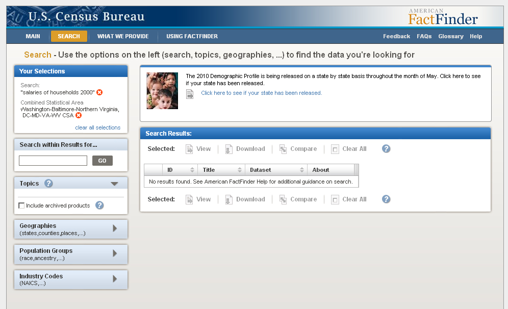
Figure 17: “Search within Results” confused some participants
Figure 18: The QS off the main page often led to a “no results found.”
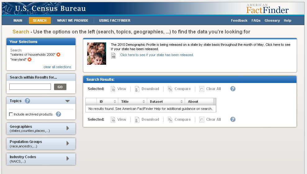


Figure 19: Search results suggest there were no results on household salaries and the state of MD.
Discussion: Issues with the “Search within Results for” were first noticed in Iteration 3 testing. It does not appear that any changes were made to address this issue for the 2011 Follow Up, but as the site is so search reliant, getting the search working in the way users anticipate will go a long way to improving the usability of the site. It is our understanding that the developers considered moving the “Search within Results for…” search tool over to the actual results section of the screen. This would likely help to indicate that the search will refine the results list. Adding in some instructional text such as “Refine your results. Search on _________” or something similar could also help.
The Initial home page tested in Iteration 212 appeared to work for participants. It was clear for participants when working with a “Start Here” search on how to get started. In addition, the search did not require participants to make a distinction between their topic and geography. See Figure 20. While there are business reasons for modifying the QS to encompass both a geography field and a topic field as well as the radio boxes of population group and industries, we see in testing that this added complexity has had an impact by decreasing comprehension and effective use.
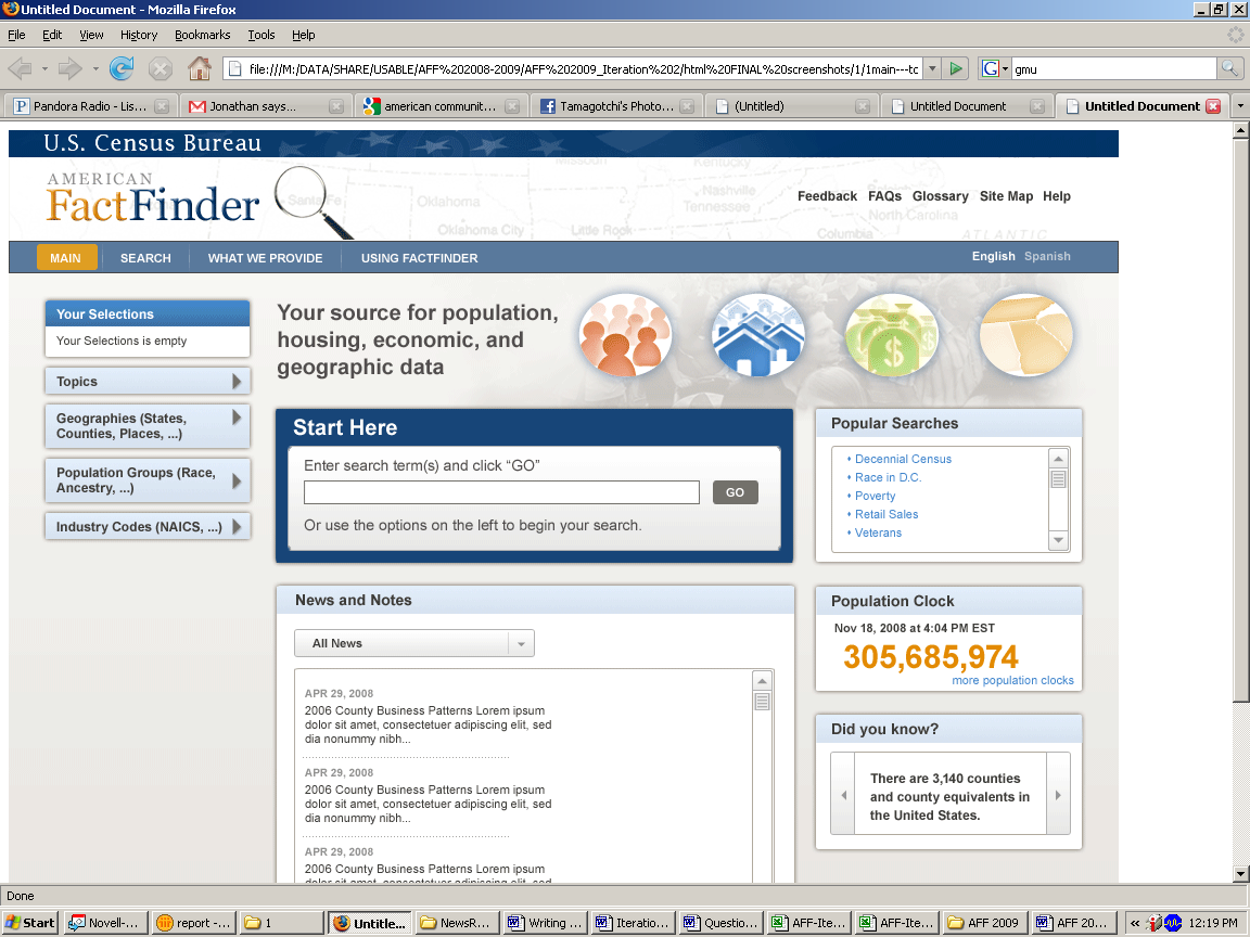
Figure 20: Screen shot of initial home page that was tested in Iteration 2 (June 2009).
Recommendation: Allow Google-like searches when you have search boxes on the site. Allow a user to search within the results for geography. Mock-up alternate designs of the “Search within Results for…” search in different locations (e.g., next to the results, as was suggested by the development team at the conclusion of Iteration 3 testing) and re-test with new participants.
Team
Response to previous recommendations to allow a Google-like search13:
Accepted. A site search feature is included in the new layout
for the main page and will also be present on all pages in the AFF.
The exact capabilities of the site search feature are still being
designed and evaluated.
12. Participants had difficulties with some of the Topics, both when topics disappeared and the label/location of some of the topics
Participants did not understand why some topics disappeared. When participants clicked on a topic and it was loaded into the “Your Selection” area, other topics disappeared, this caused confusion. (For example, when trying to work on Task 5, which asks about fastest growing age group over the age of 45, a participant clicked on population change migration (previous residence) and the topics Age & Sex and Age Group disappeared. He then went to look for age in the topics list and was confused why he could not find age. He remembered from an earlier task that age was in the list and he spent some amount of time trying to find it under product type, survey, dataset, population groups, etc. It wasted a lot of his time and was very confusing for him).
To get population data, a common task, you need to click on basic counts/estimates, which is not intuitive.
Age Group only has children and older population as topics to select. Participants said they expected to see it broken down by age ranges.
Participants clicked into the Population Change topic title when searching for age breakdowns but instead found migration, which was not what they were anticipating.
Discussion: The finding of participants not understanding when topics disappeared from the topics list is consistent with participants experience in Iteration 3 testing, although it is more nuanced. In this round of testing we saw participants confused when they tried to find a topic and it had disappeared because of another topic that they had already added into the “Your Selections” area. From Iteration 3 testing the usability team recommended adding an icon (e.g., such as a checkmark) next to the selected topics so that participants could see which topics have already been selected rather than having items disappear when they were added to the “Your Selections” box. The development team solution was to show animation of the topic moving up into the “Your Selections” box. In its current state, however, the animation is not working (IE) or working too quickly (Firefox), so that this is still a usability issue for participants.
Recommendation: Don’t have the topics disappear. If there is no content based on other items in the “Your Selections,” indicate this in another way, such as graying out the term and putting the number zero (0) in parenthesis next to it. Continue to refine the topics list (location and labels) based on common user terms and queries.
Team Response on topics disappearing14: IBM will work with the DADS Government staff to identify the appropriate approach to address this recommendation.
13. The names of the data files in the “Search Results” section of the screen were not clear. Many of the table titles listed were not scannable for many reasons: they were written in all capital letters (difficult to scan); they were were too wordy with the same words repeated from one entry to the next with the only difference something that most general participants don’t understand or pay attention to (e.g. , the data set column). Consequently, the table labels caused confusion for participants. Many participants did not believe that the results had anything to do with what they had just searched on.
The table labels were not in plain language. Participants did not know why the different table topics listed were actually there. They would say the results were not what they had searched on.
One participant said, “Why are there so many random categories? Why are there so many sub categories?” She said she wanted a more direct way to figure it out and that there was too much stuff to look through.
Another participant said, “when you put in a search, unless you know these terms… I can’t use this.”
Another participant said, after adding poverty to the “Your Selections” and looking in the results, “I feel like it should be under poverty but I can’t find the heading I want.”
Another participant said, when looking in the “Search Results” for the education attainment, “not by sex… I don’t want it by sex. It might throw you for a loop.”
A participant used the QS on the main page to begin his query. He typed in “poverty states 2000” and clicked go. The participant said he expected it to pop up with the top 10 results but what he got instead was, “I got a bunch of government jargon. It’s so technical. Who knows what this is? Not all this ID and Title. I’d do Google.” See Figure 21.
The table label “GEOGRAPHIC IDENTIFIERS” showed up in various participants searches. This led to an empty table filled with codes. Another high profile table that appeared at the top had IMPUTATION in the main title. People did not know what imputation meant.
One participant said about the Geographic Identifiers table “it’s giving mea lot of codes that I have no idea what they mean. I don’t know what this stuff means.”)
Table titles were sometimes in all capital letters which makes it hard to read.
Table titles would often be repeated exactly word for word under the “Title” heading and it was not always clear to participants what the difference was between them.
Participants did not make the connection between what they had selected and the “Search Results” list:
One participant, after 35 minutes of working on the site and trying to figure out how her selections were related to the “Search Results” said, “I feel I have all appropriate information related to the questions. That’s where I am getting hung up. I know what selections to make, I don’t know if the stuff listed here [Search Results] is based on this.” She continues to look down at the list and then said, “So I feel I’m finally beginning to catch on. Indeed the reports were related to what I had selected.” This participant was able to make the connection between the “Your Selections” and the “Search Results” but it took her over 35 minutes to do so.
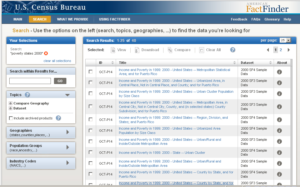

Figure 21: Results listed appear to have no relationship to search query: “poverty states 2000.”
Recommendation: Give short plain language titles, and then make the official table id, data set and “official” table title secondary. Participants do not need to see or know the entire table title when at the point of making their decision on which search result to select.
Even if the other interface elements are fixed so that they work for users, the “Search Results” will continue to cause problems for most people until the time when they are written in plain language and with shorter, more scannable labels.
Data tables that are not common, such as imputation tables or geographic identifiers should not appear at the top of common searches.
The “Title” column should not have table titles that appear in all capital letters, this takes longer to read and comprehend.
Team Response to issues with tables from quick report15: IBM will work with the DADS Government staff to identify the appropriate approach to address this recommendation. The table names and column headers are consumed and displayed by the AFF system. It may not be possible to change the table names or column headers without permission and assistance from the data providers. This also applies to the case in which tables names are displayed.
IBM will investigate alternate layouts that place the table title closer to the table.
Placing a “Back to Top” or “Back to Search” button at the bottom of a long table is a usability best practice that IBM will add to the product view at the earliest opportunity.
14. Map View tab (and Creating a Map) was confusing for participants
Participants tried to click on Map View when in a table to create a map or to attempt to get to a different geography (e.g. tried to get a map so that the participant could select their geography). Often clicking on the Map View tab did nothing.
For example, when trying to find the boundaries of Fairfax City, participants, with a data table open, tried to click on the Map View tab but it did not work. Participants would click again and again and then say “it’s not letting me see it.” It was not clear why the hand appeared on the Map View tab, which indicates that something is clickable, yet the Map View tab was not clickable.
Discussion: During Iteration 3 testing in November of 2010, we saw participants clicking on the Map View tab when it was not available, as we saw participants doing in the current round of testing. In November we told participants that the Map View tab would not be there. At that time, participants said then they would go to “Create a Thematic Map” first. In November, we saw participants not reading the instruction and not knowing how to create the map. Thus, the recommendation was to make the connection between the “Create a Map” and the instructions on what to do next clearer, such as following what is done on the Modify Table function with the call out button. As well, we recommended modifying the instructions to be more clear and succinct—not in sentence form but rather in bulleted format, e.g.,
To Create a Map you must select a data item:
1. Move the mouse cursor over the table
2. Click a cell
Recommendation: Since Iteration 3 testing, the development team removed the word “thematic” so that the button changed from “Create a Thematic Map” to “Create a Map”. This was a positive change as it reduced technical jargon on the page. We further recommend removing the “Map View” tab or disabling it (by graying it out and not making it look clickable) when it is not possible to create a Map. The instruction for how to create a map should be:
1: Written in a step by step format (see discussion above for example text)
2: Visually connected to the button, similar to the way the Modify Table call out bubble works.
3.5.2b Medium-Priority Issues
15. The label “population groups” is deceiving.
People think of it as more than just race and ancestry and frequently tried to get aging data from it.
Recommendation: Rename “Population Groups” to something more relevant to what is there. One observer recommended changing it to “Race and Ethnicity Groups.”
16. Participants tried clicking on “Modify a Table” to change geographies.
Recommendation: Allow users to change geographies from the actual result data table rather than requiring them to go back to search.
Team Response16: Accepted. Users will be able to change geographies from the product view.
3.5.2c Low-Priority Issues
17. Some participants did not what the red x was for. Other participants were able to use it.
18. One participant was confused by the question mark located right next to Topics.
19. Many participants commented on how long it took the data to load. For example after a participant clicked for a table, she read the getting data message and then after a bit said “Why is it taking so long?”
20. Comparison data: During the initial baseline study, most participants described the tasks as being pretty easy to complete. During the Follow-up to the Baseline, most participants described the tasks as being pretty difficult to complete.
3.5.3 2012 Follow-Up Study
3.5.3a High-Priority Issues
Testing identified a number of high-priority usability issues in the 2012 Follow-Up study.
21. Participants continue to have difficulties using the overlays
Novice participants still show the same pattern of interaction with the overlay as noted in previous rounds of testing. At least two expert participants who were less familiar with AFF showed similar patterns of behavior. Participant interactions with the overlay include:
Trying to drag or move the overlay out of the way
Missing the fact that their results are updated beneath the overlay.
Saying they expected results after clicking on a selection in the overlay.
Trying to click “GO” on the “Narrow your search” section (with one of the overlays open, such as Topics or Geographies) even when there were no items available to display.
Participants treat “Narrow your search” and QS as a Google-like search.
Participants frequently refer to it as search.
Participants often tried typing in a geography into the “Narrow your search” and did not understand why it did not work. In the 2011 baseline follow up report we noted, “It is not intuitive that you cannot search within your results for a geography and there is nothing that indicates that such a query is not possible.” This is still the case.
Participants would enter in their entire query into the first of the two boxes in QS.
Some participants assumed “Narrow your search” would create a new query that would search AFFs entire database.
“Narrow your search” often lead participants to dead ends or irrelevant results. A novice participant, after failing several tasks using the QS and “Narrow your search” commented, “This is kinda frustrating, I don’t know why I can’t do this.”
More than one participant commented, “QS is not that quick.”
Recommendation: Two different directions for the recommendations:
Keep novice users out of the Data Finder path.
For the intermediate/expert users, fix Data Finder by making the path more intuitive
Allow more natural search language
Allow users to narrow their search by geography. See Note below.
Modify the help in the yellow box to actually aid users as they come up against some issues
Give context specific feedback to users about what to do when their “Your Selections” is empty (See Figure 22)
Give context specific feedback to users when the items in the “Your Selections” causes no results (or irrelevant results) to be available (See Figure 23).
Allow users to move and minimize the overlay. Reduce the size of the overlay.
One participant suggested showing synonyms or related terms for similar topics. For example, if a user were to type in disabled then he/she should receive results on disability with a notification that it is a related term.
Discussion:
In earlier usability results (e.g., Iteration 3 2010), we have
recommended using the word “remove”
instead of using the
![]() icon to indicate remove. We continue to think this would be more
intuitive for users.
icon to indicate remove. We continue to think this would be more
intuitive for users.
The re-labeling to “Narrow your search” and re-locating it just above the search results list has been effective, as many more participants use the feature, and some connect the feature with refining the results list. Now the search needs to continue to be refined so that users will get more out of their searches (such as allowing users to refine by geography).
Team Response: The recommendation to allow users to refine the results list by geography was recommended in an internal report to the sponsors for 1Q2012_Cycle1 and accepted by the IMB team in an internal report17).
The recommendation to allow the overlays to be minimized and moved was accepted with the following information from IBM: Accepted. As part of the on going design process, IBM is making an effort to minimize the use of overlays. IBM will also explore the feasibility of allowing users to reposition overlays, though allowing the user to move an overlay then requires them to manage the placement of the overlay, which could present another set of usability challenges.
“Your
Selections” is empty. The searches you conduct, or options you
select from the buttons directly below affect the results and
options available to you.
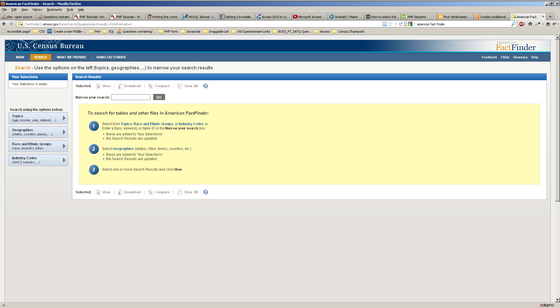

Figure 22: Suggested wording when users have not entered or chosen any options.
To
start a new search, clear your selections at left or remove an item
by clicking on
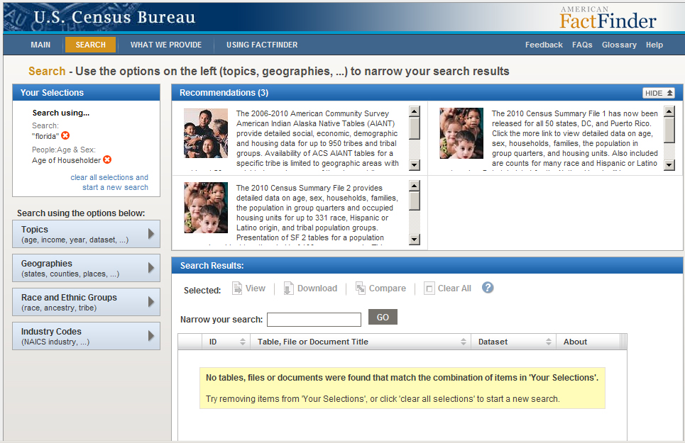
![]() until
results appear below.
until
results appear below.
Figure 23: Suggested wording for context specific help when narrowing search leads to no, or irrelevant, results.
22. Participants continue to have difficulties understanding and using the Your Selections area effectively. Participants continue to experience confusion over what the Your Selections area is and how to use it. For example:
More participants appear to notice the “Your Sections” area but they still do not necessarily understand how it is related to the rest of the site.
Participants said the “Your Selections” area showed their past searches.
Participants did not understand that options in the overlays were limited by what they had in “Your Selections.”
“Geography” grays out unavailable options, but “Topics” hides the unavailable options. This inconsistency is confusing.
Participants do not understand that topics disappear based on their selections. For example, they comment they do not know why they cannot find a topic that was available in an earlier search.
The combination of misunderstanding the search features combined with the confusion over “Your Selections” led to high rates of task failure for novice participants.
Recommendations: The confusion over the “Your Selections” area is similar to previous studies (Iteration 3 2010 and Follow-up 2011). While the recommendation of keeping the “Your Selections” open on the screen at all times has been made to the interface, as well as enhancing ways to draw the users’ eye to the “Your Selections” area of the screen, other recommendations were not made. Recommendations from the 2011 Follow-Up study that have not been implemented include:
Do not have a topic disappear when a different topic is loaded in the Your Selections area. If the topic is no longer an option, consider another way to indicate that they there is no data on that specific topic, e.g. make the label not clickable, such as graying it out and putting a zero in parenthesis next to it.
Consider adding simple instructions to the interface that explains a bit about what users need to do with the “Your Selections” area: For example: “Choose your topic” or “Choose your Geography” As well tweaking the “Your Selections” label could be more informative, such as “I am Looking for…”
We still recommend graying out unavailable options instead of hiding them. This would give users a visual cue that they cannot select these options rather than have them think that the term does not exist. Consider prior recommendations from earlier studies to help explain to users how the “Your Selections” area works, such as bullet-point 2 above.
Team Response: While we have discussed at usability meetings the possibility of graying out unavailable options in the topics list, instead of having them disappear, the team has not made a decision on this issue as of yet.
23. There are too many choices in the results list. Participants have too many choices that can lead to task failures. Examples include:
Irrelevant table titles in the results list (e.g., looking at a long list of different poverty tables, a novice participant had difficulty identifying which Poverty table would be the “right” one).
Long list of available tables was time consuming as participant attempts to find the one table that would have the “correct” information. (e.g., Participants, including experts who were familiar with the old and new AFF Web site, said they did not like the sheer number of options available since it tended to result in an extended investigation into which table was the one they needed).
QS could lead participants to a massive list of available tables (e.g., information overload). For example, one expert typed “employment for US” into QS and then said with an exasperated laugh, “Again it’s giving me all the details!”
During debriefing, several of the expert participants commented about how the old AFF system refined their options earlier in the process so that they did not have to deal with all the choices upfront. These experienced experts said they preferred the ability to use the drop downs in the old AFF to get a specific table.
Recommendation: Allow participants the option of not seeing all the data. Highlight the best choices, perhaps the most requested choices, based on the search criteria, and only show those initially.
Team Response: In the first and second cycle of 1Q2011 testing the development team demonstrated different ways to reduce the number of repeating tables by rolling all similar tables up into one table, and giving the user the option of expanding the results list to identify the exact table they wanted. Currently, however, these modifications have been postponed until 2013 or later.
In addition IBM responded18, “IBM will work with the DADS Government staff to identify the appropriate approach to address this recommendation. IBM will explore the technical cause of search returning results that do not appear to be related to the search criteria.
The table names are consumed and displayed by the AFF system. It may not be possible to change the names of the table without permission and assistance from the data providers. This also applies to the case in which tables names are displayed.
The ID column will be moved to be between the dataset and about columns.”
24. Misleading Yellow Message
The yellow message participants see when they have no items in the “Your Selections” area is misleading. Although it tries to explain the steps in using AFF, participants tend to treat them as a systematic guide where the only action they can take is to click “View.”
One participant took this message literally and thought to get any result he would have to make a selection in an Overlay and then click View since it was one of the buttons exposed when the overlay was opened. When following the instructions this participant said:
“But now it says click on View. But where’s View at? Oh View is at the top. But it’s not in bold [grayed out] so you can’t click on it. That’s just confusing. If you try to follow what it says… it’s confusing. It says select View, but View is not highlighted. It’s kinda frustrating.”
This participant may have confused the overlays with the search results. See Figure 24.


Figure 24: One participant honed in to the View button after reading these instructions.
Recommendation: Users who are struggling with the overlay are unlikely to find the instructions on using DataFinder helpful. Consider re-writing the instructions to assist users through the overlays rather than listing the steps for using DataFinder.
25. Difficulties with “Create a Map” persist. The feature was problematic for participants:
Creating a map takes several minutes. Some expert participants commented that they never use the “Create a Map” functionality because of the slow loading times. In some cases, this lead to the inability to evaluate whether the task ended in success or failure since one expert participant had Maps “freeze” up on her. She commented:
“This is a feature I never use. I never use mapping because I’m un-successful. It never gives me the option because I live in a really small state. Or I have this problem because it takes a really long time to generate this map. When I can download it and pop it into ArcGIS.”
Participants do not understand that they must have two like geographies in their table in order to be able to see a map of it. It appears random to participants when they can click on the “Create a Map” icon; sometime the feature is grayed out and sometimes it is active. Participants do not understand what will cause it to be grayed out.
Data Classes in the legend are always defined by “persons.” This led to one expert participant being concerned that she had chosen the wrong table (when it was the right table) when asked to find the counties in California with household values between $450,000 and $540,000. She said:
“This is actually the persons in the group. Rather than the value? This is median value? But yet what it says data classes it says person. So I guess my question here is, this the # of people? Or is this the value? I would assume this is the value of the owner housing.”
After the participant checked the table again to ensure she had the right answer she decided to go ahead and define the range. Although at the end she still was second guessing herself on whether she had chosen the right dataset.
Recommendations: Fix the data classes bug, have the maps load faster, allow any data item to be mapped, including single geography.
26. Inaccessible Narrow Your Search
Participants are blocked from clicking on the “Narrow your search” box when there is only one result available. Although the intent is to demonstrate the table cannot be narrowed further, there is no feedback that the box is not clickable.
Participants are treating the “Narrow your results” as a search19 and are frustrated when they cannot click on the box. Eventually participants conclude (incorrectly) that the box is broken and try another method of looking for their data.
Recommendation: Users should be informed visually that an action is unavailable (usually by graying it out). Alternatively, a message could show up in the box saying that this option is not available since they cannot narrow their search any farther. See Figure 25.
The
Narrow your search feature is unavailable because you only have one
item in the search results. You cannot narrow your search any
further.
To
start a new search, click on the clear
all selections link
on the left.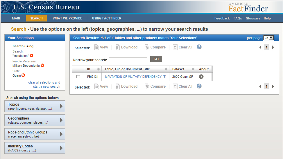
Figure 25. Suggested message/wording when the “Narrow your search” feature is unavailable.
7. Search Results: Usability issues with table titles, ID, and dataset persist. A big problem is that table titles are unhelpful, and in the worst case, misleading.
Vague titles force participants to rely on the dataset information (if they can comprehend the differences) to identify what the table may contain. Participants unfamiliar with the table titles and datasets typically gave up when they encountered the numerous results, or resigned themselves to a sort of “hunt and peck” type search for the correct table.
Repeating table title names were not scannable for many reasons: they were written in all capital letters; they were too wordy with the same words repeated from one entry to the next with the only difference something that most people don’t understand or pay attention to (e.g., the data set column).
Results were confusing for participants who approach every search like a Google search. For example, if they typed in “city limits and borders” they would receive irrelevant results. Participants did not know why the different table titles listed were actually there in the list of results. As we have heard other participants say in earlier studies, participants said that they did not understand why the results were not related to what they had just searched on. See Figure 26 for an example.
As reported in prior studies, the ID column was confusing for novice or general participants. It should not be the first thing that participants see when looking at the list of results.

Figure 26: These results are irrelevant to the participant’s query.
Users expect a few things when conducting a search:
That they will either not find what they are looking for (i.e., it doesn’t exist)
That their expected results will be near the top,
That they will have to do a little refining based on the title and description of the results.
One expert participant, (given the first novice task at the conclusion of his work with the expert tasks) said, “On the actual search engine… it said [United States] at the top… maybe the table title… should have said MD, cause that could be confusing to someone.”
When users receive irrelevant results, they may conclude that AFF does not contain the data. For example, one expert participant entered into QS “Disabled people VA” and received table titles such as “martial language, total population,” but no results on disability.
He concluded, “AFF obviously does not cover that” before starting a new search. After changing his search term, he did find disability characteristics but wrongly concluded the table did not include Virginia. In Task 6, the same expert participant had a similar conclusion when a QS query for “health clubs” resulted in health insurance results. See Figure 27 for an example.
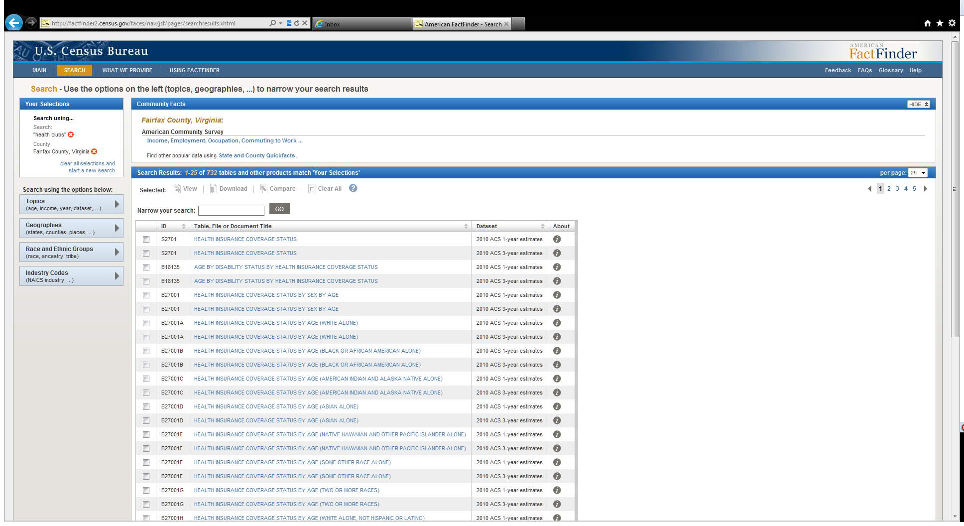
Figure 27: Health Insurance is returned after a search on health clubs.
Recommendation: Results list recommendations include:
Fix table titles to be less vague, less difficult to scan (e.g., Use upper and lower case letters, Use less vague titles)
Include more synonyms (for example, make health club and fitness center synonymous)
Work on the way search queries leads to relevant tables surfacing near the top of the results list
Move the confusing ID label over to the right of the list
Collapse similar table names into one table link (with an option to expand it) so that users do not have to see the same table repeated multiple times. It is our understanding that this recommendation is on the list of items that has been postponed due to budget and time constraints.
Team Response: The recommendation to move the ID column over to the right has been discussed, and, we understood, agreed on at various team meetings as well as in the internal report IBM Response to 4Q2011_R2_draft_2_21_2012, page 4 where the response is that, “The ID column will be moved to be between the dataset and about columns.” It is not clear if this is an oversight or if the team has decided not to move the ID column over to the right of the results list.
28. Participants select the wrong item to add to “Your Selections” because of confusion with apparent duplications (e.g., Race & Ethnicity vs. Race and Ethnic Groups; Age& Sex vs. Age Group).
Recommendation: Consider a listing or card sorting exercise on some of the topic terminology to get the users perspective of which terms should be grouped together.
3.5.3b Medium-Priority Issues
29. Community Facts section was not often used
Although Community Facts is a useful tool, participants tend to ignore the links.
Participants scrolled past Community Facts because they said they expected a list of results after conducting a search.
Some participants did notice Community Facts, as they would comment on the text in it, but would usually jump to the “Search Results” section below. When asked about this in a debriefing, one participant commented that while it would have been helpful, she was expecting a result, which is why she scrolled past it. See Figure 28.
Note: However, not all participants overlooked these links. For example, when one novice participant was asked to find the population of Maryland, he noted that it says Maryland at the top (in Community Facts). He proceeded to click the first link and was successful in finding an estimate.
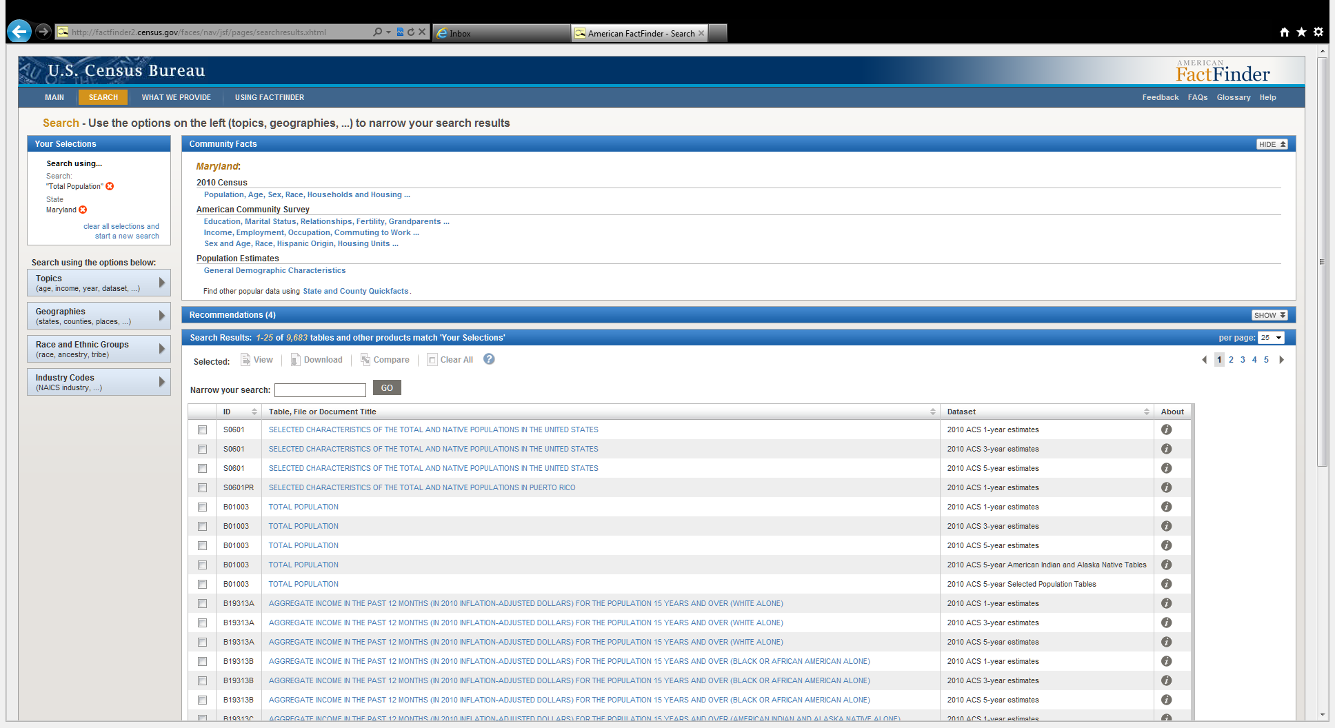
Figure 28: Users expecting search results may overlook Community Facts
Recommendation: Integrate the Community Facts into the search results.
30. Table contents are missed in complex layout, key information is overlooked.
On certain tables, key information such as the location can be missed or overlooked by users such that they may not realize the table is actually what they wanted. Table titles tend to be unhelpful, for example, a title “SELECTED SOCIAL CHARACTERISTICS IN THE UNITED STATES” when the table is listing data for Virginia. This has been reported in earlier rounds (See usability results from internal report 4Q2011_R2) and there have been no changes to the visual layout of the tables.
Participants still have trouble recognizing if the content of a table matches what they are looking for. For example, one participant clicked into a table and decided that Virginia was not mentioned in the table. Luckily, she took a second look at the table and realized it said Virginia in the column header.
Other participants had difficulty with noting the year or geography, thinking they had found the answer to the task when they actually opened a table with an incorrect year, or missed the geography.
Recommendation: For key information such as a geography or year, consider using a combination of font size, color, and styles to differentiate the identifying information from the rest of the text on a table. Put important table information (such as the title) closer to the table itself.
31. Census Bureau jargon persists. Novice participants had trouble with some of the Census Bureau jargon. For example, they did not understand what NAICS was.
One participant had this to say, “These codes, it’s something I don’t understand. Codes. I don’t know. It’s challenging. I don’t know.”
Even among expert participants, those who were unfamiliar with ECON terminology wanted some way to learn more about the codes used on the Web site. One expert participant suggested having the Help “?” icons be specific to the overlay instead of generic help on interacting with the overlays in AFF. (Figure 29 currently shows what happens if you click on the “?” symbol.)

Figure 29: Help focuses on the use of FactFinder rather than the contents
Recommendation: Help should also explain the categories in AFF. For example, it should explain what an Industry Code is, and where they could learn more about the various NAICS codes. Alternatively, within the help, there could be a linked question: “Did you need the definition?” And link to the glossary.
32. QS caused geography confusions for participants.
One novice participant, when asked to find a table on exports to Mexico repeatedly tried to enter Mexico into the Geography section of the QS. This participant may have been confusing “place” in the instruction over the text entry box “state, county, or place” to mean any geography in the world when it actually refers to a city or town. Another participant who tried this (entering Mexico in the “state, county or place” box) may have read “county” as country. Other participants tried looking for Mexico using the geography overlay, or by using QS and searching on “U.S. exports to Mexico.” See Figure 30.

Figure 30: Participant types Mexico into the Geography box in QS
Recommendation: If AFF does not index geographies outside of the USA, the label above the field should specify a state, county or place in the USA. (Note: Our recommendation depends on the intended functionality of the QS. Identify how many countries or cities outside of the USA are entered into the data field and make the change mentioned above if it seems warranted.)
3.5.3c Low-Priority Issues
33. Main page clutter caused some distraction for participants.
Some participants reported that there were too many things on the Web site. For example, one participant pointed out News & Notes should be moved somewhere less prominent. The participant continued to say, “unless you are a statistician you’re not going to care about that [area].”
Recommendation: News & Notes should take up less space on the middle of the page since the Web site serves many users who will not need to know the latest notes or revisions to the tables. Consider moving this section to the side where the users who are not going to need it can ignore it, while still having it available on the main page for those who do use it.
34. All Counties versus State
One expert participant told us that she never uses the “all counties within [state]” to look for information because she assumed she would only get data at the state level. Instead, she opted to select all the individual counties and add them to her selections. She later decided to try it just to see what happens and realized it does not aggregate all the counties.

Figure 31: All Counties within Virginia could mean the overall statistic for Virginia
Recommendation: The wording could be clarified, to “Each county in Virginia”. However, there is no user testing to backup this suggestion. The participant who pointed out the issue said, “What would be helpful is if it said 64 counties since I’m not sure.”
35. Native American / Tribal Areas in Geography List caused some confusion
One participant mentioned specific issues she had with locating American Indian Reservation data. The geography filtering for a list does not work for American Indian Reservations. For example, in Figure 32, Montana is entered to the “Your Selections” yet the Geographies overlay shows all other reservations outside of Montana as selectable options.
Another issue is the small differentiation between Fort Peck the Indian Reservation, and Fort Peck the Reservation.

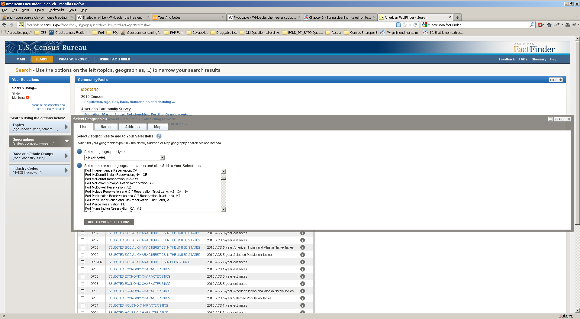
Figure 32: Lack of Filtering for American Indian Reservations
Recommendation: Fine tune the listing making sure there are actual distinctions between the listed items, and remove any redundant items.
36. Type ahead lead some participants astray
On some occasions we noticed that a user would unintentionally select a type-ahead result when they meant to search for the exact term they had typed.
Recommendation: Watch user performance with type-ahead in future studies and see if any issues persist with user comprehension. If the type aheads do not seem to be used, or continue to be used incorrectly, we recommend disabling the type ahead, or generalizing it so that you get more synomys instead of complete table titles.
4.0 Discussion
Baseline: In the Baseline study, participants said that they enjoyed using the American FactFinder Web site. Satisfaction scores were moderately high, but accuracy scores for complex tasks were moderately low. The biggest complaint from users and the biggest usability issue was that the search function did not work in the way people expected it to. It did not provide users with help and/or answers when they could not otherwise find what they were looking for.
2011 Follow Up: Usability testing of the new version of the new AFF Web site identified numerous high-priority issues that impede users from completing tasks. The 2011 Follow-Up had major interface design issues that stymied users before they could really get started with the new AFF Web site. Some of the main problems included:
Confusion with “Your Selections,” lack of understanding on how it was connected with their search for information
Confusion with the geography overlay
Problems with the “Search Results” section that has table labels that are not in plain language, not what they are searching for
There was one novice user that appeared to understood the site and one other that appeared to learn the site by the end of the session. The less Web-savvy users wanted more guidance and were slower to explore some of the different features of the site, if they did at all.
As with all recommendations we suggest further usability testing with typical users to identify if the recommended fixes to the user interface work, and to identify any new usability issues that might come from the design changes.
2012 Follow Up: In the 2012 Follow-Up study, participants continued to experience major problems with the interface design of the New AFF Web site. Data Finder continued to be problematic for novice and expert users who were unfamiliar with the way AFF worked. A number of the usability problems identified in this round of testing had been identified in prior rounds of usability testing. A few of the bigger problems are with the search, with users not understanding how “Your Selections” works, and with issues users have with the table titles in the Search Results section of the screen. While expert participants were able to use the site as well as or better than the legacy site, novice or more general participants continue to struggle with an interface that is overly complex. For nine out of the ten tasks assigned novice participants decreased in their accuracy, and efficiency. Satisfaction also decreased, reflecting the difficulty users had with the Web site.
The presence of QS occasionally helped users who could identify the most relevant keywords, but also hampered users by leading them to search results that contained vague table titles, or irrelevant results. Novice participants relied on QS rather than using the overlays, but more than one user said, “it wasn’t so Quick.”
Expert results were mixed for accuracy and efficiency, with a general trend of improvement across the six tasks. However, satisfaction declined for the 2012 Follow-Up expert participants, possibly because many of these expert users had used the legacy version of the AFF.
References
Andre, A. D., & Wickens, C. D. (1995). When users want what's NOT best for them. Ergonomics in Design, 4, 10-14.
Beck, J. & Murphy, E. (2008). Usability evaluation of the Wholesale Trade Survey Web site; (Statistical Research Division Study Series SSM2008-15). U.S. Census Bureau. http://www.census.gov/srd/papers/pdf/ssm2008-15.pdf.
Nielsen, J, (1999). Designing Web Usability. Thousand Oaks, CA: New Riders.
Chin, J.P., Diehl, V., and Norman, K. L. (1988). “Development of an instrument measuring user satisfaction of the human-computer interface.” In Proceedings of CHI 88, ACM Press, 213-218.
Forsyth, C., Grose, E. & Ratner, J. (1998). Human Factors and Web Development. Mahwah, NJ: Erlbaum.
Krug, S. (2006). Don’t Make Me Think! A Common Sense Approach to Web Usability (2nd ed.). Berkeley, CA: New Riders.
Malakhoff, L. (2007). An Accessibility and usability evaluation of the X-12 Arima Graphing Application; Human-computer interaction memorandum series #104. (Submitted to Demetra Lytras, Office of Statistical Methods, Research Economics Program). U.S. Census Bureau.
Olmsted-Hawala, E., Murphy, E., Hawala, S., & Ashenfelter, K. (2010). “Think-Aloud Protocols: A Comparison of Three Think-Aloud Protocols for use in Testing Data-Dissemnation Web Sites for Usability.” Proceedings of CHI 2010, ACM Conference on Human Factors in Computing Systems, 2381-2390.
Bergstrom, J., Chen, J. & Holland, T. (2011). “A Taxonomy of Usability Issues in US Census Bureau Web Sites: A Review of 12 Years of Web Site Usability Test Reports.” (Statistical Research Division Study SSM#2011-09). U.S. Census Bureau. http://www.census.gov/srd/papers/pdf/ssm2011-09.pdf
Romano, J. & Murphy, E. (2008). A usability evaluation of the economic census web site; (Statistical Research Division Study Series SSM2008-11). U.S. Census Bureau. http://www.census.gov/srd/papers/pdf/ssm2008-11.pdf.
Romano Bergstrom, J., Olmsted-Hawala, E., Chen, J., and Murphy, E. (2011). “Conducting Iterative Usability Testing on a Web Site: Challenges and Benefits,” Journal of Usability Studies. 7(1): 9-30. http://www.upassoc.org/upa_publications/jus/2011november/index.html
Appendix A: Tasks from 2008, 2011, & 2012
Novice Tasks
Table 12: Novice Tasks throughout the Years
Novice Task Number |
Novice Task Question |
||
November 2008 Baseline |
June 2011 Follow Up |
June 2012 Follow Up |
|
1 |
1 |
1 |
You are thinking about moving to Maryland and want to get as much information as you can about Maryland, including how many people live there. How many people live in Maryland? |
2 |
2 Year changed from 2006 to 2000 |
2 Year changed from 2006 to 2009 |
You are doing research for a project on poverty and want to know which three states had the most people living in poverty in 2006. Are you able to print this information for later use? |
3 |
Task not used, content was not loaded |
3 Year changed from 2002 to 2007. |
You are doing a project about businesses in America through the years. You want to know what type of U.S. business had the highest amount of sales in 2002? |
4 |
Task not used content was not loaded |
4 Wording changed “go to Mexico” from “come from China.” |
What percent of U.S. imports currently come from China? |
5 |
Task not used content was not loaded |
5 Wording tweaked to remove DC, year changed to 2010. |
How many people worked for the government in DC in 2002? |
6 |
6 |
6 |
You are doing a report on education. You want to know what percent of the total population in Virginia, Kansas, Maryland and Texas were college-educated in 2006. |
7 |
7 |
7 |
You are working on a project that involves city limits and you are interested in finding the borders of the city of Fairfax in 2000. You would like this information to be displayed visually as you are a visual learner. |
8 |
8 Year rage changed “from 2006 to 2008” |
8 |
You are interested in demographic changes in the U.S. and want to know what the fastest growing age group was, over the age of 45, from 2006 to 2007?
|
9 |
Task not used content was not loaded |
9 Task re-written as content no longer on site, not comparable |
B
Note:
Task 9 is not comparable across baseline and 2012. 2012 Follow Up: You are interested in various states’ labor costs and are interested in finding out which State had the greatest annual payroll in 2002
|
10 |
10 Date change from 2007 to 2000. |
10 Date change back to 2007. |
You are interested in finding the average salary of households in Virginia and Maryland for 2007. Which state had the highest average household salary? |
Expert Tasks
Table 13: Expert tasks throughout the Years
Expert Task Number |
Expert Task Question |
||
Baseline |
June 2011 Follow Up |
June 2012 Follow Up |
|
1 |
NA* |
1 |
You plan to move to one of the following cities— Seattle, WA; San Francisco, CA; Washington, DC— and would like to know the average income of females in each city for the last three years. You would like to come back to this information later. You wonder if there is any way to be able to access it all again without having to go through all those steps. |
2 |
NA* |
2 |
You would like to know the total number of finance and insurance companies in 2002, together. Then, you would like to make some comparisons between the two industries (finance and insurance). You don’t want to see extraneous information, but you would like to see the information displayed with the number of employees first, payroll second and revenue last. |
3 |
NA* |
3 |
You would like to find a map that displays the counties in California with the most recent data on the average housing values of all homes that are owned (as opposed to rented). Is there a county in Southern California that has a price range between $350,000 and $540,000? |
4 |
NA* |
4 Task was changed to obtaining a list of the Number of Establishments in the state of California by from the County Business Patterns database for 2008. |
You are interested in the income of senior citizens living in each county in Florida in 2007. You would like to gather the number of households with retirement income and the total retirement income in each county. Once you have these data displayed together, you would like to arrange the data by the highest total retirement income. Then you would like to save your work for later reference. |
5 |
NA* |
5 |
You would like to know the percent of disabled people in Virginia who are at least 65 years old in 2006. You would also like to find the county with the highest percentage of disabled people. You are looking not just for the numbers but for a map for a presentation you are preparing. When you find the information, you would like to save it in a format that would allow you to insert it into a PowerPoint presentation. |
6 |
NA* |
6 |
You are looking for the number of health clubs in the following counties in Virginia: Prince William, Fairfax, Stafford, Fauquier, and Loudoun. When you find the information you need, you would like to save it for later use. |
NA* = No testing was done in 2011 with expert participants.
Appendix B: Participant Demographics
Table 14. Novice 2008 participants’ self-reported computer and Internet experience.
|
|
Scale: 1:No Experience - 9:Very Experienced |
Scale: 1:Not Comfortable - 5:Comfortable |
Scale: 1:Never - 5:Very Often |
|||||
Participant |
Hours per day on the Internet |
Overall experience with computers |
Overall experience with Internet |
Comfort in learning to navigate new Web sites |
Comfort in manipulating a window |
Comfort in using and navigating the Internet |
How often working with data through a computer |
How often working with complex analyses of data through a computer |
How often using the Internet or Web sites to find information |
1 |
2 |
9 |
8 |
4 |
4 |
5 |
5 |
4 |
5 |
2 |
2 |
8 |
7 |
5 |
5 |
5 |
5 |
5 |
5 |
3 |
2 |
8 |
8 |
3 |
3 |
4 |
4 |
1 |
4 |
4 |
2 |
7 |
9 |
5 |
5 |
5 |
5 |
4 |
5 |
5 |
5 |
8 |
9 |
5 |
5 |
5 |
3 |
2 |
4 |
6 |
2 |
2 |
5 |
4 |
2 |
5 |
1 |
1 |
2 |
7 |
2 |
8 |
7 |
5 |
4 |
4 |
4 |
3 |
5 |
9 |
5 |
5 |
7 |
3 |
3 |
4 |
3 |
3 |
5 |
10 |
7 |
9 |
9 |
5 |
5 |
5 |
4 |
1 |
5 |
Average across participants |
3.22 |
7.11 |
7.67 |
4.33 |
4.00 |
4.67 |
3.78 |
2.67 |
4.44 |
Table 15: Novice 2011 participants' self-reported computer and Internet experience.
|
|
Scale: 1:No Experience - 9:Very Experienced |
Scale: 1:Not Comfortable - 5:Comfortable |
Scale: 1:Never - 5:Very Often |
|||||
Participant |
Hours per day on the Internet |
Overall experience with computers |
Overall experience with Internet |
Comfort in learning to navigate new Web sites |
Comfort in manipulating a window |
Comfort in using and navigating the Internet |
How often working with data through a computer |
How often working with complex analyses of data through a computer |
How often using the Internet or Web sites to find information |
1 |
5 |
8 |
8 |
5 |
5 |
5 |
5 |
3 |
5 |
2 |
5 |
7 |
7 |
5 |
5 |
5 |
5 |
4 |
5 |
3 |
5 |
6 |
9 |
4 |
3 |
5 |
3 |
1 |
5 |
4 |
7 |
7 |
9 |
5 |
5 |
5 |
2 |
1 |
5 |
5 |
5 |
7 |
9 |
4 |
5 |
5 |
2 |
1 |
3 |
6 |
2 |
8 |
9 |
5 |
5 |
5 |
3 |
3 |
5 |
7 |
2 |
7 |
7 |
3 |
3 |
3 |
1 |
1 |
4 |
9 |
5 |
9 |
8 |
4 |
5 |
5 |
4 |
2 |
4 |
10 |
7 |
8 |
8 |
4 |
5 |
5 |
4 |
2 |
5 |
Average across participants |
4.78 |
7.44 |
8.22 |
4.33 |
4.56 |
4.78 |
3.22 |
2.00 |
4.56 |
Table 16: Novice 2012 participants' self-reported computer and Internet experience.
|
|
Scale: 1:None - 5: A Great Deal |
Scale: 1:Not Difficult At All - 5:Very Difficult |
Scale: 1:Never - 5:Very Often |
|||||
Participant |
Hours per week on the Internet |
Overall experience with computers |
Overall experience with Internet |
Difficulty in learning to navigate new Web sites |
Difficulty in manipulating a window |
Difficulty in using and navigating the Internet |
How often working with data through a computer |
During last month, how many times did you do complex analyses of data using a computer? |
How often using the Internet or Web sites to find information |
1 |
33 |
5 |
5 |
2 |
1 |
1 |
- |
0 |
- |
2 |
28 |
3 |
5 |
2 |
2 |
1 |
- |
1 |
- |
3 |
30 |
3 |
3 |
1 |
1 |
1 |
- |
0 |
- |
9 |
NA |
NA |
5 |
1 |
1 |
NA |
- |
NA |
- |
10 |
NA |
NA |
4 |
2 |
1 |
NA |
- |
NA |
- |
11 |
NA |
NA |
4 |
1 |
1 |
NA |
- |
NA |
- |
12 |
29 |
3 |
3 |
2 |
1 |
2 |
- |
0 |
- |
13 |
22 |
4 |
5 |
1 |
1 |
1 |
- |
0 |
- |
17 |
18 |
5 |
5 |
1 |
1 |
1 |
- |
0 |
- |
Average across participants |
|
3.83 |
4.33 |
1.44 |
1.11 |
1.17 |
- |
0.17 |
- |
- Indicates that this question was not asked, information is collected in other question or during screener.
- Please note some of the questions asked have been changed or have had their scales changed.
Table 17: Expert Baseline participants' self-reported computer and Internet experience (2009).
|
|
Scale: 1:No Experience - 9:Very Experienced |
Scale: 1:Not Comfortable - 5:Comfortable |
Scale: 1:Never - 5:Very Often |
|||||
Participant |
Hours per day on the Internet |
Overall experience with computers |
Overall experience with Internet |
Comfort in learning to navigate new Web sites |
Comfort in manipulating a window |
Comfort in using and navigating the Internet |
How often working with data through a computer |
How often working with complex analyses of data through a computer |
How often using the Internet or Web sites to find information |
1 |
4-6 |
9 |
9 |
5 |
5 |
5 |
5 |
5 |
5 |
2 |
1-3 |
9 |
9 |
5 |
5 |
5 |
5 |
4 |
5 |
3 |
4-6 |
9 |
9 |
5 |
5 |
5 |
5 |
4 |
5 |
4 |
1-3 |
8 |
8 |
4 |
4 |
4 |
4 |
4 |
5 |
5 |
4-6 |
9 |
9 |
5 |
5 |
5 |
5 |
5 |
5 |
6 |
4-6 |
7 |
6 |
4 |
4 |
5 |
3 |
2 |
4 |
7 |
1-3 |
7 |
7 |
4 |
5 |
4 |
5 |
4 |
4 |
8 |
1-3 |
7 |
7 |
4 |
5 |
5 |
5 |
5 |
4 |
9 |
4-6 |
7 |
8 |
5 |
5 |
5 |
5 |
5 |
5 |
10 |
1-3 |
7 |
7 |
4 |
4 |
5 |
5 |
5 |
5 |
11 |
7 or more |
6 |
6 |
4 |
4 |
4 |
5 |
4 |
5 |
12 |
4-6 |
7 |
7 |
5 |
5 |
5 |
5 |
4 |
5 |
13 (Grad 6) |
1-3 |
8 |
8 |
5 |
5 |
5 |
4 |
3 |
5 |
Average across participants |
|
4.54 |
4.69 |
4.77 |
4.69 |
4.15 |
4.77 |
4.54 |
4.69 |
Table 18: Expert 2012 Follow Up participants' self-reported computer and Internet experience.
|
|
Scale: 1:None - 5: A Great Deal |
Scale: 1:Not Difficult At All - 5:Very Difficult |
Scale: 1:Never - 5:Very Often |
|||||
Participant |
Hours per week on the Internet |
Overall experience with computers |
Overall experience with Internet |
Difficulty in learning to navigate new Web sites |
Hours per week on the Internet |
Overall experience with computers |
How often working with data through a computer |
How often working with complex analyses of data through a computer |
How often using the Internet or Web sites to find information |
4 |
28 |
4 |
5 |
1 |
1 |
1 |
- |
0 |
- |
5 |
26 |
4 |
4 |
1 |
1 |
1 |
- |
15 |
- |
6 |
17 |
5 |
5 |
1 |
2 |
1 |
- |
50 |
- |
7 |
23 |
4 |
5 |
1 |
1 |
1 |
- |
20 |
- |
8 |
NA |
NA |
5 |
1 |
1 |
NA |
- |
NA |
- |
14 |
29 |
4 |
5 |
1 |
1 |
1 |
- |
3 |
- |
15 |
26 |
5 |
5 |
1 |
1 |
1 |
- |
450 |
- |
16 |
27 |
5 |
5 |
2 |
1 |
1 |
- |
0 |
- |
18 |
14 |
5 |
5 |
2 |
1 |
1 |
- |
5 |
- |
Average across participants |
23.75 |
4.50 |
4.89 |
1.22 |
1.11 |
1.00 |
- |
67.88 |
- |
- Indicates that this question was not asked on the Background questionnaire, information was collected in other questions or during screener.
-Please note some of the questions asked have been changed or have had their scales changed.
Appendix C: Protocol
General Introduction for Baseline AFF Web Site20
Thank you for your time today. My name is (Test Administrator). I work here in the U.S. Census Bureau Usability Lab, and I will be working with you today. In this lab, we evaluate how easy or difficult Census products are to use. We bring in people like you who are potential users of our products to try them out while there is still time to make changes to them. What works well, we keep. When potential users such as you have difficulty with something, we have an opportunity to fix it.
Today, we will be evaluating the American Factfinder Web site by having you work on several tasks. There are two parts to our session. First, you will complete 10 tasks using the American FactFinder Web site. Then, at the end of the session, you’ll fill out a questionnaire about your experience during the session. The entire session should last about an hour.
Before we start, there is a form I would like you to read and sign. It explains the purpose of today’s session and your rights as a participant. It also informs you that we would like to videotape the session to get an accurate record of your feedback. Only those of us connected with the project will review the tape and it will be used solely for research purposes. Your name will not be associated with the tape or any of the other data collected during the session.
[Hand consent form; give time to read and sign; sign own name and date.]
Thank you.
Before we start, I want to tell you that you can’t make a mistake or do anything wrong here. Difficulties you may run into reflect the design of the Web site, not your skills or abilities. This product is intended for people like you. Where it works well, that’s great. But if you have a problem using parts of it, do not blame yourself. We are going to use your comments and data as well as comments and data from the other participants to give feedback to the developers of the site. Your comments and thoughts will help the developers make changes to improve the site. I did not create the site, so please do not feel like you have to hold back on your thoughts to be polite. We are not evaluating you or your skills, but rather you are helping us see how well the site works. Please share both your positive and negative reactions to the site. And remember, there are no right or wrong answers.
In addition to the tasks I am about to give you, we are also going to do some eye tracking to record where you are looking on the screen. It will be very simple. In a moment we will do a very short simple task that will allow the computer to find your eyes.
I am going to give you 10 tasks to work on. Your comments are very important to us. I’d like you to tell me your impressions and thoughts as you work through the tasks. So give me your open impressions, both good and bad of what you see and what you experience on the site.
While you are working, I’d like you to think aloud. In other words, I’d like you to tell me what you are thinking, describe the steps you are taking, what you are expecting to see, why you are doing what you are doing, what you are going to do, and why. Tell me why you clicked on a link or where you expect the link to take you. Tell me if you are looking for something and what it is and whether you can find it or not.
Ok, now we will practice thinking aloud. [open www.craigslist.com and do practice question.]
Ok, that was fine. Do you have any questions about the “think-aloud” process we’ve just practiced and that I have asked you to use?
Ok, let’s do the eye-tracking calibration now. I am going to have you position yourself in front of the screen so that you can see your nose in the reflection at the bottom of the monitor. To calibrate your eyes, please follow the blue dot across the screen with your eyes.
Now that we have your eyes calibrated, we are ready to begin. Here are your task questions. When we are ready to begin, you will be working with them. Also, here is the questionnaire you will complete at the very end. I will tell you when to complete this.
[Set the task questions and questionnaire by participant.]
I am going to go around to the other room and do a sound check. While I am doing that, please take a moment to complete this computer usage and internet experience questionnaire. I am going to leave, but we will still be able to communicate through a series of microphones and speakers. Do you have any questions?
[Hand computer experience form, and go into control room.]
[Start video recording.]
For the next 60 minutes, I will ask you to work on the 10 tasks. We will begin each task by having you read the task question out load. As you work, remember to talk to me about what you are thinking and feeling. Once you have found the information you are looking for please state your answer aloud. For example, say, “My answer is ---” or “This is my final answer” and please write your answer on the sheet too. After each task, I will return you to the page where you can begin the next task.
Appendix D: Consent Form

Consent Form For Individual Participants
Usability Testing of the American FactFinder Web Site
Each year the Census Bureau conducts many different usability evaluations. For example, the Census Bureau routinely tests the wording, layout and behavior of products, such as Web sites and online surveys and questionnaires in order to obtain the best information possible.
You have volunteered to take part in a study to improve the usability of the American FactFinder Web site. In order to have a complete record of your comments, your usability session will be videotaped. We plan to use the tapes to improve the design of the product. Only staff directly involved in the research project will have access to the tapes. Your participation is voluntary and your answers will remain strictly confidential.
This usability study is being conducted under the authority of Title 13 USC. The OMB control number for this study is 0607-0725. This valid approval number legally certifies this information collection.
I have volunteered to participate in this Census Bureau usability study, and I give permission for my tapes to be used for the purposes stated above.
Participant’s Name: _____________________________________
Participant's Signature: ___________________________________ Date: __________
Researcher’s Name: ______________________________________
Researcher's Signature: ____________________________________ Date: __________
Appendix E. Questionnaire on Computer Use and Internet Experience
1. Do you use a computer at home or at work or both?
(Check all that apply.)
___Home
___Work
2. If you have a computer at home,
a. What kind of modem do you use at home?
___Dial up
___Cable
___Other __________
___Don’t know
b. Which browser do you typically use at home? Please indicate the version if you can recall it.
___Firefox
___Internet Explorer
___Netscape
___Other ___________
___Don’t know
c. What operating system does your home computer run in?
___MAC OS
___Windows 95
___Windows 2000
___Windows XP
___Windows Vista
___Other ___________
___Don’t know
3. On average, about how many hours do you spend on the Internet per day?
___0 hours
___1-3 hours
___4-6 hours
___7 or more hours
4. Please rate your overall experience with the following:
Circle one number.
No experience Very experienced
Computers 1 2 3 4 5 6 7 8 9
Internet 1 2 3 4 5 6 7 8 9
5. What computer applications do you use?
Mark (X) for all that apply
___ E-mail
___ Internet
___ Word processing (MS-Word, WordPerfect, etc.)
___ Spreadsheets (Excel, Lotus, Quattro, etc.)
___ Accounting or tax software
___ Engineering, scientific, or statistical software
___ Other applications, please specify____________________________
For the following questions, please circle one number.
6. How comfortable are you in learning to navigate new Web sites?
|
Not Comfortable Comfortable
1 2 3 4 5 |
|
|
7. Computer windows can minimize, resize, and scroll through. How comfortable are you in manipulating a window?
8. How comfortable are you using and navigating through the Internet?
9. How often do you work with any type of data through a computer?
10. How often do you perform complex analyses of data through a computer?
11. How often do you use the Internet or Web sites to find information? (e.g., printed reports, news articles, data tables, blogs, etc.)
12. How familiar are you with the Census (terms, data, etc)?
13. How familiar are you with the current American Factfinder Web site (terms, data, etc.)? |
1 2 3 4 5
1 2 3 4 5
Never Very Often
1 2 3 4 5
1 2 3 4 5
1 2 3 4 5
Not familiar Very familiar 1 2 3 4 5
1 2 3 4 5
|
||
Appendix F. Final Satisfaction Questionnaire Baseline and 2011 Follow Up
Please circle the numbers that most appropriately reflect your impressions about using this Web -based instrument.
1. Overall reaction to the Web site: |
terrible wonderful |
||||||||||
|
1 |
2 |
3 |
4 |
5 |
6 |
7 |
8 |
9 |
not applicable |
|
2. Screen layouts: |
confusing clear |
||||||||||
|
1 |
2 |
3 |
4 |
5 |
6 |
7 |
8 |
9 |
not applicable |
|
3. Use of terminology throughout the Web site: |
inconsistent consistent |
||||||||||
|
1 |
2 |
3 |
4 |
5 |
6 |
7 |
8 |
9 |
not applicable |
|
4. Information displayed on the screens: |
inadequate adequate |
||||||||||
|
1 |
2 |
3 |
4 |
5 |
6 |
7 |
8 |
9 |
not applicable |
|
5. Arrangement of information on the screen: |
illogical logical |
||||||||||
|
1 |
2 |
3 |
4 |
5 |
6 |
7 |
8 |
9 |
not applicable |
|
6. Tasks can be performed in a straight-forward manner: |
never always |
||||||||||
|
1 |
2 |
3 |
4 |
5 |
6 |
7 |
8 |
9 |
not applicable |
|
7. Organization of information on the site: |
confusing clear |
||||||||||
|
1 |
2 |
3 |
4 |
5 |
6 |
7 |
8 |
9 |
not applicable |
|
8. Forward navigation: |
impossible easy |
||||||||||
|
1 |
2 |
3 |
4 |
5 |
6 |
7 |
8 |
9 |
not applicable |
|
9. Overall experience of finding information: |
difficult easy |
||||||||||
|
1 |
2 |
3 |
4 |
5 |
6 |
7 |
8 |
9 |
not applicable |
|
10. Census Bureau-specific terminology: |
too frequent appropriate |
||||||||||
|
1 |
2 |
3 |
4 |
5 |
6 |
7 |
8 |
9 |
|
|
Additional Comments:
Final Satisfaction Questionnaire: 2012 Follow Up
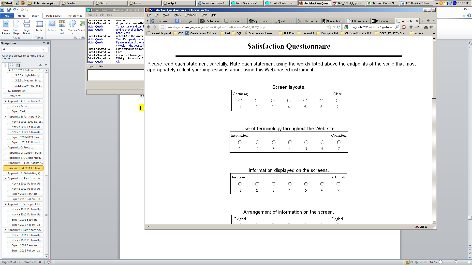

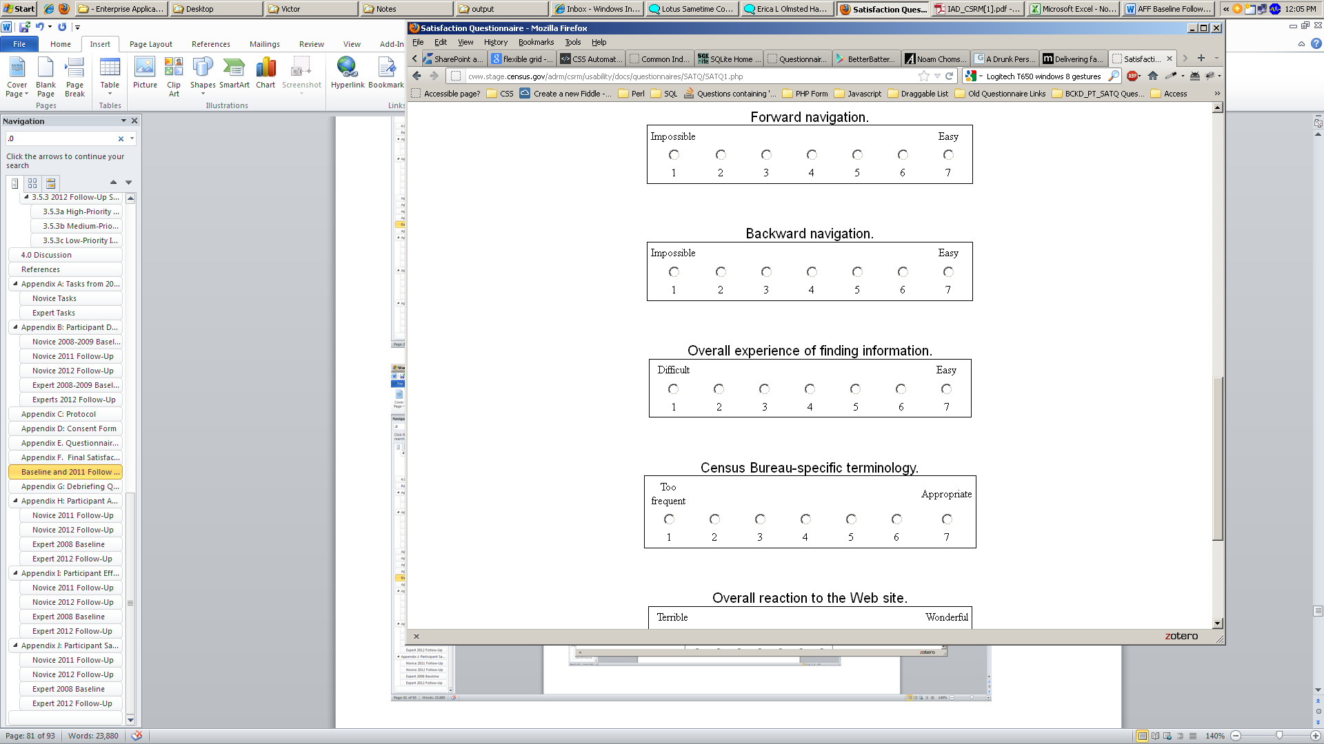
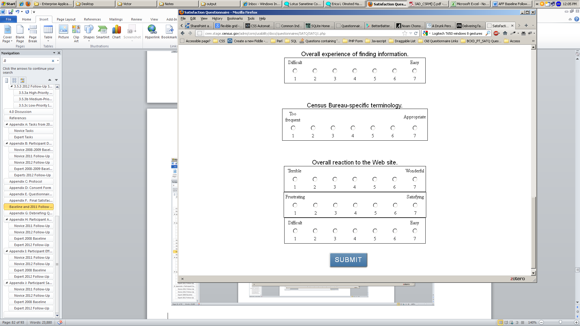
Appendix G: Debriefing Questionnaire for Baseline and Follow Up AFF Usability Tests
1. Can you walk me through your thinking on why you marked (a particular QUIS item) especially low/high? (Do this for several low/high QUIS ratings).
2. What do you think of the basic screen layout?
a. Overall?
b. Colors?
c. Links and information around the center pane?
d. Context of the information on the homepage?
e. Other?
3. What do you think of the navigational methods?
a. Previous and Next buttons?
b. Drop down menus across the center navigation?
c. Links on the sides of the pages?
d. Other?
4. What did you like best about the Web site?
5. What did you like least about the Web site?
6. Is there anything that you feel should be changed?
7. Is there anything that you feel should stay the same?
8. How easy or difficult do you feel it was to complete the tasks? What made a task easy or difficult?
9. Is there anything you would like to mention that we haven’t talked about?
10. Additional Comments:
Appendix H: Participant Accuracy Scores
Table 19. Novice 2008 Baseline Accuracy Scores
|
TASK |
|
|||||||||||
Simple Tasks |
Complex Tasks |
||||||||||||
Participant |
1 |
2 |
3 |
4 |
5 |
6 |
7 |
8 |
9 |
10 |
Overall Success Rate |
Simple Tasks Success Rate |
Complex Tasks Success Rate |
1 |
success |
success |
success |
success |
failure* |
success |
failure* |
success |
failure |
success |
70% |
71% |
67% |
2 |
success |
success |
success |
success |
success |
success |
success |
success |
success |
success |
100% |
100% |
100% |
3 |
failure |
failure* |
success |
failure* |
failure |
failure |
failure*** |
failure* |
failure* |
failure* |
10% |
14% |
0% |
4 |
success |
failure* |
success |
success |
success |
Failure |
failure*** |
failure |
failure |
ERROR |
44% |
57% |
0% |
5 |
success |
success |
success |
success |
success |
Success |
success |
failure |
failure |
success |
80% |
100% |
33% |
6 |
success |
success |
failure |
failure |
failure* |
Failure |
failure*** |
failure |
success |
failure |
30% |
29% |
33% |
7 |
success |
failure* |
failure |
success |
success |
Success |
failure* |
failure |
failure |
failure |
40% |
57% |
0% |
9 |
success |
success |
success |
success |
success |
success** |
success |
failure* |
failure |
failure^ |
70% |
100% |
0% |
10 |
success |
failure |
success |
success |
success |
success |
failure*** |
failure |
failure |
failure |
50% |
71% |
0% |
Success by Task |
89% |
56% |
78% |
78% |
67% |
67% |
33% |
22% |
22% |
38% |
55% |
67% |
27% |
* Task was stopped by the Test Administrator or by the Participant.
** Task completed, but with Test Administrator probes. See Appendix B for details.
*** Participant stopped zooming in on the map when in the vicinity.
^ Participant was correct, but had guessed based on '06 data. He said, “It probably hasn't changed much in a year”
Table 20. Novice 2011 Accuracy Scores
|
TASK |
|
|||||||
Simple Tasks |
Complex Tasks |
||||||||
Participant |
1 |
2 |
6 |
7 |
8 |
10 |
Overall success rate |
Simple task success rate |
Complex task success rate |
1 |
success |
failure |
failure |
success |
failure |
success |
50% |
50% |
50% |
2 |
failure |
failure |
failure |
failure |
failure |
failure |
0% |
0% |
0% |
3 |
failure |
failure |
failure |
failure |
failure |
failure |
0% |
0% |
0% |
4 |
success |
success |
50% success** |
success |
failure |
success |
75% |
88% |
50% |
5 |
failure |
failure |
failure |
failure |
failure |
success |
17% |
0% |
50% |
7 |
failure |
failure |
failure |
failure |
failure |
failure |
0% |
0% |
0% |
8 |
success |
failure |
failure |
failure |
failure |
failure |
17% |
25% |
0% |
9 |
success |
75% success* |
success |
success |
success |
success |
96% |
94% |
100% |
10 |
failure |
failure |
failure |
error on site*** |
failure |
failure |
0% |
0% |
0% |
Success by task |
44% |
19% |
17% |
38% |
11% |
44% |
29% |
29% |
28% |
* Participant got two of the three states correct and knew how to print the information.
** Participant found the correct information but could not map it.
*** It seemed that the participant was on the right track to finding the information, but the Web site was freezing when he tried to get to the maps.
Table 21: Novice 2012 Accuracy Scores
|
TASK |
|
|||||||||||
Simple Tasks |
Complex Tasks |
||||||||||||
Participant |
1 |
2 |
3 |
4 |
5 |
6 |
7 |
8 |
9 |
10 |
Overall success rate |
Simple task success rate |
Complex task success rate |
1 |
success |
failure |
failure |
failure |
failure |
NA |
NA |
NA |
NA |
NA |
10% |
20% |
NA |
2 |
failure |
NA |
NA |
NA |
NA |
failure |
failure |
failure |
failure |
NA |
0% |
0% |
0% |
3 |
success |
failure |
failure |
failure |
success |
failure |
NA |
NA |
NA |
NA |
10% |
20% |
NA |
9 |
success |
failure |
failure |
failure |
failure |
failure |
failure |
failure |
failure |
success |
20% |
14% |
33% |
10 |
failure |
failure |
success |
success |
failure |
failure |
failure |
failure |
failure |
success |
30% |
29% |
33% |
11 |
success |
failure |
failure |
failure |
failure |
success |
failure |
failure |
failure |
success |
20% |
29% |
33% |
12 |
success |
failure |
failure |
failure |
failure |
50% |
failure |
failure |
failure |
NA |
15% |
19% |
0% |
13 |
success |
failure |
failure |
success |
NA |
NA |
success |
50% |
failure |
success |
40% |
50% |
50% |
17 |
success |
failure |
failure |
failure |
failure |
75%* |
success |
success |
NA |
NA |
38% |
34% |
100% |
20 |
success |
failure |
failure |
failure |
failure |
success |
failure |
NA |
NA |
50%* |
25% |
29% |
50% |
Success by task |
80% |
0% |
11% |
22% |
0% |
32% |
25% |
17% |
0% |
90% |
21% |
24% |
38% |
*
Found the correct table but read the wrong number
NA =
participant did not do the task, due to time limitations
Table 22: Expert Baseline Accuracy Scores
|
TASK |
|
||||||
Participant |
1 |
2 |
3 |
4 |
5 |
6 |
Overall success rate |
|
1 |
failure |
success |
success |
success |
success |
success |
90% |
|
2 |
success |
50% |
success |
success |
failure |
failure |
55% |
|
3 |
success |
success |
success |
success |
success |
success |
100% |
|
4 |
failure |
success |
failure |
failure |
failure |
50% |
27% |
|
5 |
50% |
failure |
failure |
failure |
50% |
success |
36% |
|
6 |
50% |
failure |
failure |
failure |
NA |
NA |
17% |
|
7 |
failure |
failure |
failure |
NA |
NA |
NA |
0% |
|
8 |
50% |
failure |
failure |
failure |
success |
NA |
33% |
|
9 |
50% |
success |
success |
success |
NA |
failure |
67% |
|
10 |
NA |
NA |
NA |
NA |
NA |
NA |
NA |
|
11 |
50% |
success |
failure |
50% |
NA |
failure |
44% |
|
12 |
50% |
failure |
NA |
failure |
success |
NA |
38% |
|
13 |
failure |
50% |
failure |
failure |
success |
failure |
27% |
|
Success by task |
42% |
50% |
36% |
41% |
69% |
44% |
45% |
|
NA = participant did not do the task, due to time limitations
Table 23: Expert 2012 Follow Up Accuracy Scores
|
TASK |
|
||||||
Participant |
1 |
2 |
3 |
4 |
5 |
6 |
Total |
|
4 |
failure |
failure |
failure |
failure |
failure |
failure |
0% |
|
5 |
success |
success |
success |
success |
success |
success |
100% |
|
6 |
success |
failure |
success |
success |
success |
failure |
67% |
|
7 |
success |
success |
success |
success |
success |
success |
100% |
|
8 |
failure |
failure |
failure |
success |
failure |
failure |
17% |
|
14 |
success |
success |
50% |
success |
success |
success |
92% |
|
15 |
failure |
failure |
failure |
failure |
success |
NA |
20% |
|
16 |
failure |
failure |
failure |
failure |
NA |
NA |
0% |
|
18 |
success |
success |
failure |
success |
success |
failure |
67% |
|
19 |
failure |
failure |
75% |
success |
50% |
failure |
38% |
|
Success by task |
50% |
40% |
43% |
70% |
72% |
38% |
50% |
|
NA = participant did not do the task, due to time limitations
Appendix I: Participant Efficiency Scores
Table 24. Novice 2008 Baseline Efficiency Scores: Time in minutes (m) and seconds (s) to complete each task
|
TASK |
|
|||||||||||
Simple Tasks |
Complex Tasks |
||||||||||||
1 |
2 |
3 |
4 |
5 |
6 |
7 |
8 |
9 |
10 |
Mean Time by Participant |
|||
Participant |
Total |
Simple |
Complex |
||||||||||
1 |
2m4s |
2m45s |
52s |
32s |
7m31s* |
3m5s |
8m9s* |
4m11s |
3m38s* |
1m38s |
2m10s |
1m52s |
2m55s |
2 |
28s |
1m54s |
53s |
29s |
6m45s |
4m23s |
4m11s |
11m51s |
7m42s |
2m57s |
4m9s |
2m43s |
7m30s |
3 |
3m50s* |
8m30s* |
49s |
7m56s* |
6m40s* |
7m16s |
5m31s* |
8m39s* |
9m28s* |
13m51s* |
3m58s |
3m58s |
NA |
4 |
2m17s |
6m9s* |
3m23s |
35s |
57s |
2m55s* |
4m24s* |
3m16s* |
2m48s* |
ERROR |
1m48s |
1m48s |
NA |
5 |
2m54s |
1m14s |
1m9s |
32s |
3m29s |
1m18s |
5m33s |
3m18s* |
5m22s* |
6m50s |
2m52s |
2m18s |
6m50s |
6 |
1m10s |
2m27s |
2m31s* |
6m* |
10m29s* |
14m30s* |
2m56s* |
5m8s* |
13m56s |
2m58s |
5m8s |
1m49s |
8m27s |
7 |
34s |
6m23s* |
2m12s* |
38s |
1m37s |
8m7s |
10m39s* |
4m48s* |
4m15s* |
6m33s* |
2m44s |
2m44s |
NA |
9 |
37s |
6m51s |
3m58s |
1m16s |
1m22s |
10m23s |
2m35s |
10m47s* |
2m19s* |
3m |
3m45s |
3m52s |
3m |
10 |
3m58s |
4m36s* |
2m40s |
32s |
6m12s |
2m17s |
3m21s* |
9m49s* |
4m26s* |
2m25s* |
3m8s |
3m8s |
NA |
Mean Time by Question (correct responses only) |
1m34s |
1m41s |
1m58s |
39s |
3m24s |
5m12s |
4m6s |
8m1s |
10m49s |
3m29s |
3m19s |
2m45s |
6m7s |
* Task Failure: time not included in mean calculation.
Table 25. Novice 2011 Follow Up Efficiency Scores: Time in minutes (m) and seconds (s) to complete each task
|
TASK***** |
Mean Time by Participant |
|||||||
Simple Tasks |
Complex Tasks |
||||||||
Participant |
1 |
2 |
6 |
7 |
8 |
10 |
Total |
Simple |
Complex |
1 |
7m49s |
12m11s* |
9m4s* |
3m35s |
7m34s* |
5m42s |
7m39s |
8m10s |
6m38s |
2 |
5m6s* |
13m32s* |
3m44s* |
5m58s* |
9m53s* |
6m44s* |
7m29s |
7m5s |
8m19s |
3 |
5m22s* |
4m11s* |
10m56s* |
4m15s* |
8m41s* |
14m6s* |
7m55s |
6m11s |
11m24s |
4 |
2m7s |
10m26s |
14m29s |
6m54s |
10m22s* |
4m40s |
8m10s |
8m29s |
7m31s |
5 |
6m47s* |
6m25s* |
11m30s* |
6m1s* |
5m32s* |
6m25s |
6m47s |
7m41s |
4m59s |
7 |
7m24s* |
4m47s* |
8m16s* |
9m24s* |
3m12s* |
10m39s* |
7m17s |
7m28s |
6m56s |
8 |
5m9s |
8m37s* |
9m29s* |
9m38s* |
10m2s* |
3m10s* |
7m40s |
8m13s |
6m36s |
9 |
0m45s |
12m53s* |
4m38s |
11m48s |
4m7s |
2m9s |
6m3s |
7m31s |
3m8s |
10 |
3m11s* |
10m55s* |
14m8s* |
8m37s* |
10m33s* |
10m54s* |
9m43s |
9m13s |
10m44s |
Mean Time by Question |
4m51s |
9m20s |
9m35s |
7m21s |
7m33s |
7m10s |
7m38s |
7m47s |
7m21s |
Mean Time by Question, correct responses only |
3m58s |
10m26s** |
9m34s |
7m26s |
4m7s** |
4m44s |
6m8s |
6m46s*** |
4m37s**** |
* Task Failure: Time not included in mean calculation for correct responses only.
** Based on one correct response out of nine possible correct responses.
*** Based on 10 out of 36 possible correct simple task responses.
**** Based on five out of 18 possible correct complex task response
**** Tasks 3, 4, 5, and 9 were not administered since the data was not available in American FactFinder
Table 26: Novice 2012 Follow Up Efficiency Scores: Time in minutes (m) and seconds (s) to complete each task
|
TASK |
Mean Time by Participant |
|||||||||||
Simple Tasks |
Complex Tasks |
||||||||||||
Participant |
1 |
2 |
3 |
4 |
5 |
6 |
7 |
8 |
9 |
10 |
Total |
Simple |
Complex |
1 |
3m35s |
5m58s* |
9m30s* |
7m25s* |
6m14s* |
NA |
NA |
NA |
NA |
NA |
6m32s |
6m32s |
NA |
2 |
5m01s* |
NA |
NA |
NA |
NA |
8m52s* |
7m27s* |
6m14s* |
5m48s* |
NA |
6m40s |
7m06s |
6m01s |
3 |
03m24s |
7m13s* |
6m39s* |
5m10s* |
7m47s* |
10m05s* |
NA |
NA |
NA |
NA |
6m43s |
6m43s |
NA |
9 |
1m10s |
6m46s* |
7m45s* |
5m16s* |
5m54s* |
5m56s* |
7m52s* |
4m34s* |
4m48s* |
4m48s |
5m28s |
5m48s |
4m43s |
10 |
5m03s* |
6m43s* |
6m35s* |
2m29s |
5m28s* |
6m40s* |
6m22s* |
4m11s* |
4m40s* |
4m42s |
5m17s |
5m37s |
4m31s |
11 |
1m36s |
4m26s* |
6m00s* |
5m41s* |
4m46s* |
7m40s* |
4m24s* |
5m58s* |
5m44s* |
2m42s |
4m53s |
4m56s |
4m48s |
12 |
2m10s |
5m29s* |
8m04s* |
7m40s* |
6m30s* |
7m43s* |
5m45s* |
5m45s* |
7m54s* |
NA |
6m20s |
6m11s |
6m49s |
13 |
1m10s |
9m07s* |
5m41s* |
3m00s |
NA |
NA |
7m54s |
4m26s* |
5m51s* |
5m28s |
5m19s |
5m22s |
5m15s |
17 |
1m59s |
6m43s* |
5m33s* |
5m14s* |
3m19s* |
6m* |
7m38s |
8m |
NA |
NA |
5m33s |
5m12s |
8m00s |
20 |
5m34s |
4m54s* |
6m45s* |
6m42s* |
5m05s* |
9m58s |
6m51s* |
NA |
NA |
NA |
6m10s |
6m32s |
3m38s |
Mean Time by Question |
3m04s |
6m22s |
6m57s |
5m24s |
5m38s |
7m51s |
6m46s |
5m35s |
5m48s |
4m15s |
5m53s |
6m |
5m28s |
Mean Time by Question, correct responses only |
2m34s |
- |
- |
2m45s |
- |
9m58s** |
7m46s |
8m |
- |
4m25s |
3m59s |
3m26s*** |
5m08s**** |
* Task Failure: Time not included in mean calculation for correct responses only.
** Based on one correct response out of ten possible correct responses.
*** Based on 13 out of 61 possible correct simple task responses.
**** Based on five out of 18 possible correct complex task response
Table 27: Expert Baseline Efficiency Scores: Time in minutes (m) and seconds (s) to complete each task
|
TASK |
|
|||||||
Participant |
1 |
2 |
3 |
4 |
5 |
6 |
Total |
Correct Only |
|
1 |
10m47s* |
5m52s |
4m46s |
4m47s |
7m18s |
8m19s |
6m58s |
6m12s |
|
2 |
6m27s |
5m59s* |
3m38s |
7m45s |
7m53s* |
7m39s* |
6m33s |
5m56s |
|
3 |
23m03s |
13m55s |
4m50s |
5m59s |
9m28s |
9m37s |
11m08s |
11m08s |
|
4 |
5m23s* |
4m35s |
10m47s* |
6m54s* |
11m43s* |
9m08s* |
8m05s |
4m35s |
|
5 |
7m05s* |
1m35s* |
2m16s* |
5m26s* |
11m58s* |
12m40s |
6m50s |
12m40s |
|
6 |
7m28s* |
9m23s* |
9m40s* |
9m36s* |
NA |
NA |
9m01s |
NA |
|
7 |
6m* |
5m24s* |
4m33s* |
NA |
NA |
NA |
5m19s |
NA |
|
8 |
16m48s* |
13m26s* |
8m47s* |
5m19s* |
13m26s |
NA |
11m33s |
13m26s |
|
9 |
12m33s* |
6m14s |
8m09s |
11m07s |
NA |
9m52s* |
9m35s |
8m30s |
|
10 |
NA |
NA |
NA |
NA |
NA |
NA |
NA |
NA |
|
11 |
13m03s* |
9m13s |
2m51s* |
10m09s* |
NA |
11m41s* |
9m23s |
9m13s |
|
12 |
11m30s* |
12m10s* |
Skip |
8m55s* |
8m59s |
NA |
10m23s |
8m59s |
|
13 |
12m46s* |
4m56s* |
9m47s* |
14m11s* |
5m04s* |
16m34s |
10m33s |
NA |
|
Mean Time by Question |
11m04s |
07m43s |
06m22s |
08m11s |
09m28s |
10m41s |
8m55s |
|
|
Mean Time by Question, correct responses only |
14m45s |
07m57s |
05m20s |
07m24s |
09m47s |
10m12s |
|
9m14s*** |
|
* Task Failure: Time not included in mean calculation for correct responses only. *** Based on 22 out of 56 possible correct simple task responses.
Table 28: Expert 2012 Follow Up: Time in minutes (m) and seconds (s) to complete each task
|
TASK |
|
|||||||
Participant |
1 |
2 |
3 |
4 |
5 |
6 |
Total |
Correct Only |
|
4 |
5m29s* |
3m54s* |
4m08s* |
4m47s* |
5m09s* |
3m18s* |
4m27s |
NA |
|
5 |
6m13s |
6m10s |
8m08s |
3m54s |
5m59s |
6m19s |
6m07s |
6m07s |
|
6 |
6m43s |
7m49s* |
9m33s* |
2m24s |
11m17s |
6m56s* |
7m27s |
6m48s |
|
7 |
11m49s |
7m35s |
5m |
3m19s |
5m20s |
7m27s* |
6m45s |
6m36s |
|
8 |
12m21s* |
9m20s* |
11m22s* |
7m46s |
10m41s* |
06m05s* |
9m35s |
7m46s |
|
14 |
5m28s |
5m21s |
6m30s* |
3m15s |
6m08s |
3m31s |
5m02s |
4m44s |
|
15 |
7m47s* |
10m43s* |
5m39s* |
6m23s* |
14m25s |
NA |
8m59s |
14m25s |
|
16 |
17m07s* |
11m27s |
8m30s* |
11m10s |
NA |
NA |
12m06s |
NA |
|
18 |
5m09s |
6m47s |
9m23s* |
3m44s |
6m28s |
7m07s* |
6m26s |
5m32s |
|
19 |
6m14s* |
5m44s* |
11m45s* |
8m38s* |
6m34s* |
4m16s* |
7m11s |
8m38s |
|
Mean Time by Question |
8m26s |
7m29s |
7m59s |
5m32s |
8m |
5m37s |
7m10s |
|
|
Mean Time by Question, correct responses only |
7m04s |
6m28s |
6m34s |
4m42s |
8m16s |
4m55s |
|
6m20s*** |
|
* Task Failure: Time not included in mean calculation for correct responses only.
*** Based on 26 out of 57 possible correct simple task responses.
Appendix J: Participant Satisfaction Scores
Table 29. Novice 2008 Baseline Satisfaction Results (1 = low, 9 = high).
Participant |
Overall reaction to site: terrible - wonderful |
Screen layouts: confusing - clear |
Use of terminology throughout site: inconsistent - consistent |
Information displayed on the screens: inadequate - adequate |
Arrangement of information on the screens: illogical - logical |
Tasks can be performed in a straight-forward manner: never - always |
Organization of information on the site: confusing - clear |
Forward navigation: impossible - easy |
Overall experience of finding information: difficult - easy |
Census Bureau specific terminology: too frequent - appropriate |
1 |
7 |
9 |
8 |
8 |
8 |
6 |
8 |
8 |
7 |
8 |
2 |
6 |
6 |
8 |
7 |
5 |
5 |
5 |
4 |
5 |
3 |
3 |
5 |
5 |
4 |
5 |
7 |
3 |
3 |
4 |
3 |
5 |
4 |
6 |
4 |
6 |
6 |
3 |
7 |
9 |
9 |
8 |
9 |
5 |
5 |
5 |
4 |
4 |
4 |
7 |
7 |
6 |
6 |
8 |
6 |
5 |
5 |
5 |
6 |
5 |
4 |
4 |
7 |
4 |
6 |
7 |
7 |
7 |
7 |
9 |
9 |
6 |
9 |
7 |
6 |
6 |
9 |
7 |
7 |
6 |
6 |
2 |
4 |
6 |
8 |
5 |
7 |
10 |
8 |
8 |
8 |
8 |
5 |
7 |
6 |
8 |
8 |
9 |
Mean Satisfaction Rating by Question |
6.22 |
6.22 |
6.22 |
6.56 |
5.33 |
5.44 |
6.33 |
6.78 |
5.78 |
6.78 |
Table 30. Novice 2011 Follow-Up Satisfaction Results (1 = low, 9 = high).
|
Satisfaction Questionnaire Item |
|||||||||
Participant |
Overall reaction to site: terrible - wonderful |
Screen layouts: confusing - clear |
Use of terminology throughout site: inconsistent - consistent |
Information displayed on the screens: inadequate - adequate |
Arrangement of information on the screens: illogical - logical |
Tasks can be performed in a straight-forward manner: never - always |
Organization of information on the site: confusing - clear |
Forward navigation: impossible - easy |
Overall experience of finding information: difficult - easy |
Census Bureau specific terminology: too frequent - appropriate |
1 |
2 |
3 |
2 |
2 |
2 |
3 |
2 |
5 |
1 |
3 |
2 |
2 |
1 |
6 |
1 |
7 |
1 |
1 |
3 |
1 |
1 |
3 |
2 |
2 |
2 |
2 |
7 |
1 |
2 |
n/a |
1 |
1 |
4 |
7 |
3 |
8 |
6 |
2 |
5 |
3 |
7 |
4 |
8 |
5 |
5 |
7 |
9 |
7 |
3 |
3 |
3 |
9 |
2 |
7 |
7 |
3 |
1 |
6 |
1 |
1 |
1 |
1 |
8 |
1 |
8 |
8 |
2 |
1 |
2 |
2 |
3 |
1 |
2 |
4 |
1 |
3 |
9 |
4 |
5 |
7 |
5 |
5 |
6 |
7 |
6 |
6 |
6 |
10 |
3 |
3 |
9 |
4 |
6 |
3 |
2 |
7 |
2 |
4 |
Mean Satisfaction Rating by Question |
3.33 |
2.89 |
5.67 |
3.33 |
4.00 |
2.67 |
2.56 |
6.13 |
2.11 |
4.56 |
Table 31: Novice 2012 Follow-Up Satisfaction Results (1 = low, 9 = high).
|
Satisfaction Questionnaire Item |
|||||||||
Participant |
Overall reaction to site: terrible - wonderful |
Screen layouts: confusing - clear |
Use of terminology throughout site: inconsistent - consistent |
Information displayed on the screens: inadequate - adequate |
Arrangement of information on the screens: illogical - logical |
Tasks can be performed in a straight-forward manner: never - always |
Organization of information on the site: confusing - clear |
Forward navigation: impossible - easy |
Overall experience of finding information: difficult - easy |
Census Bureau specific terminology: too frequent - appropriate |
1 |
7 |
7 |
7 |
7 |
3 |
2 |
5 |
4 |
1 |
5 |
2 |
7 |
6 |
4 |
9 |
3 |
2 |
7 |
5 |
1 |
5 |
3 |
3 |
2 |
4 |
7 |
8 |
5 |
3 |
6 |
3 |
3 |
9 |
2 |
3 |
5 |
1 |
8 |
2 |
2 |
8 |
2 |
3 |
10 |
1 |
5 |
5 |
4 |
8 |
2 |
2 |
4 |
1 |
5 |
11 |
2 |
2 |
8 |
3 |
8 |
2 |
5 |
6 |
2 |
7 |
12 |
2 |
5 |
7 |
2 |
8 |
2 |
2 |
3 |
1 |
2 |
13 |
3 |
3 |
2 |
2 |
5 |
4 |
4 |
5 |
2 |
3 |
17 |
2 |
4 |
4 |
3 |
3 |
3 |
4 |
3 |
1 |
2 |
20 |
3 |
4 |
4 |
6 |
7 |
2 |
2 |
7 |
2 |
4 |
Mean Satisfaction Rating by Question |
3.20 |
4.10 |
5.00 |
4.40 |
6.10 |
2.60 |
3.60 |
5.10 |
1.60 |
3.90 |
Table 32: Expert Baseline Satisfaction Results (1 = low, 9 = high).
|
Satisfaction Questionnaire Item |
|||||||||
Participant |
Overall reaction to site: terrible - wonderful |
Screen layouts: confusing - clear |
Use of terminology throughout site: inconsistent - consistent |
Information displayed on the screens: inadequate - adequate |
Arrangement of information on the screens: illogical - logical |
Tasks can be performed in a straight-forward manner: never - always |
Organization of information on the site: confusing - clear |
Forward navigation: impossible - easy |
Overall experience of finding information: difficult - easy |
Census Bureau specific terminology: too frequent - appropriate |
1 |
7 |
6 |
7 |
8 |
6 |
8 |
8 |
7 |
7 |
5 |
2 |
5 |
3 |
2 |
8 |
4 |
4 |
3 |
4 |
5 |
8 |
3 |
7 |
7 |
7 |
7 |
3 |
5 |
6 |
6 |
5 |
7 |
4 |
7 |
7 |
8 |
7 |
2 |
6 |
7 |
9 |
7 |
9 |
5 |
7 |
7 |
8 |
9 |
8 |
7 |
7 |
8 |
8 |
8 |
6 |
6 |
6 |
4 |
6 |
7 |
5 |
6 |
6 |
5 |
6 |
7 |
7 |
7 |
8 |
6 |
7 |
6 |
6 |
6 |
6 |
7 |
8 |
6 |
6 |
8 |
7 |
5 |
5 |
7 |
7 |
7 |
6 |
9 |
8 |
8 |
7 |
8 |
2 |
8 |
7 |
9 |
5 |
7 |
10 |
* |
* |
* |
* |
* |
* |
* |
* |
* |
* |
11 |
5 |
6 |
6 |
6 |
5 |
5 |
5 |
5 |
5 |
5 |
12 |
7 |
7 |
7 |
6 |
6 |
5 |
6 |
5 |
6 |
7 |
13 |
6 |
3 |
8 |
5 |
7 |
3 |
7 |
5 |
2 |
4 |
Mean Satisfaction Rating by Question |
6.5 |
6.08 |
6.67 |
6.92 |
5.17 |
5.58 |
6.25 |
6.42 |
5.67 |
6.58 |
Table 33: Expert 2012 Follow-Up Satisfaction Results (1 = low, 9 = high).
|
Satisfaction Questionnaire Item |
|||||||||
Participant |
Overall reaction to site: terrible - wonderful |
Screen layouts: confusing - clear |
Use of terminology throughout site: inconsistent - consistent |
Information displayed on the screens: inadequate - adequate |
Arrangement of information on the screens: illogical - logical |
Tasks can be performed in a straight-forward manner: never - always |
Organization of information on the site: confusing - clear |
Forward navigation: impossible - easy |
Overall experience of finding information: difficult - easy |
Census Bureau specific terminology: too frequent - appropriate |
4 |
2 |
4 |
5 |
5 |
8 |
3 |
3 |
2 |
3 |
5 |
5 |
7 |
6 |
5 |
6 |
6 |
5 |
6 |
6 |
7 |
4 |
6 |
4 |
7 |
1 |
3 |
4 |
4 |
3 |
7 |
2 |
3 |
7 |
7 |
7 |
5 |
7 |
3 |
5 |
5 |
8 |
6 |
4 |
8 |
2 |
2 |
3 |
1 |
4 |
2 |
3 |
5 |
1 |
6 |
14 |
4 |
4 |
7 |
3 |
7 |
2 |
5 |
4 |
4 |
5 |
15 |
6 |
6 |
5 |
5 |
6 |
5 |
7 |
7 |
6 |
6 |
16 |
4 |
4 |
6 |
6 |
7 |
1 |
4 |
5 |
2 |
5 |
18 |
7 |
8 |
8 |
7 |
3 |
6 |
7 |
7 |
4 |
4 |
19 |
3 |
5 |
5 |
7 |
3 |
5 |
2 |
4 |
2 |
7 |
Mean Satisfaction Rating by Question |
4.60 |
5.30 |
5.00 |
5.00 |
5.10 |
3.80 |
4.50 |
5.50 |
3.70 |
4.90 |
1 One participant was a high school student who had not yet graduated from high school, but due to homework assignments, would have reason to use the Census.gov Web site.
2 Accuracy for complex tasks was low in the 2011 Follow-Up study such that the efficiency calculation was only based on five out of 18 possible complex task responses.
3 There were no expert participants run in the 2011 Follow-Up study.
4 In 2011 there were no sessions with expert participants.
5 In 2011 there were no sessions with expert participants.
6 In 2011 there were no sessions with expert participants.
7 In 2011 there were no sessions with expert participants.
8 In 2011 there were no sessions with expert participants.
9Iteration 3 is part of a series of low fidelity usability tests that occurred before the release of the new AFF Web site. The iterative tests were conducted on low-to medium fidelity prototypes not a live working site. Iteration 3 occurred in March of 2010.
10See IBM Response to 4Q2011_R2_draft_2_21_2012, page 4
11 See IMB response to Q42011_usability results_11_09_11, page 3.
12 Iteration 2 is part of a series of low fidelity usability tests that occurred before the release of the new AFF Web site. The iterative tests were conducted on low-to medium fidelity prototypes not a live working site. Iteration 2 occurred in June and July of 2009.
13 From IBM Response to 4Q2011_R2_draft_2_21_2012, page 1; also from IBM Response to 1Q2012_usability results_2-20-12, page 2.
14 See IBM Response to 4Q2011_R2_draft_2_21_2012
15 See IBM Response to 4Q2011_R2_draft_2_21_2012, page 6
16 From IBM Response to 4Q2011_R2_draft_2_21_2012, page 7. This change was tabled for the time being though the team knows users continue to try to change their geography while on a table, often using the “Modify Table” button.
17 See IMB Response to 1Q2012_usability results_2_20_12, page 3.
18 See IBM Response to 4Q2011_R2_draft_2_2012, page 4
19 For more information on how participants are treating “Narrow your results” as a general search feature, see Finding 21 above.
20 The protocol varied only slightly from the baseline to the follow up studies.
| File Type | application/msword |
| File Title | American FactFinder Baseline Report |
| Author | Victor Quach |
| Last Modified By | demai001 |
| File Modified | 2013-05-14 |
| File Created | 2013-05-14 |
© 2026 OMB.report | Privacy Policy

