NHES 2017 Web Test Appendix G - Usability Testing Report
NHES 2017 Web Test Appendix G - Usability Testing Report.docx
NCES Cognitive, Pilot, and Field Test Studies System
NHES 2017 Web Test Appendix G - Usability Testing Report
OMB: 1850-0803
2017 National Household Education Survey (NHES)
Web Data Collection Test Updated
OMB# 1850-0803 v.182
National Center for Education Statistics (NCES)
December 2, 2016
Appendix G. USABILITY TEST results memo
Memo
To: Christine Cox, and Carolyn Pickering, ADDP
From: Erica Olmsted-Hawala, Christopher Antoun, Brian Falcone, Rebecca Keegan, & Lin Wang, CSM
Date: November 28, 2016
Re: NHES Usability Quick Report
Introduction
This document provides a summary of usability issues observed during the evaluation of the NHES web instrument that was administered for NCES by the U.S. Census Bureau in October 2016 (OMB# 1850-0803 v.157). First, we describe some usability successes. This is followed by a description of several general usability issues as well as some issues that were specific to the mobile Web version of the survey. We conclude by describing several usability issues involving the way that respondents understood/interpreted the survey questions.
See Table 1 for information on the participant demographics and their mobile device usage.
Table 1. Participant Demographics and Mobile Use
Participants |
n=24 |
Gender Female Male |
22 2 |
Average age (Mean (Std.Dev)) |
39.8 (7.6) |
Education < Some college Associate’s degree Bachelor’s degree Post Bachelor’s degree |
3 2 10 9 |
Race White Black or African American Asian |
8 14 2 |
Hispanic origin Yes No Mobile Device Ownership Smartphone Tablet Smartphone & Tablet Years owned current device (Mean (Std.Dev)) Years using smart devices (Mean (Std.Dev)) |
0 24
11 3 10 1.6 (1.4) 6.4 (3.5) |
Number of hours per week using Internet on mobile device (Mean (Range)) |
21.8 (3-80) |
|
|
Usability Successes
--Look and feel. Several participants said they liked the look of the screens and that they looked professional. One participant specifically mentioned she liked the lilac color.
--Mapping of response options to real-life circumstances. A participant who was self-employed indicated that the response options nicely fit her situation. Another participant who homeschooled her children also said that the people creating the questions had “done their homework.” Implying that the answer options fit homeschooling situations.
--Links. The link “Survey Length” worked for participants that were attempting to find out about how long the survey is. One slight caveat is that the name of the Survey Length page is “Burden Statement” and that has little meaning to participants’. Another caveat is that some first clicked on the FAQ link at the top or suggested they would call the help number.
-- Security question re-entry. One participant who had the screener with the security questions failed to write down her pin. The security question re-entry worked well for her.
-- School look-up feature.: We asked several PFI participants to look up specific schools and they were able to do it without any problems.
--Save and continue later. When the moderator stopped the participant and asked what he or she would do if they needed to take a break and continue working on the survey at a later time, most participants using laptops were able to find the “save and logout” link at the top of the page. Many participants using smartphones did not immediately click on the three bars at the top of the page because they didn’t know it was a menu, but eventually did try tapping them.
--Survey length and FAQs: When the moderator stopped the participant and asked what he or she would do with questions on the length of the survey or general questions about the survey, participants responded by doing a one or more of the following: clicking on the survey length link at the bottom of the page, clicking on the FAQ link at the top of the page, suggesting they would call the number listed on the main screen, or doing a google search on NCES.
--Security question re-entry: The one participant (who happened to be assigned the screener version that allows creation of a security question) who had forgotten to write down her PIN was able to log back in using her security question without any problems.
--Login Screen. Several participants expressed that they liked that the ID numeric fields auto-tab from one field to the next.
--General. One participant commented that they really like that some of the instructions were italicized. This allowed them to immediately recognize text as instructional and they could skim or skip them when they did not need the instruction to answer the question.
General Usability Issues (Mobile and Desktop)
--Order of topicals. The topicals were in an unexpected order. We expected the participant would be asked the topical ATES first and then asked the PFI topical second. However, the opposite occurred. The topicals ATES / PFIHS were in the expected order. We are not sure if this is intentional or not. Recommendation: Verify the topicals are appearing in the order you intend.
--Several questions are asked multiple times. Participants who have the dual topicals of ATES and one of the PFI/HS topicals or have ECPP and one of the PFI/HS are experiencing many screens that are repetitions. Several participants complained about the questions being repetitive. This is likely because they answered the background questions twice (e.g., marital status, ethnicity, race, education, relationship to the child, age (via the DOB question), etc.) In addition, for ECPP, they have answered other questions twice (e.g., about number of times they have eaten dinner together in the past week, their annual household income, whether they rent or own question and how long they have lived in their current house). For the ECPP/PFI/HS repetition, it caused confusion about what was happening with the survey – where participants verbalized whether some error was happening with the survey itself.. For instance, when it asks “How are you related to [son]” and the participant has already answered this earlier in the same topical, the participant spontaneously verbalized, “I am now worried that you are doing [my son] again and not [my daughter].” Another participant said, “For some reason I thought I’d already answered these.” Another participant stated during the “Your household” section of the second topical, “I have already established that we are one household and I’ve already answered these questions.” Another participant who received the same questions twice asked, “Is this a trick question? Are you challenging me to make sure I come up with the same response?” (She said this when asked the question about the number of times the family ate meals together in the week.) A few questions later, she said “this is weird. I already said she was his sister.” And then later in the survey she started to say for each repeated question, “I already answered this question.” During debriefing, the participant commented when giving a satisfaction rating about the survey as a whole, “it was pleasant, a little redundant. I’m knocking off a point for that.” She continued, “the demographics for the children should have been clustered together – it will be the same for both children.” The participants’ are expecting the instrument to know these answers already and prefer not to be asked a second time. Participants say “I know I already answered these.” For some participants this repetition of questions has been quite frustrating with two participants so far spontaneously verbalizing that they would not continue the survey if it was repeating the questions. In addition one participant skipped a set of questions that she said she had already answered. Recommendation: Un-duplicate the questions. If the respondent has already answered the question in the earlier topical or screener, do not repeat them later in the next topical.
-- Other-specify boxes. Many participants attempted to tap on the other-specify boxes before first tapping on the “yes” radio button. The box didn’t respond. One participant said “I am clicking on other and it’s not working.” Some participants then gave up on the box while others realized that they needed to tap the “yes” answer. This design of first needing to tap the “yes” prior to activation is problematic in the desktop version but is worse in the mobile version because the “other specify” boxes are sometimes above both the “yes” and the “no” response options. In these mobile cases, it appears like the box is broken when a participant taps on it and nothing happens, and they don’t see the “yes” and “no” choices because they are out of the line of sight. When participants using laptops clicked on the box, a “no symbol” (a circle with a diagonal line through it) appeared (See Figure 3). Most participants (but not all) did eventually realize that they had to click on the “yes” before gaining access to the box, but it caused frustration to them. Finally, the other-specify box layout for mobile is inconsistent. In PFIHS, both the “yes” and “no” options are below the box and are out of the line of sight of the participant. In Figure 1 note how the “other specify” box comes above the “Yes” and “No” radio buttons. The participant taps multiple times on the “other specify” box and is unable to activate the box because she has not tapped on the “yes” button. Contrast this design with Figure 2 where in the ATES design, the “yes” is on top the box and then comes the box and below that comes the “no.” See also an example of how the ACS handles having a “specify” type box with a “yes” “no” question. This layout design of the “yes” and “no” response options with a “other specify” box appeared to work better for participants.
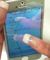

Figure 1. Screenshot of the other specify box (two different angels of the same screen) that is not in an optimal design in mobile. “Yes” and ”No” responses are below the box and user is unable to activate the box – though she it tapping into the box, she does not realize she must first tap the “yes” radio button. The “yes” radio button is out the line of sight.
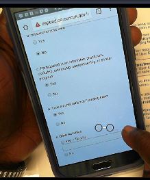
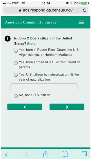
Figure 2. Screen shot on left of “other specify” box in ATES that works better for participants; on right example of how the write in box is handled with “yes” “no” responses in ACS. This is a similar design.
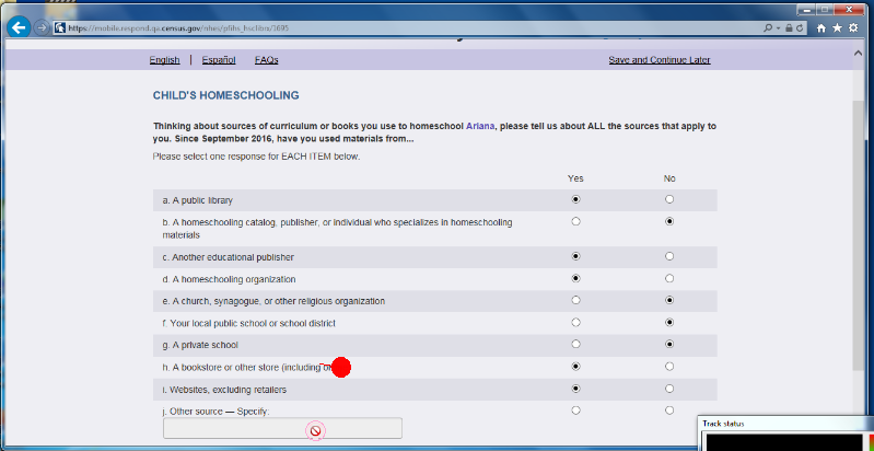
Figure 3. Screenshot of laptop view of Other Specify “not working.”
Recommendation: At minimum, for the mobile display, move the other-specify box to in-between the “yes” and “no” options as it is on the ATES screens and on the ACS example. Additionally, if a participant taps or clicks into the “other specify” box prior to tapping or clicking on the “yes” radio button, allow the respondent to write in the box and automatically mark the “yes” radio button. (Note: this is the strategy that ACS went to after we noticed the same participant behavior of first tapping on the box rather than on the radio buttons.) This is the optimal solution for both desktop and mobile displays.
--Estimated survey length. During the session when the moderator interrupted the participant to ask the participant to find out how long the survey is, some of the participants commented that the specified length of 8 minutes is not accurate (all participants in the usability test are in the dual topical assignment, so their time in the survey is quite a bit longer). Recommendation: Provide an accurate estimate of the average survey length.
--FAQ page. When participants navigated to the FAQ page, it was not immediately obvious to them how to return to the survey. On desktop, an error message appeared after the participant clicked on the “close” link. See Figure 4. After one participant clicked “close” and saw the “error” message, said she “didn’t want to close the window.” Instead she redirected herself to the tabs at the top of the page, leaving the FAQ open in another tab. She was able to redirect herself to the survey using the tabs at the top of the page, but this may not be a strategy that all respondents know.
On mobile phones, the close link is at the bottom and not all participants immediately saw it. The standard for mobile is to include a small “X” in the top right corner to close the window.
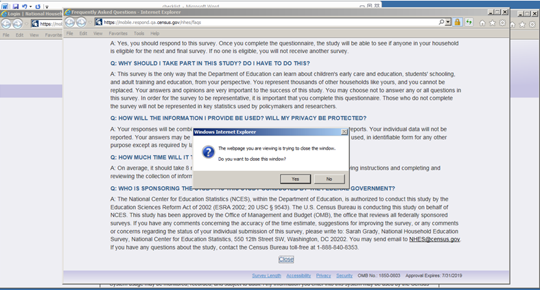
Figure 4. Screenshot of the desktop view after participant has clicked “Close” in the FAQs.
Recommendation: For desktop remove the message that reads like an error so that the window simply closes after the respondent clicks on “Close.” For Mobile, follow what is standard and use the “X” in addition to the “Close” link at the bottom of the page. See an example from the ACS mobile design in Figure 5.
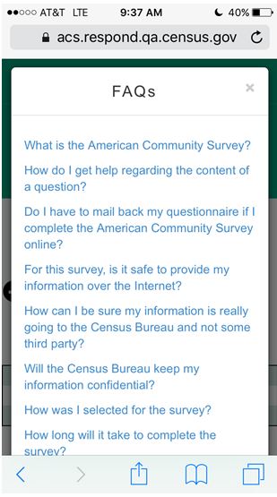
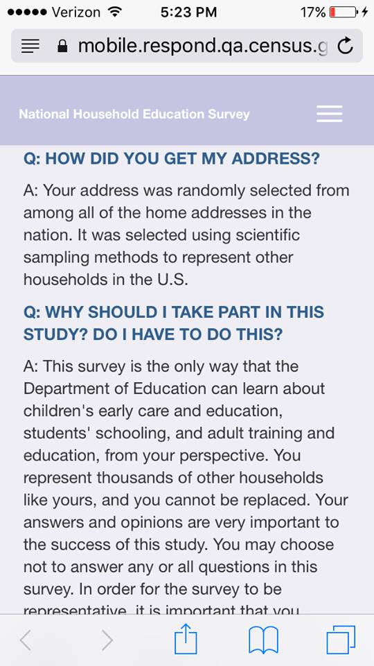
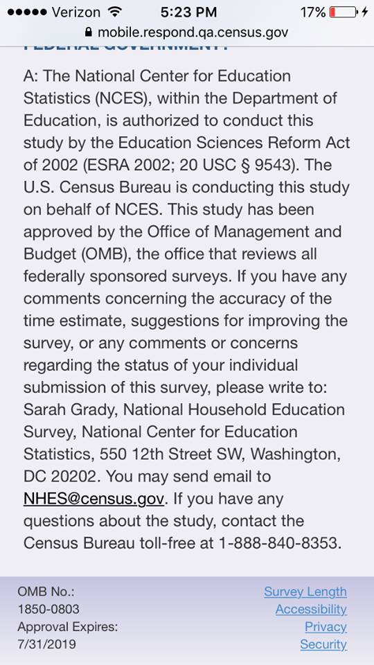
Figure 5. Screenshot from ACS with small “x” in top right corner. In the middle, top of NHES FAQ page without “close” option. On the right, bottom of NHES FAQ page without “close” option.
--Numeric entry. A number of participants attempted to enter decimals when answering time questions, such as the number of hours of homework their child does per week. We have seen participants enter in “125” when meaning to enter “12.5” because the decimal didn’t appear. Participants corrected their error and rounded up, but it is possible that some respondents will not realize that the decimal doesn’t appear and report a much larger number than they intend. Recommendation: Consider allowing decimals.
--Color contrast. The color contrast for the open menu is not strong enough. The black links on the blue background are difficult to read. Recommendation: Make it a brighter color contrast so links are visible. See Figure 6
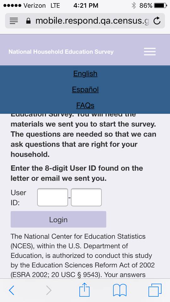
Figure 6. Screenshot of Mobile display of open menu. Black on dark blue is not enough of a color contrast.
--Work experience programs. On ATES, at least two participants attempted to select more than one option for work experience programs. Recommendation: Consider if allowing this is an option.
--Software bugs to fix:
On the screen pfi_fhhome (“how often does [fill childs name] do homework at home?”), the last response option is repeated with a code script of “/>” showing up.
On the screen pfihs_dualparent, the question (“Is the parent or guardian of [fill childs name]?”) is missing a word. See Figure 7. It is particularly confusing when the referenced person is in PFIHS and is referred by an initial only. See Figure 8.
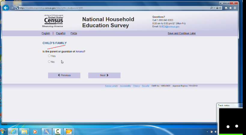
Figure 7. Screenshot of laptop view of dualparent screen.
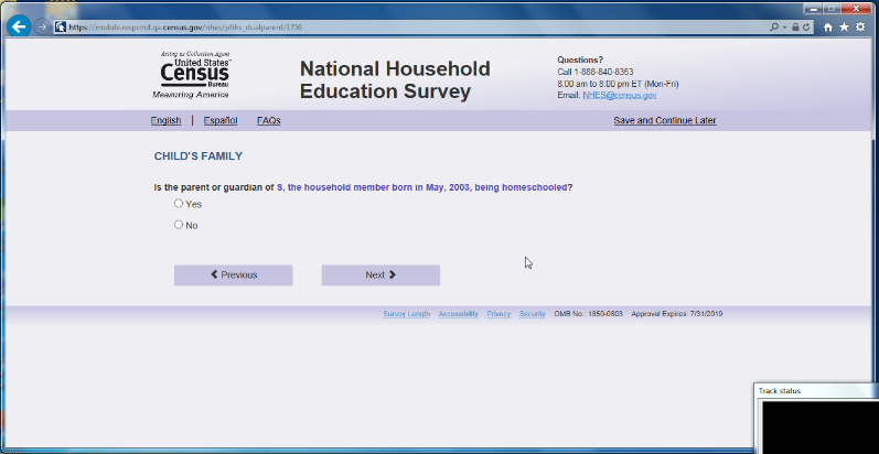
Figure 8. Screenshot of laptop view when in dual parent and respondent is using an initial to identify the family member.
In dual topicals, when the participant answered that they were born in the U.S., the question about when the participant moved to the U.S. appeared when it should have been skipped. This occurs in the Child’s Family section: where the participant is asked “How old were you when you first moved to the 50 United States” after answering in the previous question that she was born in the US. (Screen name pfihs_p1 agemv).
We noticed a fill that is not working. When answering the ECPP survey questions about people’s relationship to the child, it asks whether “person 2” is the parent or guardian of [child’s name], instead of filling Person 2’s name.
If the participant has made responses on a page and then uses “save and logout” the information they entered on the page they were working on is not saved. This could be frustrating for screens with many questions or response options to have to re-do. Recommendation: Save the information that has been entered on the page when “save and logout” is used.
Mobile Usability Issues:
--Problem with Windows Phone DOB screens: On the Windows phone (likely also on the Windows tablet which we didn’t test), the DOB dropdowns did not work as expected. Typically the question stem appears first and then once the participant taps into the field the pick list (Android phones) or wheel (IOS phones) appears. In the instance of the Windows phone however, the pick list showing a list of dates starting with “2017” appears and the participant does not know what the question is asking. There is no context for the pick list as the question stem has not been viewed yet. The one participant who had a windows phone said she thought that the pick list starting with a list of current years was asking her for the current year. Only after she selected “2016” did the pick list go away and then she saw the question and had to go in and make the change. Please note – this occurred for all the DOB dropdown questions on the Windows phone but it did NOT occur for the one other dropdown in the topicals we saw (number of times you eat together as a family). Recommendation: Fix the code so that for Windows mobile platforms, the pick list shows up only after the respondent taps into the DOB dropdown field.
--Missing response option label. There are a number of instances in the different topicals (we have seen it in PFIHS and PFI and ECPP) where the “No” is missing from a series of Yes/No questions. Screens where we have noticed it to occur include: Food stamps; Medicaid; CHIP; Section B; Food stamps ; Child’s health; and Making friends.” Recommendation: Find all instances of the missing “No’s” and fix them.
--Radio buttons on iPhones. On iPhones the selected radio button is small and hard to see. This makes it unclear whether a participant has selected a “yes” or “no” option. For instance, one participant who had inadvertently tapped “yes” to a question about whether her child had a health condition was surprised when the next question asked for more details about the health condition. The participant asked, “What health condition?” She then navigated backwards and changed her answer to a “no.” If the design had been more obvious that the “yes” radio button had been selected she may not have made that mistake. Another participant spontaneously commented during the session that the radio button was impossible to see. The same participant also commented during debriefing that the selected radio button was too tiny. ASD has programed other radio buttons for mobile phones that work for both android and iPhones, see Figure 9, far left for a current ASD design that works on iOS devices. The images on right are two iterations of iOS designs that do not work optimally. Recommendation: Make it more obvious that a radio button has been selected with visual cues like in the survey pictured below on the far left.
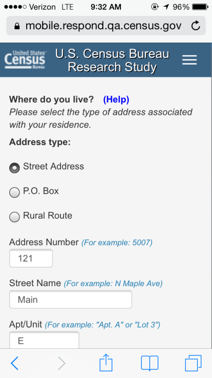
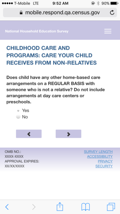
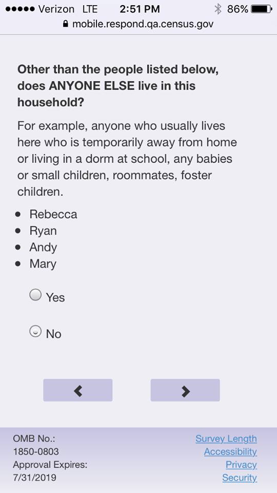
Figure 9. On left, screenshot of a selected radio button for another survey that ASD created for CSM; in the middle, the tiny radio button on mobile iPhone screens, from expert review rounds; on far right, the most recent version of NHES.
--Security warning. A foreboding warning was displayed after participants loaded the test URL on a Chrome mobile browser (or after they clicked the links to “Survey Length” and “Security”). This happened with other mobile browsers but the warnings used weaker (less frightening) language. Recommendation: Ensure the actual production URL (and the links to “Survey Length” and “Security”) work in mobile Chrome and other mobile browsers without flagging a security warning.
-- Menu icon. The meaning of the menu icon -- three lines (also known as the hamburger menu) -- is not universally obvious. Some know the icon and click on it, others do not know that it means “menu.” Not labeling the three bars on smartphone is a problem. One participant said “I’m not sure this is a menu but I am just going to guess.” Recommendation: Replace the three lines with the word “Menu” or keep the icon but label it by adding the word “Menu” underneath it.
Another issue with the menu is that once it’s opened it is difficult to close. Tapping someplace else on the screen (aside from the menu) does not close it, which is how most menus operate. When one participant attempted to close it she accidently hit “save and log out,” which led her down a sub-optimal path. Recommendation: Have the mobile menu follow typical “close” behavior so that when you tap anywhere else on screen it closes the menu. See Figure 10.


Figure 10. Screenshot of some examples with the word “Menu.”
--Spacing on long scrolling pages. The spacing on the mobile grids was not consistent. (On mobile, the grids now appear as many questions on the same screen, which is fine and works well for mobile devices. However we noticed that for at least two of the “mobile grids" on the PFI topical (satisfaction with school and health issues with the child) the questions appeared to be too closely located together. One participant missed answering one of the questions but she did notice after she had scrolled up and checked the page. So, she was able to correct the missing data, but others may not notice. Other grids in the instrument (including the mobile grids in the ATES) appeared better spread out. For example, the “Yes” and “No” answers are too close together, and needs additional spacing. One participant answered “yes” that her child was autistic and then was surprised when the following question on the next screen asked for additional details about her child’s condition. She said “what condition?” she navigated back and saw that on one of the “yes” / “no” answers she had inadvertently tapped “yes” when she had thought she had tapped “no.” At minimum, additional spacing should aid in this issue. Some of the ATES spacing is appropriate. Note: it appeared that when there was a lot of content it was more crammed together – versus when there were only a few response options, it was better spaced. We have noticed that participants don’t mind the scrolling so adding in a little space for visual aid is an optimal solution. Recommendation: Make all mobile yes/no questions have a consistent amount of spacing, specifically increase the spacing in the two "mobile grids" in the PFI topical mentioned above. In addition, spacing between the last response option for a question and the next question-stem should be larger than the space between other response options within that question.
--Formatting of response option text. The spacing was off on longer response options that spanned two lines. The second line appeared in between radio buttons. This makes the screen look cluttered. See Figure 11. Recommendation: For responses that span two lines, indent the second line to line up with start of first line above.
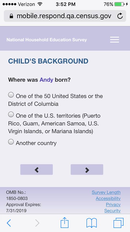
Figure 11. Screenshot of question responses that are intermingled with the radio buttons.
--Visibility of menu header. When participants scrolled down on the mobile page, and the moderator asked them to find out more about the survey, they sometimes failed to see the menu header (because it was hidden from view). On some mobile applications, a user can touch on the screen (but not on a response option) to make the header appear. Once the user taps on the screen again, the menu header disappears. Recommendation: Consider adding in this extra functionality.
--Wrong virtual keypad. The QWERTY keyboard (with letters) appeared after participants tapped into some of the numeric only entry fields. See Figure 12, on left. Recommendation: For all fields where only numbers will be entered, have the number pad come up. This leads to easier data entry and less chance of incorrect buttons being hit. See Figure 12, on right.
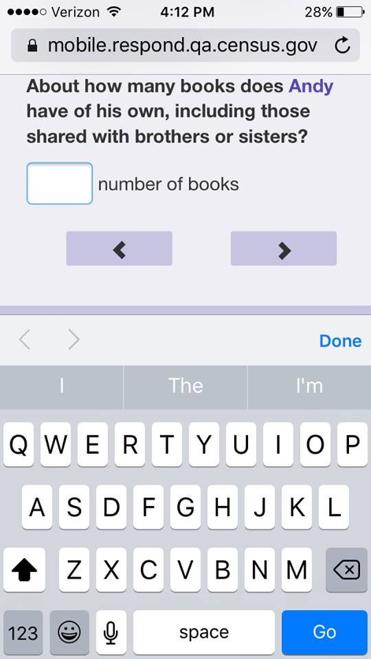
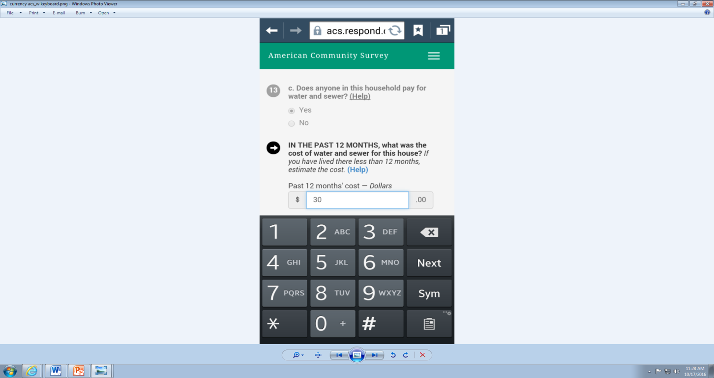
Figure 12. Screenshot on left, QWERTY keyboard for a numeric entry field; on right example of a keypad keyboard for numbers only fields.
--Alignment of “Don’t know” option. For the questions about the “Parent 2,” the “Don’t Know” label was in an odd alignment; is seemed to be misaligned with the checkbox icon and the text field. See Figure 13.. Recommendation: Review the location of the “Don’t Know” and reposition for the small screen.
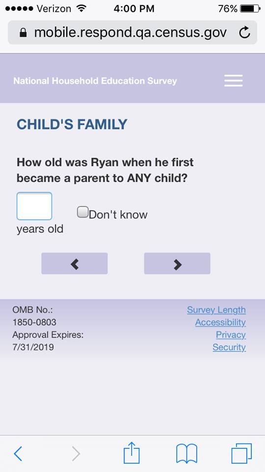
Figure 13. Screenshot of the “Don’t know” checkbox alignment.
--Volume of text on the login screens. A few participants commented on the excessive amount of text on the initial Login and PIN screens. See Figure 14. In addition, when participants logged back into the survey, the PIN screen repeated the first paragraph of text and User ID information, unnecessarily pushing the PIN entry box down the screen. Recommendation: Consider reducing the amount of text on the initial screens.
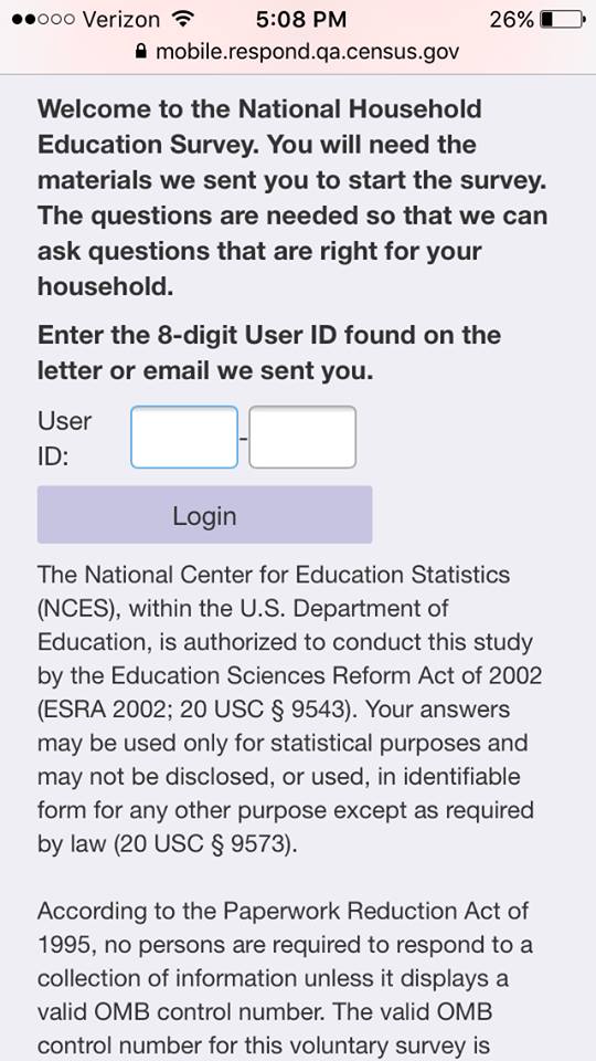
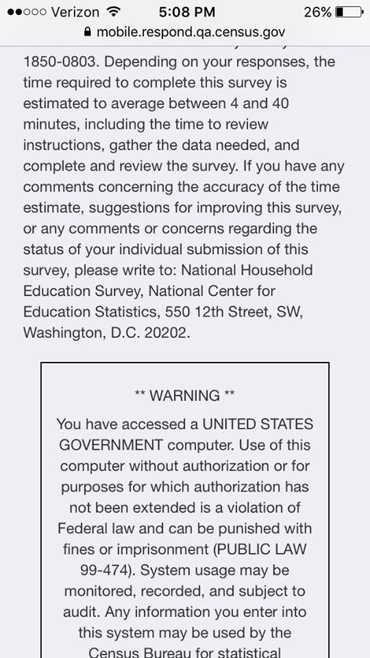
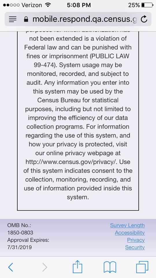
Figure 14. Screenshot of the initial login page on Mobile. Participants commented on the excessive amount of text on this screen.
--Dropdowns. The dropdowns were rendered differently on different devices. Sometimes they were rendered as pick lists that took up the full screen (more recent Android platforms), other times they were displayed as pick lists on the bottom third of the screen (older Android devices), and still other times they were displayed as a wheel (iOS phones, see Figure 15, left). For the DOB screens (the majority of the NHES dropdowns), we think the best design is the more recent Android platforms that display a pick list. There has been anecdotal evidence from other usability studies1 where participants struggled with the iOS wheel (either failing to see it entirely or, as occurred in the NHES dry run, failing to click on the “Done” button to save their answer). Recommendation: Consider using a code to override the default iOS dropdown display and opt to follow the more recent Android look where the dropdown becomes a pick list that takes up the full screen.
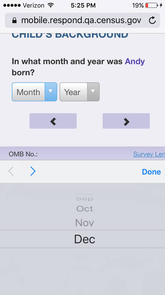
Figure 15. On the left, screenshot of the DOB wheel on iPhone that some participants struggle with. On right, screenshot of the DOB on an Android phone [note: still need to add this screenshot].
--Size of numeric entry fields. Some numeric entry fields are slightly too small. When a participant entered two digits, half of the first number became hidden from view (see Figure 16).. This was the case until participants tapped out of the field. One participant commented about this issue on the question, “How many years have you lived at that address.” She said that she wasn’t sure if the first digit was a 1 or a 4. Recommendation: Increase the width of the boxes slightly so that both numbers can appear once they are entered.
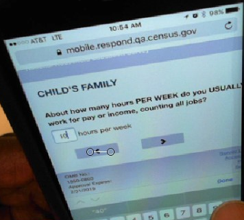
Figure 16. Participant types “40” hours. The “4” is cut off.
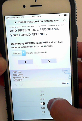
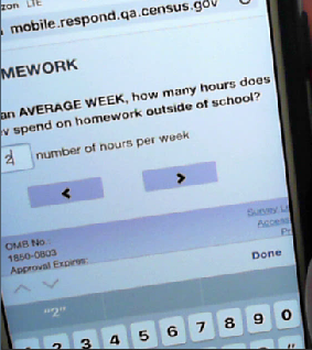
--Inconsistent entry-methods for Hours each Week questions between PFI and ECPP: As visible in Figure 17 below, the entry methods are different by topical. One participant that noticed this much preferred the keyed entry rather than having to scroll through a long list of numbers. Recommendation: Make entry methods consistent within and between topicals for similar questions. Preferably, keyed-entry for higher values to avoid excessive scrolling.
Figure 17. Hours per/each Week Questions. Left: ECPP used scroll-wheel. Right: PFI used keyed-entry.
Usability issues involving understanding/interpreting the question or response options:
--For ECPP topical, we noticed that some participants expressed confusion when answering the child care segments. For example:
One participant struggled after answering that the “program” her child attended was pre-kindergarten because the survey seemed to be referring to the school as pre-kindergarten but when she reads “pre-kindergarten,” she is thinking of the actual class that her child is in, not the school. During debriefing, she explained that the school has a range of classes starting from age 2 and going through age 5, and her child is in the class that is “pre-kindergarten.” It was not immediately obvious from the survey question and the use of the “pre-kindergarten” fill whether, when answering the questions, she should be thinking of her child’s class only or the whole school. This became particularly confusing when the question asks for the number in years and months when she started going to “this particular prekindergarten.” The participant said, “so that’s the question with respect to the class (not the school). On later question she said, “I can’t tell if we are talking about the class or the school.”
For at least two participants in the ECPP topical, they were not sure what exactly was meant by “REGULAR BASIS”. See Figure 18 One participant said “once every week or every other week we have a babysitter.” Another person said that her mother-in-law helps out sometimes but recently she was ill, still she answered “yes” once a week, but later in the survey she was confused with the questions about the care on a regular basis, and started answering about a former day care that her child had attended the previous year.
On the same screen (Figure 18), one participant expressed confusion about the phase “receiving care”. His commented that his parents “care about” his daughter and that they “hug her” and “read to her” and so he selected “yes”; but it turned out that they never actually watch the child on their own (the child goes to day care while the parents work). For this participant, it was unclear how he should have answered the question. Recommendation: It could help to define “receiving care” and be clear if watching over the child is what is really meant.
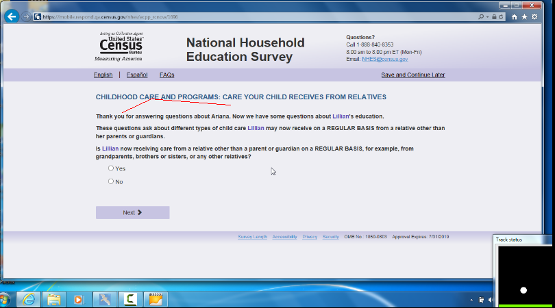
Figure 18. Screenshot of laptop question about care received on a “regular basis.”
--A number of participants commented that they did not like the way one of the “50 United States or the District of Columbia” was worded. See Figure 19. One participant said it made it sound like DC was not a part of the U.S. Recommendation: Simply refer to it as the United States and put the extra information in parentheses – for example: “United States of America (one of the 50 states or the District of Columbia)”.
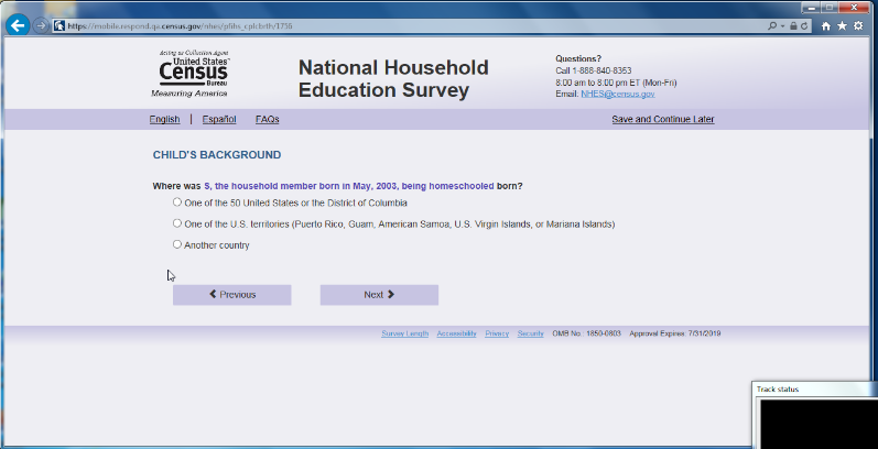
Figure 19. Screenshot of laptop view where it mentions “50 United Stats or the District of Columbia.”
--One participant whose child has “mild cerebral palsy” commented on the health question, “health as compared to what? What is considered average? I can’t imagine anyone would say he is in excellent health but overall he is really great right now.” She went on to say “I am using him as his own baseline to answer this question.” She said this was as opposed to comparing him to “normal” healthy children.
--For the ECPP topical, (ecpp_cphrs) one participant, when answering the question about the numbers of hours each week that the child attends the school, mistakenly reported the number of hours per day that her child is in care.
--On the question about whether the parent had told the child a story (not including reading to child) we heard participants spontaneously verbalize different answers to the same behavior. For instance, some verbalized that they had told their child about their day so they were answering “yes” because that is a story about their day. Other parents said that they didn’t consider telling their child about their day to be a story and so answered “no”. Recommendation: Consider clarifying what is meant by telling a story to the child.
--One participant (the same one who has a child with mild cerebral palsy) said of the question about whether her child is receiving “services for his condition” that she thought the words “services” was “vague.” Recommendation: Consider adding in examples or defining what is meant by “services.”
--One participant is her child’s school PTA president and she had a comment on the question related to “Families & Schools” which asks about whether, since the beginning of the school year, if any adult in the family had done any of the following things at the child’s school – and it lists “h. met with a guidance counselor in person.” The participant said that she had met with the guidance counselor in person because of a PTA related event so she was answering yes but it had nothing to do with her child. She said she thought the question was probably asking about if the meeting with the guidance counselor had to do with the child the survey was about, but in her case, her “yes” response was not in reference to her child.
--After one participant had responded to the survey that her child was in 2nd grade, and another participant responded that her child was in 3rd grade, they both received the question that asked about whether their child was “currently enrolled in any highs school Advanced Placement (AP) classes.” Both participants verbalized that they should not be asked this since the child was in elementary school. Recommendation: If you report that the child is in elementary school remove the question about whether they are in any AP high school classes.
--One participant who only used a first initial for her children said that the clause that included their birth year was at times long in the questions and did make a few of the questions more confusing than they needed to be. During debriefing she mentioned that she would not have used the initials in a government survey if it didn’t explicitly say that she could. As well, there is at least one question that repeats the clause twice in the same question which became very difficult to interpret. The participant suggested for that question to use the initial clause (e.g., “E” born in 2011), only once and the second time, simply use the initial and leave off the rest of the clause. In addition, another participant that used a single initial and was homeschooled said that she did not need to have the part of the clause include “being homeschooled,” the month and year of birth was more than sufficient. This additional part to the clause makes the question seem redundant. See Figure 19, Figure 21, and Figure 22. Recommendation: Consider removing the instruction to use initials. If you include the initials, do not repeat the clause twice in one question. Also do not include the information about being homeschooled in the clause.
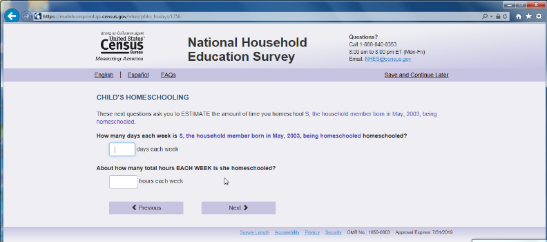
Figure 20. Screenshot of laptop where participant used only an initial to identify child. Homeschool is repeated on this screen six times.
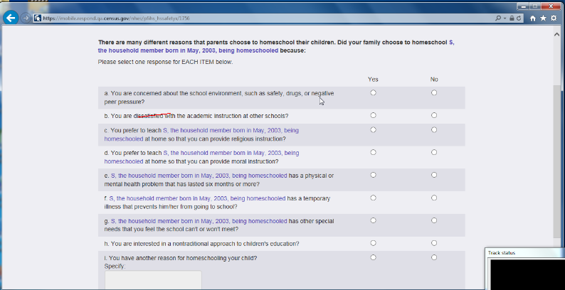
Figure 21. Screenshot of laptop view, here the clause is repeated too many times. See the response options that refer excessively to homeschooling.
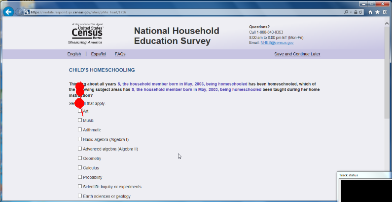
Figure 22. Screenshot of laptop view – another example of excessive mentioning of “homeschooling” in the question stem. “being homeschooled has been homeschooled….. being homeschooled …taught during her home instruction.”
--One participant said of the log in page sentence that reads “The questions are needed so that we can ask question that are right for your household” that she was “super confused by that sentence.” She said the repetition of the word “questions” did not make sense. See Figure 23. Recommendation: Remove the sentence or clarify it.


Figure 23. Screenshot from mobile with confusing sentence circled in blue.
--One participant in the PFIHS topical asked whether the sports activities (such as gymnastics or swimming) count as private tutors.
--One participant had questions about what is considered a “serious emotional disturbance.” She said she thought it only would include something like schizophrenia or bi-polar disorder. She asked if anxiety counts, or whether someone with a sensory processing disorder should say “yes” to this question. (Those were the two conditions that her child had.) Eventually she did tap “yes.”
--One participant was unclear about the definition of a “district-assigned school” because her child went to a district assigned school, but then they moved and her child stayed in the same school. She was wondering if she should still think of this school as a “district-assigned” one even though it was assigned based on her previous address as opposed to her current one.
--One participant was confused by the certificate question about GED because she wanted to make sure that it was known that she had a high school diploma.
--One participant initially interpreted “work experience program” to mean “work experience” and then went back and changed her answer.
--One participant was unsure about whether to count a math club for homeschoolers as a community homeschool group.
--A few participants have commented that the answer option “Now married” is odd. Participants thought it should just say “married” without the “Now.” In addition, the question stem uses the word “current” so to repeat “Now” in the response option is redundant. See Figure 24. Recommendation: Remove the word “Now.”
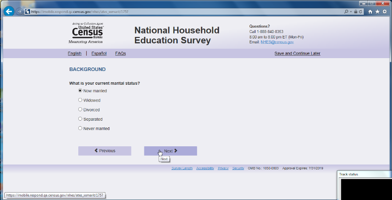
Figure 24. Screenshot of laptop view of marital status question with “Now” in front of married response option.
--For a family that homeschooled, the “Art” choice caused cognitive confusion for one participant that asked if “Art” meant performing art or visual art? The participant said, “There is no instruction for specifying what type of Art.” Recommendation: Since there is room, you could add some examples of the type of art that should be considered.
-For homeschooling, the question about whether anyone in the family had done any of the following with the child – in the instance of when the child was an older teen – did not seem as relevant because, as one parent said, he has gone to the library by himself? Does that count?
--For the employment question, one participant wanted to know whether to count all hours or just paid hours.
--One participant treated the question about different government assistance programs like it was a check-all-that-apply question, clicking ‘yes’ on some items and skipping the rest.
--Cognitive/layout issue on Mobile: One ATES participant said that she had been looking in the position that the “Too soon to tell” response option (the other response options were “Not useful,” “Somewhat useful,” “Very useful”) was as the most extreme of the options, rather than as a neutral option. She thought “too soon to tell” belonged somewhere else, such as at the top. Recommendation: Consider checking the response order options. Perhaps if there was additional spacing separating out the “Too soon to tell” from the other three choices the distinction would be more obvious.
--At least two people asked aloud “what is journeyman status?” Both participant answered “no” because as one participant articulated that “if I had received it I would know what it is.”
--In ATES situations where the person works both full and part time - remove the follow-up question. One person who answered that she worked both full and part-time said the follow up question “do you prefer to work full time rather than part time” doesn’t make sense.
-- The ECPP question (ecpp_cpunit) about the easiest way to “report” childcare expenses received mixed comments. One participant spontaneously verbalized, “oh that’s a nice way to do it”. But others had trouble understanding the word “report”. One participant said she “initially thought report to whom?”. She continued, “then I thought about the survey itself.” So she seemed to understand it at that point. Recommendation: consider replacing the word “report” with something more colloquial such as “tell us” and perhaps even mention something like this: “We are about to ask you about your child care expenses and want to know if it’s easiest for you to tell us about these costs in daily, monthly, or yearly increments.”
--For the ECPP topical, one participant commented that “I said she was watched somewhere else and that the person didn’t live with me - why would they live with me and be watched elsewhere?”
--It appears that for participants in the ATES topical, many seem to pause on the question that states what the difference is between a certificate and a certification. It is not exactly a clear distinction for participants. Participants are rereading this question multiple times and are still confused.
--One participant in the ATES topical had the same certification in multiple states. The question asks to put the “most important” certification first. They were not sure how to respond to this. Eventually, they decided to use the one that they use the most even though they considered each one equally important.
--One of the answers listed in the FAQ page that discusses why someone was not asked any questions about their child’s education may not make sense for people in a dual topical survey. Consider rewording that FAQ.
--In an ATES topical, one participant said that the questions about whether she has a license to do her job feels like it is redundant. She said that she was already asked this earlier in a different manner. The question reads, “do you have a license that is required by a federal state or local government agency to do the job”
--One participant commented on the letter that if he had received this in the mail he may not have completed it because its justification was too vague. At least one participant scrolled to read the warning message, exploring if it was a secure site before logging in. There is a more updated warning message that the decennial census is using, we recommend using that wording as it has been cognitively tested and performs better. See Figure 25.

Figure 25. Screenshot of updated wording in the Terms and Conditions that was tested in the Decennial 2016 test and is being used for future decennial test.
--For one participant, the instructions to enter “first name, initial, or nickname” on the first “About You” question are located just above the field and was seen easily. On the next screen asking about household members, the screen had these same instructions but for this participant it was buried in a large amount of text. The participant missed this part and commented that it was odd that they were allowed to enter only a nickname or initial for themselves but not for other household members. Consider placing these instructions in the same location as the first screen (just above field) and separate from the rest of the text.
--At least two participants commented that the sex question should consider adding in an “other” option.
--The wording of calendar year vs 12 month year was confusing to at least one participant.
--The question in ATES asking the respondent to report the highest degree received caused some confusion. At least two participants that had some graduate school but with no degree did not prefer to choose that response option because they verbalized that they had a BA degree they just did not finish graduate school. The wording “but no degree” made them think it would not count their BA degree, so they underreported the amount of schooling they had received.
--In the section on “Families and school” the screen “fcschool” the question is a Likert like scale that only offers four options. One participant indicated she wanted another “in-between” option (so not an even number of choices).
--In one of the questions on the PFI topical, the parent is asked about how the child feels about how much homework she has. The participant mentioned that her child doesn’t really talk about it – and there was no option for “I don’t know” or “No opinion.” In this instance, the participant skipped the question
--On the screen “Hdintdis” the first option (a) mentions “mental retardation.” No participant commented on this but it is possible this term may offend some people as it is not politically correct. It may be more appropriate to use the term “intellectual disability.” When we googled this term we found an article that suggests in 2010 President Obama signed legislation that requires the term “mental retardation” to be now termed “intellectual disability” for most governmental purposes. See https://www.disabilityscoop.com/2010/10/05/obama-signs-rosas-law/10547/ (American Psychiatric Association. (2013). DSM 5. American Psychiatric Association.)
--One participant during the second vignette, when attempting to learn more about the survey went to google and found the NHES main website. She proceeded to read about their overview and mission statement on http://nces.ed.gov/nhes/. It is possible other respondents will do this. Recommendation: Ensure the website is updated for the current survey.
----A number of participants in the PFIHS topical initially were not sure how to respond to the question about the tutor because they all mentioned aloud that they were in a co-op and they were not sure if the co-op should be counted as a tutor. The very next question is about whether the child is in a homeschooling co-op. While all participants were able to figure it out after receiving the next question, it caused extra frustration and time when they were deciding how to answer the first question (not knowing that their answer would be in the next question). For example, one participant verbalized that she didn’t know if a private tutor employed by the home school group that she belongs to should be reported as her own private tutor. After she saw the next question about belonging to a co-op group, she recommended changing the order of questions so that the home school group question appears before the private tutor question. This way, she would have already reported belonging to a home school group and would know that a private tutor is something different. Recommendation: As it appears that almost all the participants are in some type of co-op (more so than private tutorials) it may make sense to switch the order of the questions so that the question about co-ops come before the question about private tutors.
--The question about how many total hours each week the child was homeschooled took a while to count for some of the participants. In addition, based on what the participants spontaneously verbalized as they counted, it appeared that participants counted the hours differently. For example, some participants counted strictly only the hours they worked with their children and did not count the co-op hours or time that other people worked with their children. Other participants counted all the time that their child was in instruction including co-op settings, extracurricular type activities such as organized sports, etc. Thus the range of hours varied wildly by participants. Recommendation: Consider adding in some instruction on what the respondent should consider when making their answer.
--For two participants, one of whom had used both public/private schooling for some of their child’s education as well as homeschooling, paused on the question asking how many years had the child been homeschooled. The question starts with the phrase, “Thinking about typical grade levels for which grade levels was [fill of child’s name] home schooled?” This question did not seem to bother respondents who had homeschooled their children for every school year. One of the participants that had issues with this question recalled that her child was in kindergarten but that she had done some “stuff” with her last year. The other participant had use the public/private schooling system and was now homeschooling, so she had used a combination of two types of schooling. It was not clear exactly why this question was confusing, but it is something to keep watching.
In ATES, a few participants hesitated on the question about maintaining or renewing their certificate/license. One participant said that if you have a current license it is implied that you are maintaining/ renewing it.
--One participant in the ATES wanted to know if volunteering should count as work experience.
--There is no question specific help (like ACS) but at least one participant, during debriefing, said she would prefer to have some specific help for some of the questions.
--A few participants verbalized that they would like a progress bar. This typically occurred after the moderator interrupted the participant to ask them to complete a specific task (e.g., save and logout, length of survey, etc.) Note: Research is mixed on whether having progress bar is beneficial for longer surveys.
--On one of the early PFIHS screens there is an incorrect grammatical possessive. See the first sentence in Figure 26. Recommendation: Fix this error.
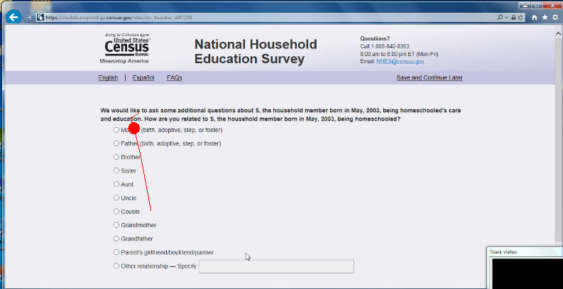
Figure 26. Screenshot of laptop pfihs when respondent has written in only her child’s initial.
--For the PFI public school topical, some participants verbalized that being asked the name and address of their child’s school was too personal.
--At least one participant said that they wanted a text field that they could specify another language when “other” is selected.
--One participant wanted to be able to also select a minor in addition to a major for their degree.
--For PFI, one participant had lived at their home address for less than a year. For the question about how many years living at this address, they entered 6 for months. They then realized that it was asking for years and changed to 0 years. The participant expressed that she felt she could not answer this question appropriately.
--For PFIHS, many participants were unsure about what “another educational publisher” means for the question about educational materials. It was perceived as too broad or vague.
--For ECPP, many participants struggled with approximating the number of books that belonged to their child. Several participants said that this number was in the hundreds and was very difficult to try to estimate. One participant suggested that a set of different ranges (e.g. 0-10, 10-25, etc.) to choose from would make this question easier to answer.
--For PFI health response options, the “Another impairment lasting 6 months or more” option confused at least 2 participants. The word “another” implied to them that the other response options needed to last 6 months or more to qualify.
--A general issue is that participants were at times unsure about what question to expect next. Two participants asked why the survey didn’t ask about their other children. They were surprised when the survey ended before they had answered questions about all their children. If respondents outside of the lab also think that they will have to answer questions about all of their children, they may breakoff. We think it might help to provide some context for respondents about what to expect. For example, it would be good to mention at the very start of the survey that only one of their children is sampled (“We will ask you several questions about [fill for child’s name] and their education. We ask each family about only one of their children, and so will not ask detailed questions about your other children.”). This will also help respondents focus on that particular child while answering questions. If respondents are participating in two topicals, then this should also be mentioned at the start of the survey so that the transition from one topical to the next is less abrupt (If in dual topical of ATES and PFI/HS or ECPP: “First we will ask about your work and then we will ask about your child [fill]. OR if in ECPP and PFI/HS: “First we will ask about your child [ fill ECPP child’s name] and then we will ask about [fill PFI/HS child’s name]. We will only ask you questions about these two children.) In other words, any “signposting” or guidance to give respondents a sense of where they are in the survey and what is coming next would help.
Satisfaction Ratings
Participants rated their satisfaction with the survey. In the graph below, darker colors represent a more negative impression of the survey and lighter colors represent a more positive impression. For comparison purposes, the range of possible scale colors is shown in Figure 27.

Figure 27: Range of scale colors for 7 point rating scale
When asked for participants’ overall reaction to the web survey where 1 was “Unpleasant” (darker blues) and 7 was “Pleasant,” (lighter blues) participant ratings on Laptop were slightly more often aligned with the light blue color as compared to Mobile. See Figure 28.
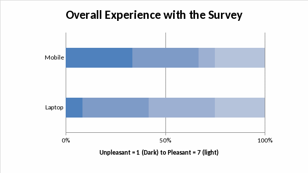
Figure 28. Satisfaction questionnaire that compares overall satisfaction from participants that used Mobile versus Laptop
When asked for participants’ impressions about whether the survey screens were visually pleasing where 1 was “Never” (darker blues) and 7 was “Always,” (lighter blues) participant ratings on Laptop and Mobile were about the same. See Figure 29.
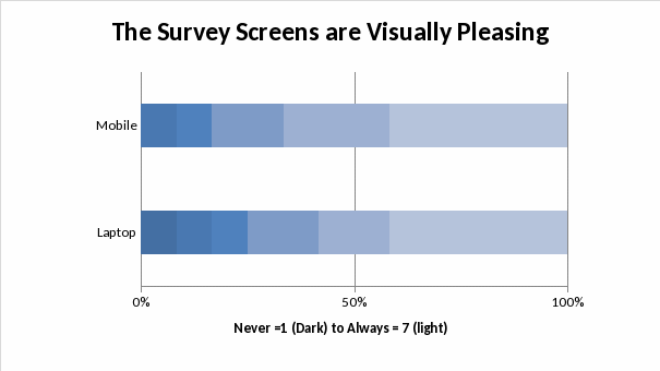
Figure 29 . Satisfaction questionnaire that compares survey screens from participants that used Mobile versus Laptop
When asked for participants’ impression of the legibility of the words and text on the screen where 1 was “Barely legible” (darker blues) and 7 was “Very legible,” (lighter blues) participant ratings on Laptop were slightly more often aligned with the light blue color as compared to Mobile. See Figure 30.
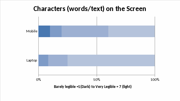
Figure 30. Satisfaction questionnaire that compares words and text on screen for participants that used Mobile versus Laptop.
1 CSM is currently planning a research study to compare user performance on iOS and Android dropdown boxes on mobile devices. Once the research is finished we hope to have some evidence based guidelines on how to design dropdowns for mobile.
| File Type | application/vnd.openxmlformats-officedocument.wordprocessingml.document |
| File Title | NHES quick report |
| Author | Erica L Olmsted Hawala |
| File Modified | 0000-00-00 |
| File Created | 2021-01-22 |
© 2026 OMB.report | Privacy Policy
