Survey to Assess National Weather Service Hurricane Prod
NOAA Customer Surveys
REVISED_HLS_ATSFW Ophelia Survey_OMB Submittal_09_13_16.DOCX
Survey to Assess National Weather Service Hurricane Products
OMB: 0648-0342
Survey to Assess National Weather Service Hurricane Products
The National Oceanic and Atmospheric Administration’s (NOAA’s) National Weather Service (NWS) needs your help to improve its communication of tropical cyclone hazards—and to help save people’s lives and homes.
Please share your opinions by completing the following survey. The NWS is distributing this survey to emergency managers and members of the media. It asks for your opinions about possible improvements to tropical cyclone forecast products issued by local NWS offices and about some new map prototypes created by the National Hurricane Center (NHC).
This survey should take about 40 minutes of your time. Your participation is voluntary, and your responses to the questions are anonymous.
Paperwork Reduction Act Statement: Public reporting burden for this collection of information is estimated at 40 minutes per response, including the time for reviewing instructions, searching existing data sources, gathering and maintaining the data needed, and completing and reviewing the collection of information. Send comments regarding this burden estimate or any other suggestions for reducing this burden to Jennifer Sprague-Hilderbrand, NOAA National Weather Service, 1325 East West Highway, Silver Spring, MD, 20910-3283. Notwithstanding any other provisions of the law, no person is required to respond to, nor shall any person be subjected to a penalty for failure to comply with, a collection of information subject to the requirements of the Paperwork Reduction Act, unless that collection of information displays a currently valid OMB Control Number.
First, you will be answering a few questions about some local NWS hurricane products and services. When an area is under a hurricane watch or warning, NWS Weather Forecast Offices (WFOs) provide locally relevant threat and impact information in text and supporting graphical products.
Below are three ways in which a local WFO might reference the threat level (severity) of a particular hurricane hazard (wind, storm surge, flooding rain, and tornadoes) in its text products. Option A uses labels, Option B uses ranges, and Option C uses both labels and ranges. The example below is for wind.
WIND THREAT
OPTION A. LABELS |
OPTION B. RANGES |
OPTION C. LABELS & RANGES |
Extreme |
Greater than 110 mph |
Extreme: Greater than 110 mph |
High |
74–110 mph |
High: 74–110 mph |
Moderate |
58–73 mph |
Moderate: 58–73 mph |
Elevated |
39–57 mph |
Elevated: 39–57 mph |
Little to None |
Less than 39 mph |
Little to None: Less than 39 mph |
Which option do you prefer?
Option A (labels)
Option B (ranges)
Option C (labels and ranges)
No preference
Not sure
None of the above
[Next Screen]
Now, consider the labeling options presented below for the second-to-lowest threat level (outlined in red). Wind and surge are shown here for context.
THREAT LEVELS
THREAT LABEL |
WIND |
SURGE |
Extreme |
Greater than 110 mph |
Greater than 9 feet above ground |
High |
74–110 mph |
Greater than 6 feet above ground |
Moderate |
58–73 mph |
Greater than 3 feet above ground |
A. Elevated B. Slight C. Low D. Minor |
39–57 mph |
Greater than 1 foot above ground |
Little to None |
Less than 39 mph |
Little to No storm surge flooding |
Which label do you prefer for the second-to-lowest threat level?
Label A (Elevated)
Label B (Slight)
Label C (Low)
Label D (Minor)
No preference
Not sure
None of the above
[NEXT SCREEN]
S uppose
that a major hurricane is approaching Florida’s southwest
coast. Map A below depicts the wind threat based on a reasonable
worst-case scenario,
which means there is a 10 percent (or 1 out of 10 chance) that the
winds could be stronger than what is depicted on the map, while Map B
uses a
most likely scenario, which
means there is a 50 percent (or 5 out of 10 chance) that the winds
could be stronger than those depicted on the map.
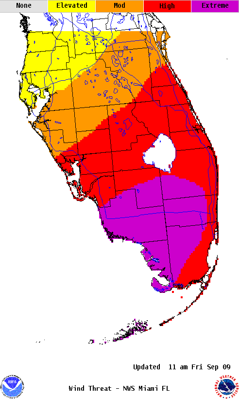
Map A. Reasonable worst-case scenario Map B. Most likely scenario
Which map do you prefer for your internal decision-making/job responsibilities?
Map A (reasonable worst-case scenario)
Map B (most likely scenario)
Both maps (reasonable worst-case and most likely scenarios)
No preference
Neither map
Not sure
N/A
Which map do you prefer for your external communications?
Map A (reasonable worst-case scenario)
Map B (most likely scenario)
Both maps (reasonable worst-case and most likely scenarios)
No preference
Neither map
Not sure
N/A
[NEXT SCREEN]
How useful do you consider each of the following statements for your internal decision-making/job responsibilities?
|
Very Useful |
Somewhat Useful |
Not Particularly Useful |
Not Useful At All |
Not Sure |
|
|
|
|
|
|
|
|
|
|
|
|
|
|
|
|
|
|
|
|
|
|
|
|
How useful do you consider each of these statements for your external communications?
|
Very Useful |
Somewhat Useful |
Not Particularly Useful |
Not Useful At All |
Not Sure |
|
|
|
|
|
|
|
|
|
|
|
|
|
|
|
|
|
|
|
|
|
|
|
|
[NEXT SCREEN]
WFOs are working with local authorities to develop potential impact (the possible amount of damage associated with a threat) statements to include in local text products. A set of potential impact statements are provided below for a high wind threat.
POTENTIAL IMPACTS FROM WIND: EXTENSIVE DAMAGE |
BUILDINGS: Considerable roof damage to sturdy buildings, with some having window, door, and garage door failures leading to structural damage. Mobile homes severely damaged, with some destroyed. Damage accentuated by airborne projectiles. Locations may be uninhabitable for weeks. |
TREES: Many large trees snapped or uprooted along with fences and roadway signs blown over. |
ROADS: Some roads impassable from large debris, and more within urban or heavily wooded places. Several bridges, causeways, and access routes impassible. |
UTILITIES: Large areas with power and communications outages. |
How useful do you consider each of these bulleted sections for your internal decision-making/job responsibilities?
BUILDINGS Section:
|
TREES Section:
|
ROADS Section:
|
UTILITIES Section:
|
How useful do you consider each of these bulleted sections for your external communications?
BUILDINGS Section:
[NEXT SCREEN] |
TREES Section:
|
ROADS Section:
|
UTILITIES Section:
|
The following tables present two different ways of labeling the potential impacts (the possible amount of damage associated with the threat) related to each threat level (severity). The example below is for wind. Table A uses the same labels for both the potential impacts and the threat level. Table B uses different labels.
HURRICANE THREATS AND IMPACTS
THREAT LABEL |
POTENTIAL IMPACTS LABEL (for possible damage) |
WIND |
||||
Extreme |
Extreme |
Greater than 110 mph |
|
|||
High |
High |
74–110 mph |
|
|||
Moderate |
Moderate |
58–73 mph |
|
|||
Elevated |
Elevated |
39–57 mph |
|
|||
Little to None |
Little to None |
Less than 39 mph |
|
|||
HURRICANE THREATS AND IMPACTS |
|
|
|
|
||
THREAT LABEL |
POTENTIAL IMPACTS LABEL (for possible damage) |
WIND |
||||
Extreme |
Devastating/Catastrophic |
Greater than 110 mph |
||||
High |
Considerable |
74–110 mph |
||||
Moderate |
Significant |
58–73 mph |
||||
Elevated |
Limited |
39–57 mph |
||||
Little to None |
Minimal |
Less than 39 mph |
||||
B. Different labels for threats and impacts
Which labeling option do you prefer?
Table A (same labels for threats and impacts)
Table B (different labels for threats and impacts)
No preference
Neither
Not sure
[NEXT SCREEN]
On a scale of 1 to 5, how well do you think each of the following terms characterizes the potential impacts from a high wind threat (74 to 110 mph), where 1 represents the worst and 5 represents the best choice?
Considerable
1 – Worst 2 3 4 5 – Best
Significant
1 – Worst 2 3 4 5 – Best
Extensive
1 – Worst 2 3 4 5 – Best
On a scale of 1 to 5, how well do you think each of the following terms characterizes the potential impacts from a moderate wind threat (58 to 73 mph), where 1 represents the worst and 5 represents the best choice?
Considerable
1 – Worst 2 3 4 5 – Best
Significant
1 – Worst 2 3 4 5 – Best
[NEXT SCREEN]
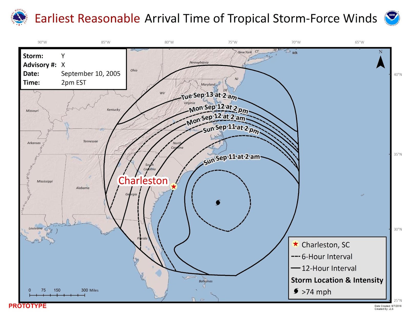
Now, you will be looking at a number of prototype maps developed by the National Hurricane Center (NHC).
If you lived in Charleston, South Carolina, how would you interpret the following map?
{open-ended}
[NEXT SCREEN]
How do you currently use projected timing information for the arrival of sustained tropical storm-force winds (greater than 39 miles per hour)? Check all that apply.
For issuing evacuation orders
For communicating with authorities
For communicating with the general public
During informal discussions with colleagues
For media or social media sharing
Other (please describe)
N/A
How satisfied are you with your current sources for determining the arrival of sustained tropical storm-force winds?
Very satisfied
Somewhat satisfied
Not particularly satisfied
Not at all satisfied
Not sure
N/A
[NEXT SCREEN]
Imagine your area of responsibility is Charleston, South Carolina. Look at the two maps below. Map A depicts the earliest reasonable arrival time for sustained tropical storm-force winds, while Map B depicts the most likely arrival time.

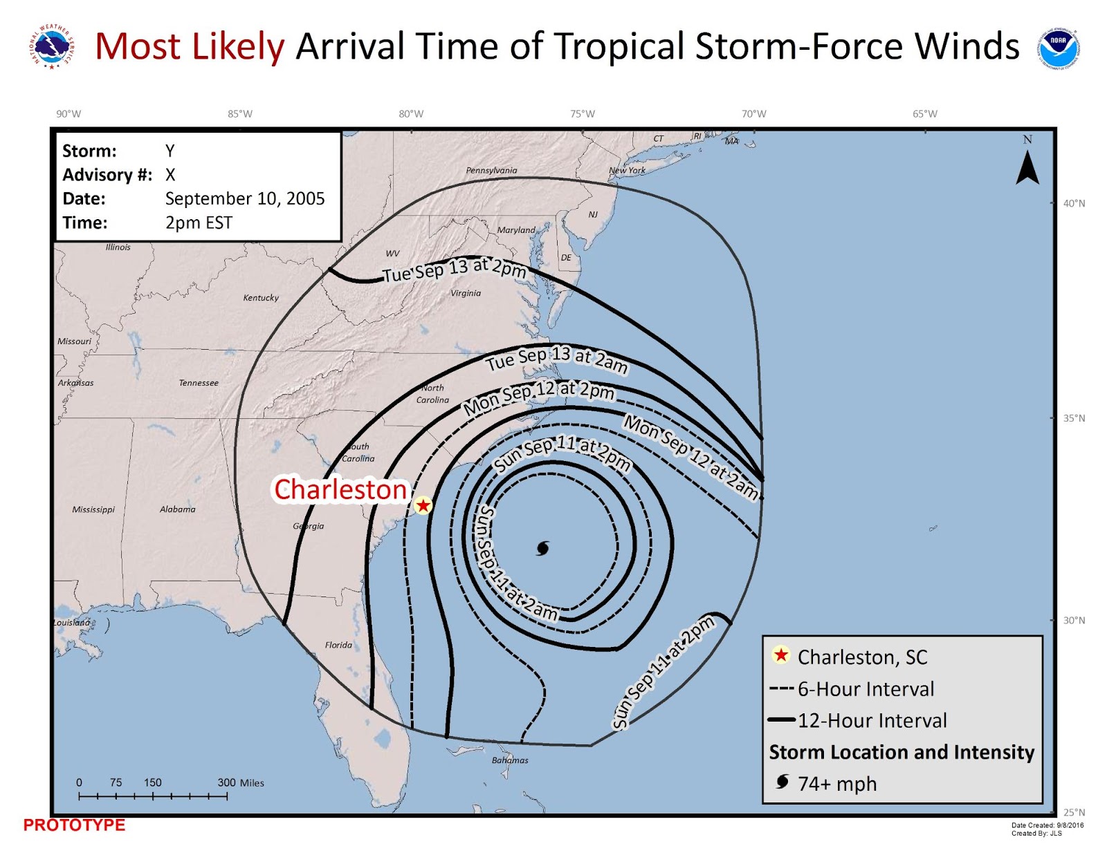
Which map do you prefer for your internal decision-making/job responsibilities?
Map A (earliest reasonable arrival time)
Map B (most likely arrival time)
Both maps (earliest reasonable and most likely arrival times)
No preference
Neither map
Not sure
N/A
Which map do you prefer for your external communications?
Map A (earliest reasonable arrival time)
Map B (most likely arrival time)
Both maps (earliest reasonable and most likely arrival times)
No preference
Neither map
Not sure
N/A
[NEXT SCREEN]
Here are two alternatives for expressing the arrival times on the map. Option A uses specific timing labels, while Option B gives more general time periods.
Option A: Specific timing label, such as Saturday, October 3 at 2:00 a.m.
Option B: General timing label, such as Saturday, October 3, p.m.
Which timing labels do you prefer?
Option A (specific timing labels)
Option B (general timing labels)
No preference
Neither option
Not sure
[NEXT SCREEN]
Here are two alternatives for time placement on the map. Map A places the label on the segment border, while Map B places the label in the center of the segment.

Map A. Label on border
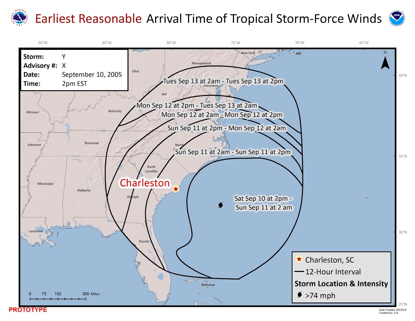
Map B. Label in center of segment
Which time placement do you prefer? one
Map A (on the border)
Map B (in center of segment)
No preference
Neither map
Not sure
[NEXT SCREEN]
Here are two different coloring options for the map. Map A uses shades of gray, while Map B uses no color.
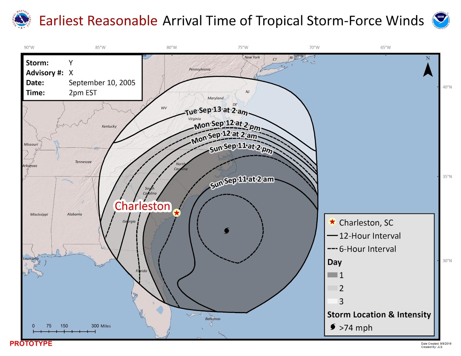
Shades of gray

No color
Which map do you prefer?
Map A (shades of gray)
Map B (no color)
No preference
Neither map
Not sure
[NEXT SCREEN]
What does the darkest shade of gray in the map below convey to you?

Area that could experience the most intense winds
Area that could experience winds first
Both
Neither
Not sure
[NEXT SCREEN]
The NHC currently produces a map depicting the probabilities (in percentages) that wind speeds of at least 39 mph will occur from the current time through the five-day forecast. Here is an example of this map.
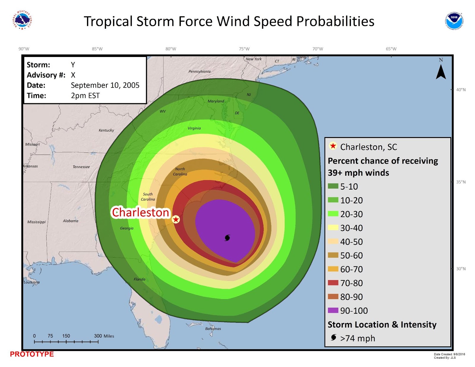
To what extent do you use this graphic in your decision-making/job responsibilities?
Always use
Frequently use
Sometimes use
Never use
N/A
[NEXT SCREEN]
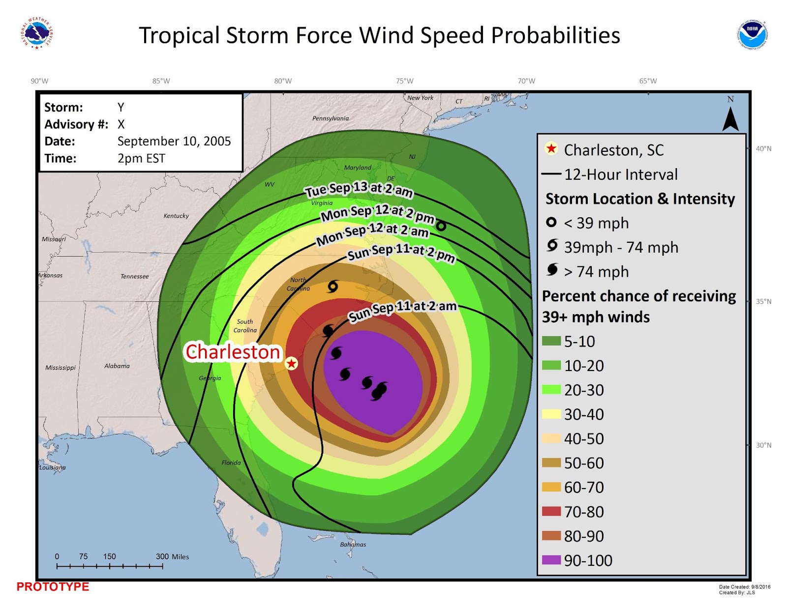
The map below combines the NHC wind speed probability data with the arrival of sustained tropical storm-force winds graphic.

If you lived in Charleston, South Carolina, how would you interpret this map?
{open-ended}
How useful is this combination map?
Very useful
Somewhat useful
Not particularly useful
Not at all useful
Not sure
[NEXT SCREEN]
The following map combines the storm track with the arrival of sustained tropical storm-force winds.
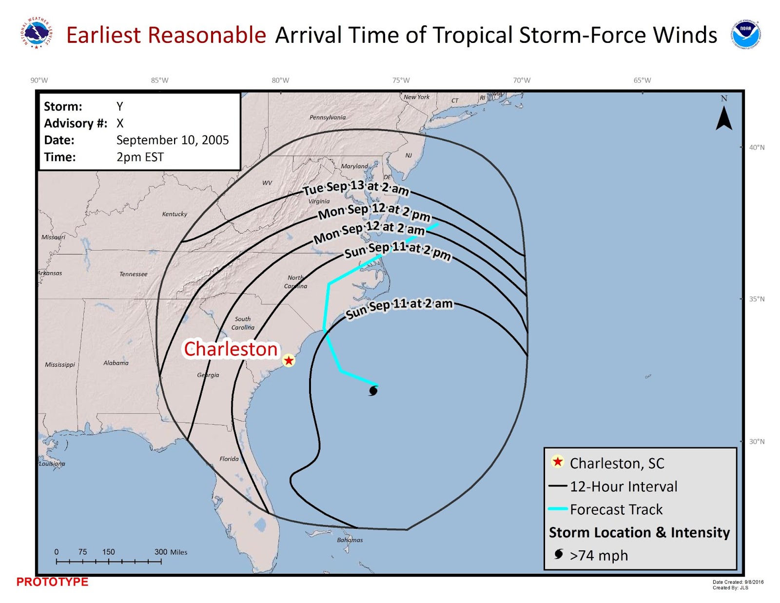
If you lived in Charleston, South Carolina, how would you interpret this map? {open-ended}
How useful is this combination map?
Very useful
Somewhat useful
Not particularly useful
Not at all useful
Not sure
[NEXT SCREEN]
The map below combines three types of information: arrival of tropical storm-force winds, wind speed probabilities, and storm track.
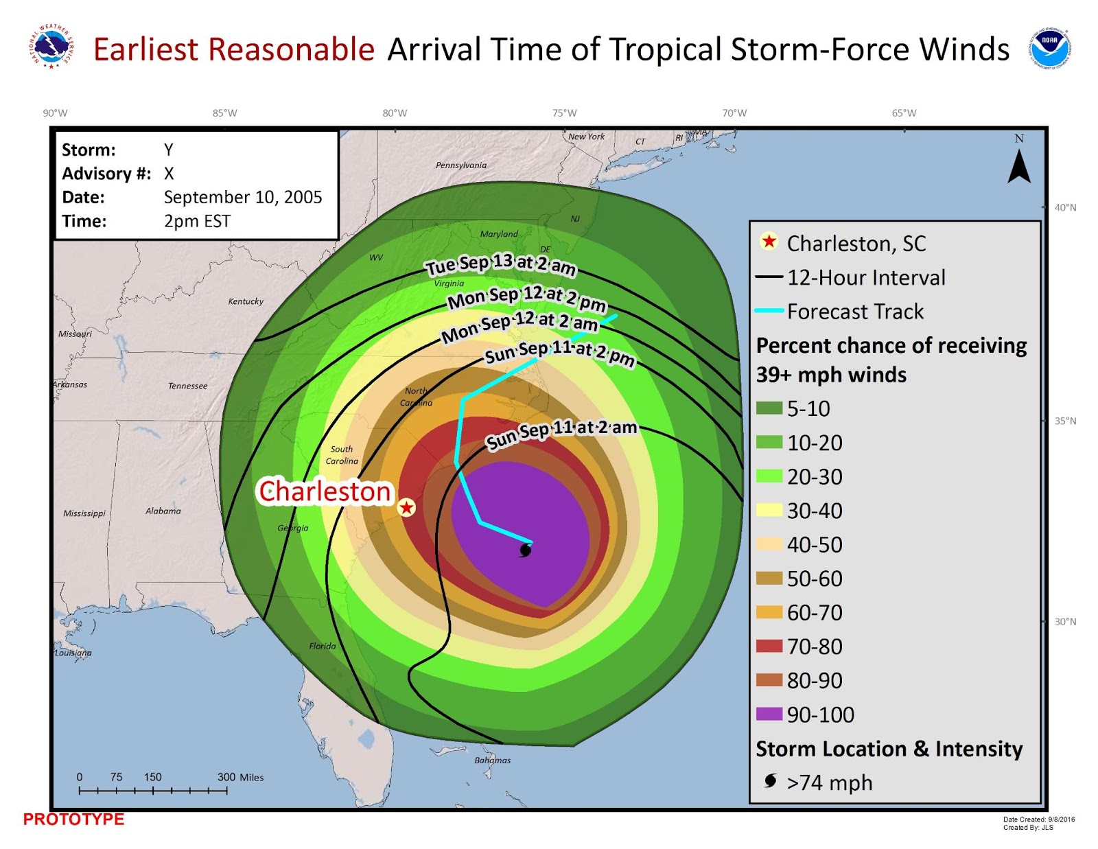
If you lived in Charleston, South Carolina, how would you interpret this map? {open-ended}
How useful is this combination map?
Very useful
Somewhat useful
Not particularly useful
Not at all useful
Not sure
[NEXT SCREEN]
The maps below show two different ways to depict the storm track. Map A uses a center line, while Map B uses center points.

Map
A. Storm track center line
Map
B. Storm track center points
Which map do you prefer?
Map A (center line)
Map B (center points)
No preference
Neither map
Not sure
[NEXT SCREEN]
How useful is a toggle feature that would allow you to turn different types of information on and off?
Very useful
Somewhat useful
Not very useful
Not useful at all
Not sure
Now that you’ve had a chance to examine the prototypes, do you think that an Arrival of Sustained Tropical Storm-Force Winds graphic should be added to the NHC’s suite of forecast products?
Definitely
Maybe
Probably not
Definitely not
Not sure
If the NHC issued the map, to what extent would you use it for your internal decision-making/job responsibilities?
Always use
Frequently use
Sometimes use
Never use
Not sure
N/A
If the NHC issued the map, to what extent would you use it for your external communications?
Always use
Frequently use
Sometimes use
Never use
Not sure
N/A
Are there any comments you’d like to make about your preferences, the design of the graphic, or about the graphic in general? Or any suggestions you’d like to make about further development of the graphic? {Open-ended}
Thank you for taking the time to complete this survey. Your input will be very helpful to the National Weather Service.
| File Type | application/vnd.openxmlformats-officedocument.wordprocessingml.document |
| Author | Linda Girardi |
| File Modified | 0000-00-00 |
| File Created | 2021-01-25 |
© 2026 OMB.report | Privacy Policy